Bridging the gap between user research insights and actual organizational action — with a clear…

Write Better CSS By Borrowing Ideas From JavaScript Functions — TechRuum
I like to think of writing CSS, like writing functions that describe how your layouts respond to change. When we forget the principles of writing a good function, here’s some of what can happen:
- We lose time.
When we have to worry about side effects, changes take longer. - We create bugs.
My favorite example is an online store where the “Buy” buttons were hidden due to misuse of viewport units. - We build fewer features.
When changes are scary and time-consuming, they often don’t happen.
Let’s look at how we can borrow best practices and ideas from writing good JavaScript functions for writing CSS that is easy to use, free from unwanted side effects, and resilient to change.
Avoiding Unwanted Side Effects
When you change something in your system, it shouldn’t change something else by surprise. That’s as true for CSS as it is for JavaScript functions.
Let’s look at this arrow icon in a circle as an example:

It looks fine, but let’s say we want a narrower arrow icon:

Now the containing circle is squished! This is an example of an unwanted side effect. Using a narrower arrow ruins the shape of the circle.
If we inspect the element in DevTools, we can see that the shape of the containing circle depends on the size of the inner icon and the padding around the icon.

Ideally, the interior icon shouldn’t change the shape of the containing circle. Here’s a demo of how to fix the squished icon:
See the Pen [Arrow Icon Example [forked]]( by Yaphi.
There are two improvements in this example:
- The container dimensions have been isolated from the content.
This way, we can use different icons without messing up the container. - The container’s size has been separated from the icon’s placement.
Because we’ve used Flexbox to center the icon horizontally and vertically, the icon’s position won’t be messed up when the container size changes.
The improvements in this example may not be good for every use case. For example, if you need the container’s shape and size to change with the interior icon, then the “before” version of the code might suit you better.
When I say avoid unwanted side effects, the keyword is “unwanted.” Some side effects are desirable! Like, if I have three paragraphs and add more text to the first one, I’d like the rest of the content to make space for it by shifting down the page.
I guess what I’m saying is that my goal here is not to dictate a specific way of doing things. My hope is that you will consider what side effects (anticipated and otherwise) you might encounter and then choose a course of action that suits your needs. Too often, we reach for published solutions to other people’s problems without regard to whether that code creates more problems than it solves.
More after jump! Continue reading below ↓
Writing Convenient Code
Function parameters in JavaScript provide a convenient way to define which inputs you want to control. It’s like deciding what knobs to put on a TV.
We can write CSS that is just as easy to control. To do that, let’s look at how to avoid two problems we might run into when writing a JavaScript function:
- Too many parameters.
More configurations create more overhead and become hard to use. - Not enough parameters.
Fewer configurations might not provide enough control for your use cases.
Too Many Parameters
Let’s pretend we have a JavaScript function that switches a lightbulb on and off. If our goal is to make the function as easy to use as possible, we’d probably want a parameter in it that determines the state of the bulb.
Here’s a convenient function that is easy to use:
switchLightbulb(ON);
Compare that to this painfully complex function:
switchLightbulb(getConnectedWires, isCompleteCircuit, setUpBattery, batteryStatus, isUsingWallOutlet, hasPowerOutage, isElectricityBillPaid, etc);
In this case, we just want to turn the lightbulb on, but when we have too many parameters, we have too many other steps to complete. Sure, all those other parameters are neat and might be useful in some situations. Or maybe not. Regardless, they are out of scope as far as the function’s essential goal: toggling between an ON state and an OFF state.
A similar idea applies to CSS. Let’s say we have a card with an image, title text, body text, and a button. We want to easily change the card’s width.
This one-liner is easy to use and understand:
.card {
  max-width: 300px;
}
A way less convenient approach is to explicitly define the max-width of each .card component:
.card-image {
  max-width: 300px;
}
.card-title-text {
  max-width: 300px;
}
.card-body-text {
  max-width: 300px;
}
.card-button {
  max-width: 300px;
}
If we want to resize the card in the second example, we need to make four updates to achieve one change. For our use case, the first example is much more convenient to work with.
Too Few Parameters
Now that we’ve seen what can go wrong with too many parameters let’s see what can happen with too few. Pretend we have a function that sets a car’s speed and its turning angle in degrees. We’ll need at least two parameters for those properties.
Our function could look like this:
setCarState({ speed: 60, turnAngleDegrees: 2 });
We could attempt to be more concise and combine the parameters:
setCarState({ speedAndTurnAngle: 60 });
Sure, that’s concise, but it’s also terrifying to use. Imagine a car where speeding up also turns the steering wheel! We definitely don’t want to lump speed and turn angle into a single parameter because that parameter doesn’t provide enough control, and it produces alarming side effects.
In CSS, there are similar cases where we want to control one parameter without affecting another. For example, perhaps we have another card component, this time with a photo, name, short bio, and a “Read More” button, and we want to change the width of the card without it affecting the photo’s dimensions.
Unfortunately, the max-width approach we used earlier on the card container is going to provide too few parameters for our needs:
.card {
  max-width: 300px;
}
As we noted before, the card’s child elements will adapt to the card’s container width up to 300px. That includes the image, which will shrink as the container width shrinks below 300px.
What we need is one more parameter for the photo:
.card {
  max-width: 300px;
}
.photo {
  width: max(150px, 50%);
}
Since we want to change the photo’s width independently of the card, we need enough parameters to give us that level of control. In this case, that means giving the photo a separate width from the card by setting that width on a class scoped to the photo.
Whether you need more parameters or fewer, the important part is to consider your use case.
Writing Resilient Styles
When writing a function, it’s useful to ask, What happens to the output when the input changes?
We can ask variations of that same question in CSS, such as:
- If an element’s width is constrained, what happens to its height?
- If an element slides in from the side of the window, what happens to the page’s accessibility?
- If the user goes from mouse to touch, what happens to the hover interactions?
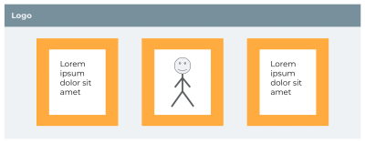
Let’s say we have a layout with three cards arranged horizontally in a container.

The CSS sets max-width: 900px on the container, and each card gets a little breathing room with padding: 5vw. This may look fine on the surface, but there’s a problem: the container has an upper bound while the padding doesn’t. As the screen gets wider, the content gets crushed.
See the Pen [Example of padding crushing content [forked]]( by Yaphi.
Possible solutions include:
- Using viewport or container breakpoints to keep the padding under control,
- Using the CSS
min()function to set an upper bound on the padding, or - Using fixed units, such as pixels, that won’t grow indefinitely with the window.
What these solutions have in common is that they account for what happens when the viewport width changes. Similarly, we can avoid many CSS problems by considering the layout as output and anticipating what could happen when the inputs change.
Ahmad Shadeed has a great name for this technique: Defensive CSS. The idea is that we can “future-proof” styles by thinking about them as inputs that output a UI and anticipating situations that would diminish the output’s usability.
Conclusion
Coding a layout isn’t about laying things out on a page but describing how they respond to change. For that reason, it’s risky to treat CSS like constants rather than functions.
Fortunately, the same ideas that help us write good functions can help us write good CSS, namely:
- Avoid unwanted side effects.
- Use the right parameters.
- Consider how inputs change outputs.
What ties these ideas together is a question I hope you’ll ask yourself the next time you write CSS, How should this layout respond to change?
Further Reading On SmashingMag
(gg, yk, il)
#Write #CSS #Borrowing #Ideas #JavaScript #Functions #Smashing #Magazine


