Maybe 2025 has already started as you’re reading this, maybe you’re still waiting for the…
What Leonardo Da Vinci Can Teach Us About Web Design — TechRuum
Exhaustive, sometimes bizarre notes… wireframes… mind-bending blends of art and science. Is it a GitHub repository? No, it’s the life of a Renaissance genius. With the right lessons, we can all write some da Vinci code.
Web development is a pretty big tent. It encompasses color, mathematics, accessibility, typography, photography, copywriting, ethics, and the list goes on and on. The web is a near-infinite world which — for all its relentless innovation and disruption — inherits many of its most beautiful qualities from old ways.
It is in that spirit that we’ll be looking at the Italian polymath Leonardo da Vinci, the latest in a rather eclectic lineup of old maestros I’ve had the pleasure of writing about:
Perhaps more than any other person in history, da Vinci showed the kind of magic that can happen in the overlap between art and science, where much of web development lives. His methods and outlooks are as applicable today as they were in Renaissance Italy.
Document Your Thoughts, Ideas, And Work
Da Vinci was a fastidious writer, producing tens of thousands of pages of notes and sketches during his life. Their content ranged from mundane to genius, and that was part of their value. One day it’s a shopping list, another it’s flying machines. There was no filter, no preciousness, only expression and exploration.
This exhaustive documentation was valuable for a number of reasons. They were of benefit to him as an outlet for his thoughts, ambitions, and experiences and as points of reference for long-term projects. Getting his thoughts down allowed them to be tested and iterated on.
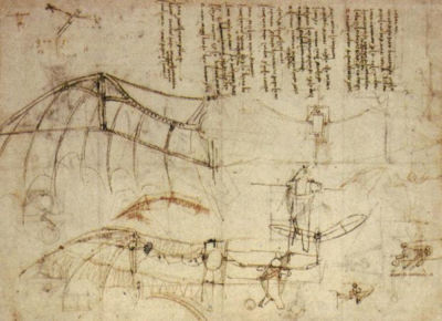
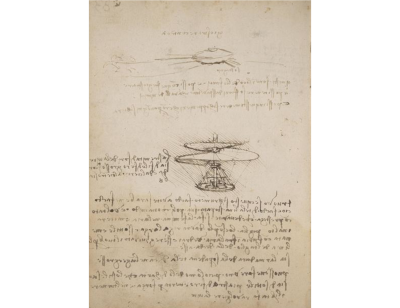
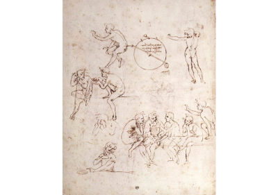
The benefits of such extensive documentation were not limited to da Vinci himself. Writing his ideas down also allowed them to survive him for the benefit of countless millions since. Centuries on his notebooks continue to surprise, delight and educate.
Da Vinci’s zeal for writing and sketching lends itself to web development. First is the powerful — sometimes downright mysterious — creative freedom of jotting down what’s going on inside your head. Sometimes you start writing down idea A and suddenly find yourself at solution X.
Not everything we do has to be perfect. Anyone expecting to arrive directly at the final product is going to be disappointed or have a pretty shoddy final product. Writing and sketching give you the license to be playful, maybe even a little bit audacious. Many timeless ideas are born on notebook paper.
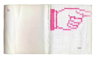
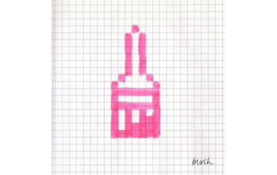
There is a sense sometimes that the code we write is akin to sand sculptures — pretty but temporary. This doesn’t have to be the case. Even if the final form of websites continues to change, the thinking behind that evolution is invaluable. How did we get here, and why?
Documenting your pull requests to survive when you’re dead may be a bit strong, but your successors at old jobs will be grateful for the insight and guidance.
Web devs and designers ought to document their own journey, be it through PR descriptions or an actual notebook of their own:
- Flesh out ideas,
- Jot down idle thoughts,
- Doodle page layouts.
May future generations be delighted and awed by your pull request descriptions. May the feature ideas in your GitHub issues be as aspirational as da Vinci’s flying machines.
The best ideas in the world are of no practical use for as long as they’re stuck in one’s head.
More after jump! Continue reading below ↓
Obsess Over Geometry
As most famously demonstrated by the Vitruvian Man, da Vinci was a lifelong student of geometry, shape, and proportion. He was fascinated by the recurrence of various shapes in nature, as well as by the workings of proportion and perspective. He understood their value to paintings and architecture alike.
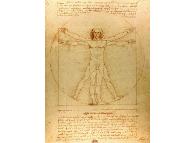
As his sketches show, da Vinci strove to build his art on sound foundations. Eyeballing a scene wouldn’t cut it. If grids of hundreds of lines were necessary to craft a true-to-life scene — grids that wouldn’t appear in the finished product — then so be it. He recognized that what we see is only half the story, and that’s if we’re being generous.
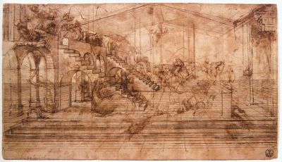
Da Vinci took great pains to understand these invisible frameworks and replicate them in his work. Although he is more often remembered for his fine art, everything he did was underpinned by a fascination with science and mathematics.
These are essential tools for any web developer. Pages look similarly off-kilter if they are not assembled around invisible guidelines. Grids are the most common example of this, but areas like typography and responsive design are similarly rooted in questions of size, proportion, ratio, and shape.
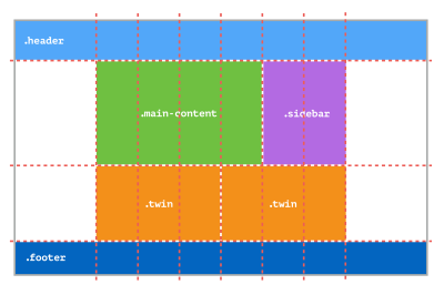
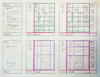
Showing a da Vinci-like interest in the rules behind these subjects is the difference between a website being pleasing to the eye and being a complete disaster. If you’re unsure where to start, then it’s safe to say Smashing has you covered:
From nature to painting to architecture to web design, applied geometry can create a sense of the sublime.
Think Right-To-Left
In his notebooks, da Vinci typically wrote right to left in ‘mirror script’. He only wrote the ‘normal’ way when he intended it to be read by other people.
Why did he write that way? He was left-handed and wasn’t classically schooled. It prevented him from smudging the ink. It made his ideas harder to steal. Whatever the combination, it’s clearly what he felt most comfortable with.

Da Vinci’s mirror script shows the value of embracing ways of working that suit you. Da Vinci didn’t have to justify his methods to anyone else. And neither do you.
Trust what feels natural and customize the way you work to fit. Personalize your IDE, choose fonts and colors that you like, and write and draw however comes naturally — be that with a tablet or in a leatherbound journal.
Norms being what they are doesn’t necessarily mean that’s how they should be. You will feel better about yourself, and who knows, maybe making space for your methods will allow unexpected ideas to appear.
Find Good Patrons (Or Failing That, Good Employers)
Da Vinci was picky about the work he did and the patrons he found. He lived in places that gave space to his flamboyance and creativity. Florence valued the arts, so it valued da Vinci as well as peers like Michelangelo.
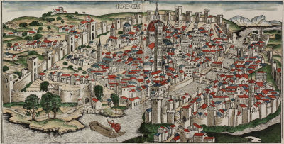
When he moved to Milan, he delighted the courts with his theatrics, eloquence, and stagecraft. On the other end of the spectrum, da Vinci also spent a couple of years in the service of Cesare Borgia, a man so conniving, violent, and altogether horrible that he was a major inspiration for Machiavelli’s book The Prince. Still, it gave him the opportunity to apply himself in new areas like mapping.
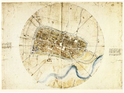
Time inside the belly of the beast can be educational in its own way. However, it’s telling that da Vinci only spent a few years in Borgia’s service before slipping back into the less murderous company.
Although patrons are all well and good, we, in the world of web development, usually have to settle for employers. We owe it to ourselves — if at all possible — to find spaces for our creativity, to find outlets for our passions, or at the very least, not feel like a cog in some colossal evil machine.
Have enough pride in your work to channel it into projects you care about. Even da Vinci needed a good working culture. Find your Florence, and if you can’t, do what you can to make where you are a little more like it.
Iterate, Iterate, Iterate
It may be of some comfort to know that Leonardo da Vinci was, at times, a breathtaking procrastinator. He would take years to complete works, and that’s if he finished them at all.
Da Vinci worked on many of his paintings for years, including the Mona Lisa, which he took with him on his travels until the day he died.
Da Vinci’s creations were the result of countless experiments, tangents, and iterations. The final products are what looms large in the public consciousness today, but each was but the final step of long, often difficult journeys.
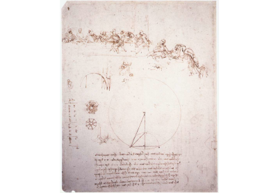
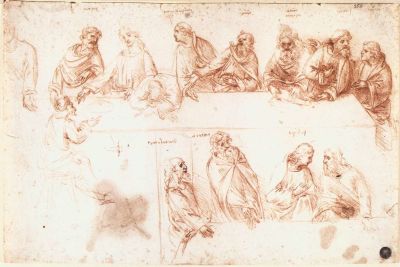
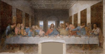
One particularly pertinent example of this process in action is Leonardo’s Horse, an equestrian monument da Vinci was commissioned to design and build in 1482 by the Duke of Milan Ludovico il Moro. A decades-long frenzy of research ensued, ranging from horse anatomy to concocting entirely new bronze casting techniques.
The project was not completed in da Vinci’s lifetime, but his work made it possible for the effort to be renewed when his extensive notes resurfaced in the 20th century. In 1999, a cool 517 years after he was commissioned, da Vinci’s horse was finally unveiled in Milan.
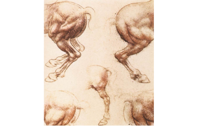
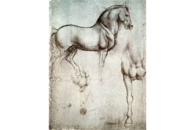
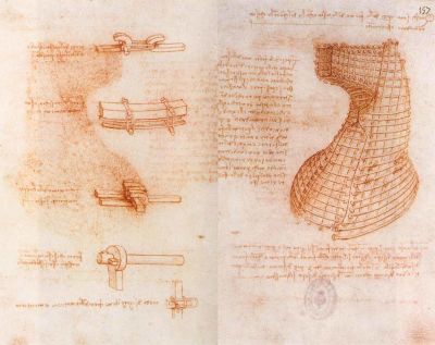

For all his brilliance, da Vinci was also an exemplar of the power of slow, steady progress — even procrastination. Yes, sometimes inspiration strikes, but more often, we find it at the end of a long, laborious journey. As Steven Pressfield puts it in The War of Art, “The Muse favors working stiffs.”
In the world of web design, the idea of something being ‘finished’ is pretty quaint. There will always be dependencies to update, tweaks to make, and new devices to accommodate. This is a good thing. It is true to nature. It’s exciting. In how many fields can one rebuild something they’ve made? Architects don’t have that luxury. Even painters can only change so much before they have to start again.
The ethereal nature of the web and its technologies lends itself to a da Vinci-esque approach to iteration. Build it, then build it again better. And again. And again.
Do not get too attached to what it is now. It is valuable, yes, but ultimately a stepping stone to what is to come. It is not about throwing away your work but evolving it.
Seldom is a work truly finished. There are always more perfections to be made.
“Art is never finished, only abandoned.”
— Leonardo da Vinci
Feed Your Inner Polymath
Leonardo da Vinci was too multifaceted to be tied down with one label. He was a writer, painter, sculptor, architect, inventor, scientist, philosopher, and the list goes on and on.
“He who loves practice without theory is like the sailor who boards a ship without a rudder and compass and never knows where he may cast.”
— Leonardo da Vinci
His knowledge of each field improved his proficiency in others. Anatomical studies led to more realistic illustrations. His studies of light helped him to create more lifelike paintings.

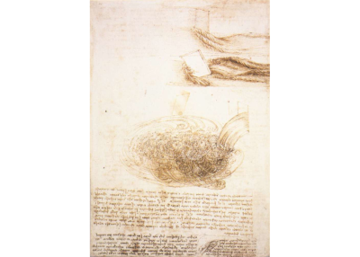
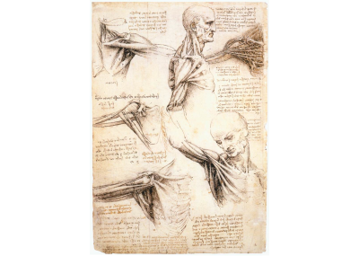
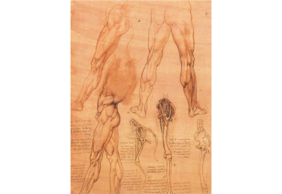
This, in part, stemmed from his atypical education. By avoiding the classical syllabus, he was able to explore on his own terms, blurring the lines between different subjects. His understanding of the world was fluid and holistic.

Web developers operate within a similarly vast and beautiful constellation of interconnected disciplines. The really good stuff happens when we tie them together.
“Technology alone is not enough — it’s technology married with liberal arts, married with the humanities, that yields us the results that make our heart sing.”
— Steve Jobs
Play with new languages, old languages, frameworks, and libraries. Browse TechRuum categories that you’re a novice in. Go down those rabbit holes. Pull on those threads. As da Vinci said of art, so too is true of the web: it can never be finished, only abandoned.
Further Reading
(yk, il)
#Leonardo #Vinci #Teach #Web #Design #Smashing #Magazine


