The most reliable way to meet user needs is through extensive usability research. However, scaling…
The View Transitions API And Delightful UI Animations (Part 1) — TechRuum
Animations are an essential part of a website. They can draw attention, guide users on their journey, provide satisfying and meaningful feedback to interaction, add character and flair to make the website stand out, and so much more!
On top of that, CSS has provided us with transitions and keyframe-based animations since at least 2009. Not only that, the Web Animations API and JavaScript-based animation libraries, such as the popular GSAP, are widely used for building very complex and elaborate animations.
With all these avenues for making things move on the web, you might wonder where the View Transitions API fits in in all this. Consider the following example of a simple task list with three columns.
This is a complex state-based animation, and it is exactly the sort of thing that the View Transitions API is designed to handle. Without it, we would need both the old state (i.e., the outgoing image) and the new state (i.e., the incoming image) to be present in the DOM. This is where complexity kicks in. It can be very difficult to handle and maintain states in the DOM and is not necessarily made much easier with other web APIs and/or a JavaScript animation library.
And if things weren’t daunting enough, keep in mind that JavaScript is the most expensive resource on the web and our transition would depend on whichever JavaScript animation library that we choose, which needs to load and parse before it executes. In other words, a transition like this could be very costly in build, accessibility, maintenance, and performance. You wouldn’t be blamed for questioning whether the cost of having the animation is worth the return.
But what if we could leave the extra baggage of dependencies at the door and rely on vanilla JavaScript and CSS? We could let the optimized browser API do all the heavy lifting while maintaining complete control over how transitions behave between states. That’s the value of the View Transitions API and why we need it. It trivializes the types of popular effects that currently require additional overhead.
It might sound simple, but that’s already a lot of heavy lifting that we don’t have to worry about anymore! All we have to do is take care of DOM updates and animation styles. The API also allows us to tap into those individual states and more and gives us full control over the animation using the CSS animation shorthand properties and its individual constituent properties.
Browser Support And Standards Status
In this article, we’re going to take a deep dive into the View Transitions API and explore its potential by building three fun and exciting real-life examples from scratch.
But before we get there, it’s certainly worth restating that the View Transitions API specification is in Candidate Recommendation Snapshot status. That means the CSS Working Group has published the working draft, the W3C has given it a “wide review,” and it is intended to become a formal W3C Recommendation. Until that happens, the specification will remain a Candidate Recommendation and is in a feedback period (that was scheduled to conclude on December 5, 2023).
So, the View Transitions API is not quite ready for prime time and should be used experimentally at the time of this writing. The latest versions of Chrome, Edge, Opera, and Android Browser currently support the API. Safari has taken a positive position on it, and there’s an open ticket for Firefox adoption. We have to wait for these last two browsers to formally support the API before using it in a production environment.
While we’re on the topic of the View Transition API’s specification and status, I’ll also note that the feature was initially called the “Shared Element Transitions API” before it was known as the View Transitions API. You will still see the old name pop up, particularly articles published in 2021 and 2022 that have not been updated.
Example 1: Crossfade UI State Changes
Let’s start with a relatively simple yet fun example involving a grid of card components. The idea is that clicking on a card’s image expands the image in a sort of lightbox or modal fashion without leaving the current page.
Let’s start with the following markup:
<aside class="overlay">
  <div class="overlay__inner"></div>
</aside>

<main>
  <figure>
    <div>
      <img class="gallery__image" src=" alt="Vast, still lake on a sunny day." />
    </div>
    <figcaption>Peyto Lake, Canada</figcaption>
  </figure>

  <!-- etc. -->
</main>
You can get the full markup, styles, and scripts from the following CodePen. The basic idea is that we have a <main> element that serves as a grid container that contains a series of <figure> elements that are styled as card components.
See the Pen [Image gallery v2 – 1 – starting markup [forked]]( by Adrian Bece.
Let’s take a closer look at JavaScript:
const overlayWrapper = document.getElementById("js-overlay");
const overlayContent = document.getElementById("js-overlay-target");

function toggleImageView(index) {
  // Get the image element by ID.
  const image = document.getElementById(`js-gallery-image-${index}`);

  // Store image parent element.
  const imageParentElement = image.parentElement;

  // Move image node from grid to modal.
  moveImageToModal(image);

  // Create a click listener on the overlay for the active image element.
  overlayWrapper.onclick = function () {
    // Return the image to its parent element
    moveImageToGrid(imageParentElement);
  };
}

// Helper functions for moving the image around and toggling the overlay.
function moveImageToModal(image) {
  // Show the overlay
  overlayWrapper.classList.add("overlay--active");
  overlayContent.append(image);
}

function moveImageToGrid(imageParentElement) {
  imageParentElement.append(overlayContent.querySelector("img"));
  // Hide the overlay.
  overlayWrapper.classList.remove("overlay--active");
}
On card click, we are moving the image element from the grid markup into the overlay, leaving the container node empty. We are also setting the overlay onclick event — which moves the image back into its origin container — as well as toggling the visibility CSS class on the overlay element.
It’s important to note that we are moving the image element from the <figure> element that is contained in the <main> container into an <aside> element with a .js-overlay class that represents the lightbox’s overlay, or backdrop. So, we have the same DOM node in <main> and the <aside>.
Now that we have finished setting up the markup, basic styles, and JavaScript functionality, we are going to create our first state transition using the View Transitions API! We call document.startViewTransition and pass our callback function that updates the DOM by passing the image from <main> to the <aside>:
// Fallback
if (!document.startViewTransition) {
  doSomething(/*...*/);
  return;
}

// Use View Transitions API
document.startViewTransition(() => doSomething( /*...*/ ));
Let’s look at the toggleImageView function and implement the API. moveImageToModal and moveImageToGrid are the functions that update the DOM. All we have to do is pass them as a callback to the startViewTransition function!
function toggleImageView(index) {
  const image = document.getElementById(`js-gallery-image-${index}`);

  const imageParentElement = image.parentElement;

  if (!document.startViewTransition) {
    // Fallback if View Transitions API is not supported.
    moveImageToModal(image);
  } else {
    // Start transition with the View Transitions API.
    document.startViewTransition(() => moveImageToModal(image));
  }

  // Overlay click event handler setup.
  overlayWrapper.onclick = function () {
    // Fallback if View Transitions API is not supported.
    if (!document.startViewTransition) {
      moveImageToGrid(imageParentElement);
      return;
    }

    // Start transition with the View Transitions API.
    document.startViewTransition(() => moveImageToGrid(imageParentElement));
  };
}
Let’s take a look at our example with the View Transitions API included. Remember, this is only going to work in Chrome at the moment.
See the Pen [Image gallery v2 – 2 – view transitions API [forked]]( by Adrian Bece.
We got this neat little cross-fade animation right out of the box just by passing the DOM update functions as a callback to document.startViewTransition!
Naming A Transition Element In CSS
When we call the startViewTransition function, the API takes a screenshot of the old page state and performs the DOM update. When the update is complete, the new, live state is captured. It’s important to point out that what we see during the transition is generated by the CSS and not the actual DOM elements. That’s a smart way of avoiding potential accessibility and usability issues during the transition.
By default, View Transitions API will perform a cross-fade animation between the old (fade-out) and new (fade-in) states.
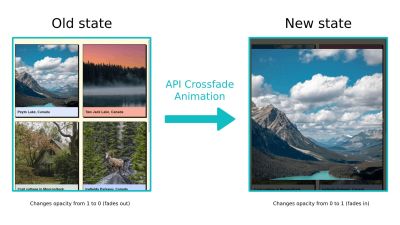
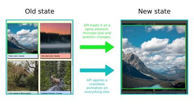
We’re merely crossfading between the two screen states, and that includes all elements within it (i.e., other images, cards, grid, and so on). The API is unaware that the image that is being moved from the container (old state) to the overlay (new state) is the same element.
We need to instruct the browser to pay special attention to the image element when switching between states. That way, we can create a special transition animation that is applied only to that element. The CSS view-transition-name property applies the name of the view transition we want to apply to the transitioning elements and instructs the browser to keep track of the transitioning element’s size and position while applying the transition.
We get to name the transition anything we want. Let’s go with active-image, which is going to be declared on a .gallery__image--active class that is a modifier of the class applied to images (.gallery-image) when the transition is in an active state:
.gallery__image--active {
  view-transition-name: active-image;
}
Note that view-transition-name has to be a unique identifier and applied to only a single rendered element during the animation. This is why we are applying the property to the active image element (.gallery__image--active). We can remove the class when the image overlay is closed, return the image to its original position, and be ready to apply the view transition to another image without worrying whether the view transition has already been applied to another element on the page.
So, we have an active class, .gallery__image--active, for images that receive the view transition. We need a method for applying that class to an image when the user clicks on that respective image. We can also wait for the animation to finish by storing the transition in a variable and calling await on the finished attribute to toggle off the class and clean up our work.
// Start the transition and save its instance in a variable
const transition = document.startViewTransition(() =>l /* ... */);
// Wait for the transition to finish.
await transition.finished;
/* Cleanup after transition has completed */
Let’s apply this to our example:
function toggleImageView(index) {
  const image = document.getElementById(`js-gallery-image-${index}`);

  // Apply a CSS class that contains the view-transition-name before the animation starts.
  image.classList.add("gallery__image--active");

  const imageParentElement = image.parentElement;

  if (!document.startViewTransition) {
    // Fallback if View Transitions API is not supported.
    moveImageToModal(image);
  } else {
    // Start transition with the View Transitions API.
    document.startViewTransition(() => moveImageToModal(image));
  }

  // This click handler function is now async.
  overlayWrapper.onclick = async function () {
    // Fallback if View Transitions API is not supported.
    if (!document.startViewTransition) {
      moveImageToGrid(imageParentElement);
      return;
    }

    // Start transition with the View Transitions API.
    const transition = document.startViewTransition(() => moveImageToGrid(imageParentElement));

    // Wait for the animation to complete.
    await transition.finished;

    // Remove the class that contains the page-transition-tag after the animation ends.
    image.classList.remove("gallery__image--active");
  };
}
Alternatively, we could have used JavaScript to toggle the CSS view-transition-name property on the element in the inline HMTL. However, I would recommend keeping everything in CSS as you might want to use media queries and feature queries to create fallbacks and manage it all in one place.
// Applies view-transition-name to the image
image.style.viewTransitionName = "active-image";

// Removes view-transition-name from the image
image.style.viewTransitionName = "none";
And that’s pretty much it! Let’s take a look at our example (in Chrome) with the transition element applied.
See the Pen [Image gallery v2 – 3 – transition element [forked]]( by Adrian Bece.
It looks much better, doesn’t it? With a few additional lines of CSS and JavaScript, we managed to create this complex transition between the two states that would otherwise take us hours to create.
Customizing Animation Duration And Easing In CSS
What we just looked at is what I would call the default experience for the View Transitions API. We can do so much more than a transition that crossfades between two states. Specifically, just as you might expect from something that resembles a CSS animation, we can configure a view transition’s duration and timing function.
In fact, the View Transitions API makes use of CSS animation properties, and we can use them to fully customize the transition’s behavior. The difference is what we declare them on. Remember, a view transition is not part of the DOM, so what is available for us to select in CSS if it isn’t there?
When we run the startViewTransition function, the API pauses rendering, captures the new state of the page, and constructs a pseudo-element tree:
::view-transition
└─ ::view-transition-group(root)
   └─ ::view-transition-image-pair(root)
      ├─ ::view-transition-old(root)
      └─ ::view-transition-new(root)
Each one is helpful for customizing different parts of the transition:
::view-transition: This is the root element, which you can consider the transition’sbodyelement. The difference is that this pseudo-element is contained in an overlay that sits on top of everything else on the top.::view-transition-group: This mirrors the size and position between the old and new states.::view-transition-image-pair: This is the only child of::view-transition-group, providing a container that isolates the blending work between the snapshots of the old and new transition states, which are direct children.::view-transition-old(...): A snapshot of the “old” transition state.::view-transition-new(...): A live representation of the new transition state.
Yes, there are quite a few moving parts! But the purpose of it is to give us tons of flexibility as far as selecting specific pieces of the transition.
So, remember when we applied view-transition-name: active-image to the .gallery__image--active class? Behind the scenes, the following pseudo-element tree is generated, and we can use the pseudo-elements to target either the active-image transition element or other elements on the page with the root value.
::view-transition
├─ ::view-transition-group(root)
│  └─ ::view-transition-image-pair(root)
│     ├─ ::view-transition-old(root)
│     └─ ::view-transition-new(root)
└─ ::view-transition-group(active-image)
   └─ ::view-transition-image-pair(active-image)
      ├─ ::view-transition-old(active-image)
      └─ ::view-transition-new(active-image)
In our example, we want to modify both the cross-fade (root) and transition element (active-image ) animations. We can use the universal selector (*) with the pseudo-element to change animation properties for all available transition elements and target pseudo-elements for specific animations using the page-transition-tag value.
/* Apply these styles only if API is supported */
@supports (view-transition-name: none) {
  /* Cross-fade animation */
  ::view-transition-image-pair(root) {
    animation-duration: 400ms;
    animation-timing-function: ease-in-out;
  }

  /* Image size and position animation */
  ::view-transition-group(active-image) {
    animation-timing-function: cubic-bezier(0.215, 0.61, 0.355, 1);
  }
}
See the Pen [Image gallery v2 – 4 – custom CSS [forked]]( by Adrian Bece.
Handling Unsupported Browsers
We’re already checking for support in the code we’ve written so far:
// etc.

// Move the image from the grid container to the overlay.
if (!document.startViewTransition) {
  // Fallback if View Transitions API is not supported.
  moveImageToModal(image);
} else {
  // Start transition with the View Transitions API.
  document.startViewTransition(() => moveImageToModal(image));
}

// Move the image back to the grid container.
overlayWrapper.onclick = async function () {
  // Fallback if View Transitions API is not supported.
  if (!document.startViewTransition) {
    moveImageToGrid(imageParentElement);
    return;
  }
}

// etc.
Let’s break that down and get a firm grasp on how it works. To start, all we have to do to detect feature support in JavaScript is check if the startViewTransition function exists in the document object:
// Fallback
if (!document.startViewTransition) {
  doSomething(/*...*/);
  return;
}

// Use View Transitions API (Arrow functions).
document.startViewTransition(() => doSomething(/*...*/));
Then, in CSS, we can use the @supports at-rule to conditionally apply styles based on whether the browser supports a certain feature. Typically, we apply styles when the feature is supported. That said, it’s also possible to apply styles when the feature is not supported.
@supports (view-transition-name: none) {
  /* View Transitions API is supported */
  /* Use the View Transitions API styles */
}

@supports not (view-transition-name: none) {
  /* View Transitions API is not supported */
  /* Use a simple CSS animation if possible */
}
At the same time, @supports is still a relatively new feature and might not be an ideal approach if you need feature detection in older version browsers that might not support it. In that case, we can conditionally apply the CSS class using JavaScript:
if("startViewTransition" in document) {
  document.documentElement.classList.add("view-transitions-api");
}
Now, we can style the transition in CSS on the condition of a .view-transitions-api added to the <html> element:
/* View Transitions API is supported */
html.view-transitions-api {}

/* View Transitions API is not supported */
html:not(.view-transitions-api) {}
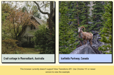
That means we can render something like this if the View Transitions API is unsupported:
Accessible Animations
Of course, any time we talk about movement on the web, we also ought to be mindful of users with motion sensitivities and ensure that we account for an experience that reduces motion.
That’s what the CSS prefers-reduced-motion query is designed for! With it, we can sniff out users who have enabled accessibility settings at the OS level that reduce motion and then reduce motion on our end of the work. The following example is a heavy-handed solution that nukes all animation in those instances, but it’s worth calling out that reduced motion does not always mean no motion. So, while this code will work, it may not be the best choice for your project, and your mileage may vary.
@media (prefers-reduced-motion) {
  ::view-transition-group(*),
  ::view-transition-old(*),
  ::view-transition-new(*) {
    animation: none !important;
  }
}
Final Demo
Here is the completed demo with fallbacks and prefers-reduced-motion snippet implemented. Feel free to play around with easings and timings and further customize the animations.
See the Pen [Image gallery v2 – completed [forked]]( by Adrian Bece.
Example 2: Using CSS Keyframes To Transition Elements
That first example was meant to help us understand the basics of the View Transitions API. What we looked at is considered a default transition — one that crossfades between two states. But we can produce more interesting transitions by defining our own CSS @keyframes and making use of animation properties to configure a custom animation.
Let’s create an interactive to-do list with three-column containers. We’ll use a similar approach as before and customize the animation to make the motion more natural. Specifically, the clicked to-do item will subtly scale up as it leaves the parent container, scale back down, and then slightly bounce when it moves to its target container. The remaining to-do list elements should also be animated smoothly to cover the empty space that the completed to-do item leaves behind.
We’ll start with the View Transitions API already implemented with a default crossfade animation. Check out the following CodePen for more details.
This is what we would get if we were to apply the default crossfade transition we made in the last example:
See the Pen [To-do list v2 – 1 – crossfade [forked]]( by Adrian Bece.
The crossfade is nice but not spectacular. It would be better if the transition was more informative as it’s pretty tough to follow the to-do item to its new container; it just sort of teleports from one container to another. The whole point of this example is that we will customize the transition with CSS animations.
We can use the same setup as the last example. The only difference with this example is that we have two possible containers for to-do items to transition to: “Done” and “Won’t Do.” That means we have one column that serves as the “source” container and two columns that serve as “destination” containers.
function moveCard(isDone) {
  const card = this.window.event.target.closest("li");

  // Get the target column id (done or wont do).
  const destination = document.getElementById(
    `js-list-${isDone ? "done" : "not-done"}`
  );

  // We'll use this class to hide the item controls.
  card.classList.add("card-moving");

  if (!document.startViewTransition) {
    destination.appendChild(card);
    return;
  }

  const transition = document.startViewTransition(() => {
    // Update DOM (move the clicked card).
    destination.appendChild(card);
  });
}
Notice how the View Transitions API freezes rendering, and we cannot interact with any other element on the page while the animation is running. This is an important limitation to keep in mind, so it’s best to avoid creating lengthy animations that might harm usability and even impact performance in the form of a slow Interaction to Next Paint (INP) Core Web Vital metric, depending on what is being blocked by the transition.
Creating Transition Elements
Let’s start by adding the CSS view-transition-name property values to the to-do items and setting up a basic animation that updates an item’s position. We’ll use two different sets of view-transition-name values for this example:
card-active: This is a to-do item that is currently being moved to another column. We’ll apply this right before the animation runs and remove it once the animation ends.card-${index + 1}: This is applied to the leftover to-do items once the completed item has transitioned to its new destination container. Each to-do item gets a unique index number to help sort their order and update positions to fill the empty space left behind by the completed to-do item.
Now, the to-do items no longer crossfade, but the browser does keep track of their positions and sizes and animates them accordingly.
// Assign unique `view-transition-name` values to all task cards.
const allCards = document.querySelectorAll(".col:not(.col-complete) li");
allCards.forEach(
  (c, index) => (c.style.viewTransitionName = `card-${index + 1}`)
);

// This function is now async.
async function moveCard(isDone) {
  const card = this.window.event.target.closest("li");

   // Apply card-active to a card that has been clicked on.
   card.style.viewTransitionName = "card-active";

  const destination = document.getElementById(
    `js-list-${isDone ? "done" : "not-done"}`
  );

  card.classList.add("card-moving");

  if (!document.startViewTransition) {
    destination.appendChild(card);
    return;
  }

  const transition = document.startViewTransition(() => {
    destination.appendChild(card);
  });

  // Wait for the animation to complete.
  await transition.finished;

  // Cleanup after the animation is done.
  card.style.viewTransitionName = "none";
}
And, just like that, we have a really nice animation set up for to-do items. Notice how all we’re really doing in the code is toggling view-transition-name values and telling the browser which elements to watch position and size for. That’s really all we need, and we get a pretty powerful transition out of it!
See the Pen [To-do list v2 – 2 – transition elements [forked]]( by Adrian Bece.
While this animation looks pretty good, it feels somewhat rigid at the same time. What gives? Sometimes, a view transition looks impressive right out of the box, like we saw in the first example using a default crossfade. Other times, though, the animation requires extra fine-tuning.
Applying CSS Keyframes
Let’s fix the rigidity of our current animation by defining our own CSS @keyframes that scale and bounce completed to-do items. We can take full advantage of CSS animation properties and create our custom keyframes to get a more appealing transition between states.
Let’s break down the animation sequence:
- The clicked to-do item should scale up — increase in size — like it’s being lifted out of its source container and then “fly” toward the destination container, where it bounces when touching the ground.
- Meanwhile, the leftover to-do items located below the newly completed item should wait a moment before moving their positions up in the list to account for the completed item’s leftover space.
- The leftover to-do items shift positions. The container should wait before shrinking to its new height so it doesn’t cut off other to-do items.
- The containers resize to their new heights instantly without a crossfade transition.
Let’s start with the delayed animation for the leftover to-do items and the container. Again, items in the “To Do” column are assigned unique view-transition-name values (e.g., card-1, card-2, and so on). We are able to select the entire group of them in CSS with the universal selector (*) on the ::view-transition-group pseudo-element rather than writing them out individually, then declare an animation-delay on them:
/* Delay remaining card movement */
::view-transition-group(*) {
  animation-timing-function: ease-in-out;
  animation-delay: 0.1s;
  animation-duration: 0.2s;
}
Next, we’ll do essentially the same thing for the source and destination containers. We want to delay their animations for a brief moment as the completed to-do item completes its transition. Referencing the DOM tree, we noted at the beginning of this article, we know that the ::view-transition-old and :view-transition-new pseudo-elements are available, and they happen to represent the source and destination containers, respectively.
We’ll target those states at the transition’s root level:
/* Delay container shrinking (shrink after cards have moved) */
::view-transition-old(root),
::view-transition-new(root) {
  animation-delay: 0.2s;
  animation-duration: 0s; /* Skip the cross-fade animation, resize instantly */
}
Let’s customize the animation that is triggered when a to-do item is clicked. First, we’ll adjust the clicked item’s animation-duration by selecting it with the ::view-transition-group pseudo-element scoped to the active item, which we had earlier named card-active:
/* Adjust movement animation duration */
::view-transition-group(card-active) {
  animation-duration: 0.4s;
  animation-delay: 0s;
}
Lastly, we’ll create a custom @keyframes animation in the CSS and apply it to the ::view-transition-image-pair wrapper for the old and new states.
/* Apply custom keyframe animation to old and new state */
::view-transition-image-pair(card-active) {
  /* Bounce effect is achieved with custom cubic-bezier function */
  animation: popIn 0.5s cubic-bezier(0.7, 2.2, 0.5, 2.2);
}

/* Animation keyframes */
@keyframes popIn {
  0% {
    transform: scale(1);
  }
  40% {
    transform: scale(1.2);
  }
  50% {
    transform: scale(1.2);
  }
  100% {
    transform: scale(1);
  }
}
With just a few tweaks in our CSS, we’ve created a customized, delightful, and whimsical animation to make our to-do example really pop.
See the Pen [To-do list v2 – jumping & bouncing animation – completed [forked]]( by Adrian Bece.
Example 3: Running Multiple Transitions
The previous two examples demonstrate view transitions that run a single animation on a single element. Let’s increase the complexity and see just how powerful the View Transitions API can be. In this third example, we’ll create two animations that run one in sequence. Specifically, we’re going to apply a view transition on a common interaction on e-commerce sites: the user adding an item to the cart.
First, the click event will activate a dot that moves to the cart icon in the page header. Then, the displayed number of items in the cart will animate to its updated value.
As in the previous examples, we’ll start with a basic setup for the default crossfade transition. This time, we’re working with a grid of product cards that each contain a button that, when clicked, reveals a “dot” in the same shape as the button that transitions from the product card to a shopping cart. That shopping cart is an icon located in the top-right corner of the page and includes a counter that increments when items are added (or removed) from the cart.
let counter = 0;
const counterElement = document.getElementById("js-shopping-bag-counter");

async function addToCart(index) {
  const dot = createCartDot();
  const parent = this.window.event.target.closest("button");

  parent.append(dot);

  const moveTransition = document.startViewTransition(() =>
    moveDotToTarget(dot)
  );

  await moveTransition.finished;

  dot.remove();

  if (!document.startViewTransition) {
    incrementCounter();
    return;
  }

  const counterTransition = document.startViewTransition(() =>
    incrementCounter(counterElement)
  );
}

function moveDotToTarget(dot) {
  const target = document.getElementById("js-shopping-bag-target");
  target.append(dot);
}

function incrementCounter() {
  counter += 1;
  counterElement.innerText = counter;
}

function createCartDot() {
  const dot = document.createElement("div");
  dot.classList.add("product__dot");

  return dot;
}
Creating Composed Animations
First, we need to toggle a view-transition-transition value for the dot and cart elements in their respective transition animations. We’re using await transition.finished to delay the counter increment animation until the dot has finished its journey to the cart. We are registering two new view transition names in the process, cart-dot and cart-counter:
async function addToCart(index) {
  /* ... */

  const moveTransition = document.startViewTransition(() =>
    moveDotToTarget(dot)
  );

  await moveTransition.finished;
  dot.remove();

  dot.style.viewTransitionName = "none";
  counterElement.style.viewTransitionName = "cart-counter";

  if (!document.startViewTransition) {
    incrementCounter();
    return;
  }

  const counterTransition = document.startViewTransition(() =>
    incrementCounter(counterElement)
  );

  await counterTransition.finished;
  counterElement.style.viewTransitionName = "none";
}

/* ... */

function createCartDot() {
  const dot = document.createElement("div");
  dot.classList.add("product__dot");
  dot.style.viewTransitionName = "cart-dot";
  return dot;
}
Now, we have what we need to jump back into CSS and customize both animations. Let’s define two @keyframes animations; one called toDown and another fromUp that pretty much do what it says on the tin:
/* Counter fade out and moving down */
@keyframes toDown {
  from {
    transform: translateY(0);
    opacity: 1;
  }
  to {
    transform: translateY(4px);
    opacity: 0;
  }
}

/* Counter fade in and coming from top */
@keyframes fromUp {
  from {
    transform: translateY(-3px);
    opacity: 0;
  }
  to {
    transform: translateY(0);
    opacity: 1;
  }
}
For the dot animation, we’ll change its animation-duration and animation-timing-function, and for the counter, we’ll add a slight vertical movement to a standard crossfade animation.
@supports (view-transition-name: none) {
  ::view-transition-group(cart-dot) {
    animation-duration: 0.6s;
    animation-timing-function: ease-in;
  }

  ::view-transition-old(cart-counter) {
    animation: toDown 0.15s cubic-bezier(0.4, 0, 1, 1) both;
  }

  ::view-transition-new(cart-counter) {
    animation: fromUp 0.15s cubic-bezier(0, 0, 0.2, 1) 0.15s both;
  }
}
A couple of things worth noting in this setup. First, we’re wrapping the animation rulesets in @supports to ensure they are only applied if the user’s browser supports the View Transitions API. If the browser does not support the basic view-transition-name property, then we can safely assume there’s no support for view transitions at all.
Next, notice that there are no animations on the counter-dot element, nor are there CSS properties applied to it that would change its dimensions. That’s because the dot’s dimensions respond to its parent container. In other words, the dot’s initial position is in the product cart’s button container before it moves to the smaller shopping cart container.
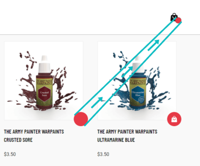
This is a perfect example of how the View Transitions API tracks an element’s position and dimensions during animation and transitions between the old and new snapshots right out of the box!
See the Pen [Add to cart animation v2 – completed [forked]]( by Adrian Bece.
Conclusion
It amazes me every time how the View Transitions API turns expensive-looking animations into somewhat trivial tasks with only a few lines of code. When done correctly, animations can breathe life into any project and offer a more delightful and memorable user experience.
That all being said, we still need to be careful how we use and implement animations. For starters, we’re still talking about a feature that is supported only in Chrome at the time of this writing. But with Safari’s positive stance on it and an open ticket to implement it in Firefox, there’s plenty of hope that we’ll get broader support — we just don’t know when.
Also, the View Transitions API may be “easy,” but it does not save us from ourselves. Think of things like slow or repetitive animations, needlessly complex animations, serving animations to those who prefer reduced motion, among other poor practices. Adhering to animation best practices has never been more important. The goal is to ensure that we’re using view transitions in ways that add delight and are inclusive rather than slapping them everywhere for the sake of showing off.
In another article to follow this one, we’ll use View Transitions API to create full-page transitions in our single-page and multi-page applications — you know, the sort of transitions we see when navigating between two views in a native mobile app. Now, we have those readily available for the web, too!
Until then, go build something awesome… and use it to experiment with the View Transitions API!
References
(gg, yk)
#View #Transitions #API #Delightful #Animations #Part #Smashing #Magazine

