The goal of content design is to reduce confusion and improve clarity. Yet often it’s…
The Big Difference Between Digital Product And Web Design — TechRuum
In the early days of the web, I remember how annoying it was when print designers would claim they could design websites, too. They assumed that just because they could design for one medium, they could design for the other.
That assumption often led to bad user experiences. The skills for effective web design are quite different from those for print design.
A similar thing happens today. Designers know how to design traditional marketing and e-commerce sites. They, therefore, presume they have the skills to work on SaaS apps and other digital projects.
But when it comes to design, there’s a big distinction between traditional websites and digital products. If we want to work on digital products, we need to understand those differences and adopt a different approach to our work.
People Interact with Digital Products More Regularly
The biggest difference is that users interact with digital products more than most websites.
Think about your own web use. What are the sites you visit most often? If you listed your top ten, well over half would be some form of digital product, from a social media application to a productivity tool.
So, with that in mind, let’s dive into the specifics of how the frequency of usage impacts our design approach and what we can do about it.
Why Frequency of Use Matters So Much
The more we interact with a web app or website, the more important the overall user experience becomes. Users develop deeper connections with digital products. They also form more complex mental models of products they use often. This changes how they see the app in two fundamental ways.
Friction Becomes Significantly More Irritating
First, friction points become increasingly annoying. Users interact with a digital product many times per day. Any small problem in the interface compounds quickly.
When you encounter a clunky UI or confusing workflow on a website you only visit once in a while, it’s frustrating but easy to overlook. But, when that same friction occurs in an app you use multiple times per day, it becomes a major source of irritation.
Change Undermines Our Procedural Knowledge
Second, the more we use an app, the more familiar we become with it and how it works. We end up using the app automatically, without even thinking, much like when you’ve been driving a car for years, you don’t think about the process. This is known as procedural knowledge.
This is great news for digital product designers, as it means we can create interfaces that become second nature to our users. But, if we break their mental models or introduce unexpected changes, we risk causing frustration and disruption.
So, knowing these two things, how does this affect our approach to digital product design? Well, let’s start by considering the problem of friction.
Fixing Friction Points
As digital product designers, we need to become obsessed with removing friction from the user experience. Failure to do so will alienate users over time and ultimately lead to churn.
To mitigate friction, we need to constantly seek out friction points. We need to diagnose the exact problem and then test any solution to ensure it does, in fact, make things better.
So, how exactly do we find friction points?
Finding Friction
The most obvious way is to listen to customers. User feedback is crucial in identifying friction points in the user experience. However, we can’t simply rely on that. Analytics can be your friend, too.
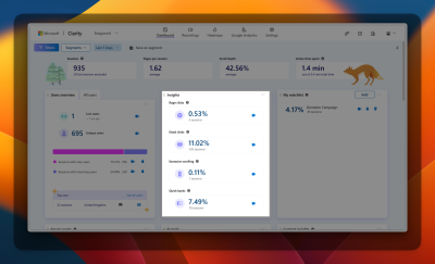
Microsoft Clarity offers essential insights to pinpoint issues on your app.
I would highly recommend using a tool like Microsoft Clarity. It gives detailed insights into user behavior. They help find points of friction. These include the following:
- Rage clicks: Where individuals continuously click on something due to frustration.
- Dead clicks: Where people click on something that is not clickable.
- Excessive scrolling: Where users scroll up and down looking for something.
- Quick backs: Where a person accidentally lands on a screen and promptly navigates back to the previous one.
- Error messages: Where the user is triggering an error in the system.
These will help you identify potential friction points that you can then investigate further.
Diagnosing Friction
Once you know where things are going wrong, you can use heat maps and session recordings in Clarity. They will help you understand the problem. Why are people excessively scrolling or rage-clicking, for example?
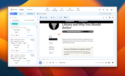
Session recordings are valuable for pinpointing particular problems in the interface.
If the heat maps or session recordings don’t make things clear, that is where you would need to consider usability testing.
Once you understand the problem, you can then begin exploring solutions and testing them rigorously to ensure they effectively reduce friction.
Testing Your Friction Busting Solutions
How you test your solution to the point of friction will depend on the size and complexity of the changes you need to make.
For small changes, such as tweaking the UI or changing some text, A/B testing is often the best approach. You show the new solution to a subset of your users and measure the impact on those indicators of frustration.
But A/B testing isn’t always the right approach. If your app has lower levels of traffic, getting results from a statistically significant A/B test can be time-consuming.
Also, when your solution involves big changes, like adding new features or redesigning many screens, A/B testing can be expensive. That is because you need to first fully develop the solution before you can test it, meaning that it can prove costly if that solution turns out not to work.
Your best approach in such situations is to create a prototype for remote testing.
Initially, I usually conduct unfacilitated testing with a tool such as Maze. Unfacilitated testing is easy to set up. It requires minimal time investment, and Maze offers analytics, so you don’t necessarily need to watch every session back.
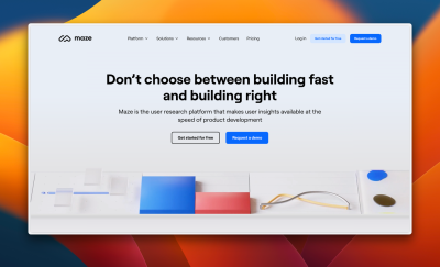
Maze serves as a valuable resource for conducting remote testing, offering both test data and recordings for each test.
If testing uncovers issues you can’t fix, then try facilitated testing. Facilitated testing enables you to delve into any arising issues by asking questions.
Once you have a solution that works, it’s time to roll that feature out. But you need to be careful at this point because of the procedural knowledge I mentioned earlier.
Dealing With the Dangers of Procedural Knowledge
Introducing fixes to a user interface has a good chance of breaking a user’s procedural knowledge. Interface elements are often moved and so are no longer where users expect to find them, or they look different, and so users miss them.
This can upset many existing customers. That can panic stakeholders and lead to rash decisions.
To some extent, you need to accept that this is inevitable and prepare stakeholders for this eventuality. Users will normally adapt in a couple of weeks of regular use, and so there is no immediate need to panic.
That said, there are things you can do to mitigate the reaction.
- To start with, you can let people know that change is coming. This allows people to mentally adapt to the change before it occurs.
- Secondly, if the change is significant, you may wish to give people the ability to opt out of it, at least in the short term. That is why some apps roll out features in beta and give users the option to opt in or out. This provides a sense of control that reduces people’s reactions.
- Finally, you can also provide guidance within the user interface itself. Tooltips and overlays can show users where features have been moved so new interface elements can be highlighted.
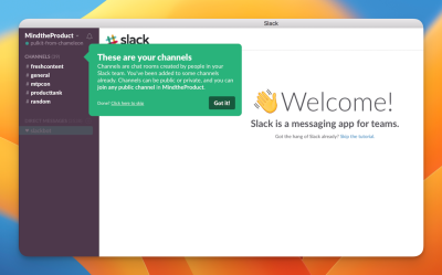
Slack use tooltips to explain how their interface works.
The key is to strike a balance. You must add needed improvements while causing minimal disruption to users’ workflows. You will also need to carefully monitor adoption and adapt accordingly.
Change The Way We Work
That constant monitoring and adaptation lies at the heart of digital product design. You cannot rely solely on the initial solution but must be prepared to continuously refine and iterate as user behavior and needs evolve.
(yk)
#Big #Difference #Digital #Product #Web #Design #Smashing #Magazine

