The Wizard of Oz method is a proven UX research tool that simulates real interactions…

Optimizing The Image Element LCP — TechRuum
Largest Contentful Paint (or LCP) is one of three metrics of the Core Web Vitals. These metrics are used by Google to evaluate the quality of user experience. LCP measures the time it takes for the browser to load the main content in the viewport.
Since recently becoming a ranking factor, this major web performance KPI is still a new concept for many web developers. It becomes especially tricky to optimize when the LCP element is an image.
To address this problem, I’ll provide an overview of the best practices for the integration and optimization of an LCP image. I’ll cover the following:
- How to improve the LCP Resource load time subpart with the help of the
<img>tag and a focus on proper LCP image sizing. - Some explanations on the browsers’ behavior for this
<img>tag and its attributes, so you can really understand and integrate your LCP image correctly. - How to improve LCP Resource load delay subpart.
All the explanations will be illustrated by an example that we will iterate on. The images used in the article’s Codepen demonstrations will be integrated with TwicPics to save time in their creation and speed up the optimization of the LCP metric.
Note: The other LCP subparts are “Time to first Byte” and “Element render delay,” which will not be covered here. Read this “Optimize Largest Contentful Paint” article by Philip Walton and Barry Pollard to learn more about the four LCP subparts and their relation to each other.
If you want to find out how to identify the LCP element on your web pages, check out this guide by Laurent Cazanove.
More after jump! Continue reading below ↓
Improve LCP Resource Load Time With The Help Of The <img> Tag
The goal here is to decrease the loading time of your LCP image as much as possible without compromising its visual quality. To succeed in this operation, one of the key points is to let the browser choose the best-suited version of the image.
Instead of declaring a single image file via the src attribute — whose dimensions would be identical for all users across any devices — we need to let the browser choose the image file best suited to each context. This approach allows images with smaller dimensions to be downloaded for users on smaller devices. This way, the image loads faster, and your website will get a better LCP score.

To do this, we need to give the browser the information it needs using the <img> tag and its srcset and sizes attributes:
- The
srcsetattribute points the browser to a list of image files, with a description of their intrinsic width. - The
sizesattribute tells the browser the intended display width of the image. It can be combined with CSS media queries to select the appropriate image for the width of the screen.
Note: The <picture> tag could be used instead of <img> to allow the browser to load different images depending on device characteristics, such as the width of the viewport or image format compatibility. For simplicity, we will only use the <img> tag in our examples.
The srcset Attribute Of The <img> Tag
The srcset attribute of the <img> tag indicates a list of image files and their intrinsic width. The browser uses this list to choose the image that it thinks is best suited to the users’ context.
This makes the srcset attribute the first step towards optimizing your LCP image.
<img srcset="" src="" alt="" />
To declare this list of images, it is recommended to follow a mobile-first approach. That means first declaring the smallest image as the default option with the src attribute and then declaring it again within the srcset attribute, followed by the larger dimension variants.

The intrinsic width of each image, expressed in pixels, should also be indicated using the unit w (w for “width”):
<img
  src="
  srcset="
     300w,
     900w,
     1800w"
  alt="Image description"
/>
Our example above defines three images (image-300.png, image-900.png, and image-1800.png) separated by a comma, with respective intrinsic widths of 300, 900, and 1800 pixels. To respect the mobile-first approach, image-300.png is the default image here, defined in the src and srcset attributes.
Note: When using the srcset attribute, it is important to keep the src attribute, so the browser knows which is the default image and to ensure that it is displayed on browsers that do not support the srcset attribute.
Note: It is also possible to use the srcset attribute by declaring the Device Pixel Ratio (DPR) of images rather than their intrinsic width; however, this approach will not be discussed here.
Knowing the user’s context, the browser can now choose the image to load from the list declared in the srcset attribute.

However, in order to avoid unexpected results, we need to understand how the browser selects the best-suited image:
- Within the
srcsetattribute, the browser always chooses the image according to the viewport size; it ignores the image display dimensions. Consequently, your CSS styles and media queries have no impact on its choice. You will also have to keep in mind the landscape orientation of mobiles and tablets when defining the list of images. - By default (without the
sizeattribute being specified), the browser chooses the image, assuming it is intended to occupy 100% of the viewport width. - As the browser knows the resolution of the devices, it also adjusts for the Device Pixel Ratio (DPR) in its calculations. Therefore, to optimize the LCP image, it will also be necessary to define a variant for each DPR.
Based on these behaviors, the default formula applied by the browser to choose the image according to the viewport width is:
viewportWidth x 100% x DPR
Note: When no image in the list matches the calculation, the browser will choose the closest match. In case of a tie, the browser selects the larger image.
Let’s illustrate the browser’s behavior with an example using our previous code:
<img
  src="
  srcset="
     300w,
     900w,
     1800w"
  alt="Image description"
/>
👉 See live: Codepen demo 1.
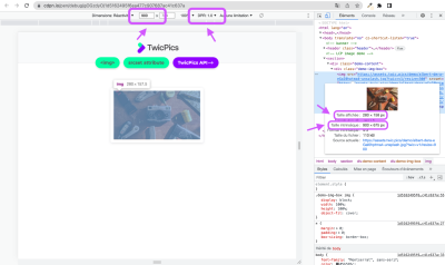
Note: In your browser development tools, open the Network > Img tabs to see the image chosen by the browser according to each viewport and DPR.
The image in this demo is displayed at a fixed width of 280px on all devices. But on a 900px wide screen with DPR 1, the browser will search the srcset attribute image list for an image that is:
900px (viewport width) x 100% (viewport width occupied by the image by default) x 1 (DPR)
In this case, the browser is looking for an image 900px wide.
In our example, while the display width of the image is 280px, the image with the intrinsic width of 900px will be loaded anyway.

We can see from this example that the images declared within our srcset attribute are not adapted to the display width of 280px on all devices.
While the browser applies the formula viewportWidth x 100% x DPR to pick the image to load, we can use a simpler formula to generate the different images declared in the srcset attribute:
imageRenderedSize x DPR
Taking into account DPRs 1, 2, and 3 on our first demo, we would need to create and define the following three images:
- DPR 1:
280 x 1=> an image280 pixelswide; - DPR 2:
280 x 2=> an image560 pixelswide; - DPR 3:
280 x 3=> an image840 pixelswide.
And finally, update our code :
<img
  src="
srcset="
     280w,
     560w,
     840w"
  alt="Image description"
/>
👉 See live: Codepen demo 2.
Still, the updated code is not fully optimized for all devices yet.
In fact, for a laptop device with a viewport of 1024px and DPR 2, the optimal image should be an intrinsic width of 560px (imageRenderedSize x DPR= 280 x 2= 560). But with this code, the browser will want to load an image of 1024 x 100% x 2, i.e., an image of 2048px, which does not exist in the srcset attribute.
Let’s see how the sizes attribute can help us solve this issue.
The sizes Attribute Of The <img> Tag
The sizes attribute gives developers additional control over the browser’s behavior, preventing the browser from assuming images occupy 100% of the viewport. This helps to ensure the optimal image will be loaded and, consequently, optimize your LCP metric.
<img srcset="" sizes="" src="" alt="" />
Note: The sizes attribute is therefore not necessary when the image actually occupies 100% of the viewport.
To assign the value of the sizes attribute, we can use and combine the following approaches:
- Define the image width as a percentage of the viewport width, e.g.,
sizes="50vw", when the image is responsive (for example, when the CSSwidthproperty is defined as a percentage). - Define the width of the image in pixels, e.g.,
sizes="500px", when it has a fixed display width regardless of the users’ devices. - Use one or more media queries to allow the browser to make the best choice of an image according to different viewports, e.g.,
sizes="(min-width: 1024px) 800px, (min-width: 768px) 80vw, 100vw"(with100vwbeing the default when no media query is applied).
Let’s update our code example:
<img
  src="
  srcset="
     280w,
     480w,
     560w,
     840w,
     960w,
     1440w"
  sizes="(min-width: 768px) 480px, 87.5vw"
  alt="Image description"
/>
Note: To know the width of the viewport occupied by the image in percentage, apply the calculation formula (imageRenderedSize / viewportWidth) x 100, e.g., (280 / 320) x 100 = 87.5% of the viewport width (87.5vw).
👉 See live: Codepen demo 3.
Now with the source code of our third demo, and regardless of the DPR, the browser can load the perfect image:
- For a display width of
280pxfor a viewport of320px(87.5% of the viewport). - And for a display width of
480pxon all devices with a viewport of at least768px.
At this stage, if the integration of the LCP image has been correctly carried out thanks to the <img> tag and its srcset and sizes attributes, the optimization of LCP Resource load time should be optimal.
Note: We’ve mainly focused here on properly sizing the LCP image according to the users’ device. For the LCP score and its “Resource load time” subpart to be really optimal, you may also consider compressing your images using modern image formats, setting far-future cache expiry headers, or even using a CDN to reduce network distance.
Note: Even if your LCP image is well-optimized and well-integrated within the <img> tag, keep in mind that this would not be sufficient if your page contains render-blocking resources such as JavaScript files. Refer to this talk by Philip Walton to see how you can eliminate unnecessary element render delay.
Now let’s see how it is possible to further optimize the LCP score by reducing its loading time.
Improve LCP Resource Load Delay Subpart
In this section, we are going to complete the code example used earlier to see how to load the LCP image as soon as possible.
Don’t Lazy-load The LCP Image Element
When users browse the internet to visit a website, the LCP image’s loading is often delayed by the lazy loading technique, whether applied by native lazy loading or a JavaScript library. But it’s important to note that this loading delay is included in the calculation of the LCP time.
For instance, with a lazy-loading JavaScript library, the script must first be loaded in order to load the final image. This additional step contributes to a significant delay in loading the LCP resource.
In other words, lazy loading an LCP image penalizes the LCP score of the web page.
Similarly, progressive loading or Low-Quality Image Placeholder (or LQIP) is not considered for LCP by Google at the time of this writing. However, discussions are ongoing regarding LQIP, so the situation may change in the future.
Use Priority Hints
We have just seen that the LCP image must not be lazy-loaded. But how can we prioritize its loading?
To manage the resources of a page, the browser natively applies a loading order according to a priority defined, among other parameters, by the type of the resource.
Images have a lower priority than render-blocking resources. In addition to meaning the resource is fetched with a lower priority, it also means the fetch is actually delayed, as browsers deliberately delay “low” resources initially so that they can concentrate on more critical, often render-blocking, resources.
This means you need to change the browser’s default load order and its behavior towards hero images so that the LCP image is not delayed and can be loaded as soon as the HTML document is received.
It is the fetchpriority="high" attribute that allows us to modify this loading priority.
<img fetchpriority="high" src="" alt="">
Let’s update our code example. Simply add the attribute to the <img> tag, and the browser will automatically determine the right version of the image for prioritizing based on the sources declared in the srcset attribute:
<img fetchpriority="high"
  src="
  srcset="
     280w,
     480w,
     560w,
     840w,
     960w,
     1440w"
  sizes="(min-width: 768px) 480px, 87.5vw"
  alt="Image description"
/>
👉 See the final demo.
Note: The fetchpriority attribute also works on the <img> tag of the <picture> element. For now, it’s mainly compatible with Chromium but should be supported by Firefox in early 2023. However, note that you can still use the fetchpriority attribute without any downsides: the attribute will be simply ignored by browsers that do not support it.
As shown in our demo, the <img> tag and its src and srcset attributes are present in the initial HTML source code. This means there is no need to preload the LCP resource here, as the browser’s preload scanner can discover it.
Note: The preloading of responsive images is not supported by all browsers, as is the case for Safari: make sure not to use the href attribute on the <link> element so that non-supporting browsers don’t request a useless image. Read this article to learn more about this topic and see when you might need to preload your LCP resource.
In this last demo, not only can the browser now know the optimal image required for devices with a viewport of 320px and for devices with a viewport of at least 768px, but it can also prioritize its loading compared to other resources. As developers, all the points illustrated in this article should therefore help you improve the LCP score of your website.

Conclusion
In conclusion, here is a summary of the steps required to optimize the LCP image:
- Once the page template for your website has been defined, create and store all the images needed for each device and each DPR based on the
imageRenderedSize x DPRformula. To simplify this step, you can use the TwicPics API to generate multiple versions at different dimensions from the high-quality original image. - Use the
srcsetattribute of the<img>tag to include the list of images defined in step 1, following a mobile-first approach (remembering to put the default image within thesrcattribute). - Using the
sizesattribute of the<img>tag, combined with the media queries as needed, tell the browser the display width the image would occupy according to the different device contexts:- If the image is responsive, define its width as a percentage of the viewport width using the formula
(imageRenderedSize / viewportWidth) x 100. - If the image is fixed for a range of viewport widths, simply define its width in pixels.
- If the image is responsive, define its width as a percentage of the viewport width using the formula
- To further improve your LCP score, use priority hints with the attribute
fetchpriority="high"to prioritize the loading of the LCP image. And remember not to lazy load your LCP image resource!
Further Reading on SmashingMag
(vf, yk, il)
#Optimizing #Image #Element #LCP #Smashing #Magazine


