The goal of content design is to reduce confusion and improve clarity. Yet often it’s…
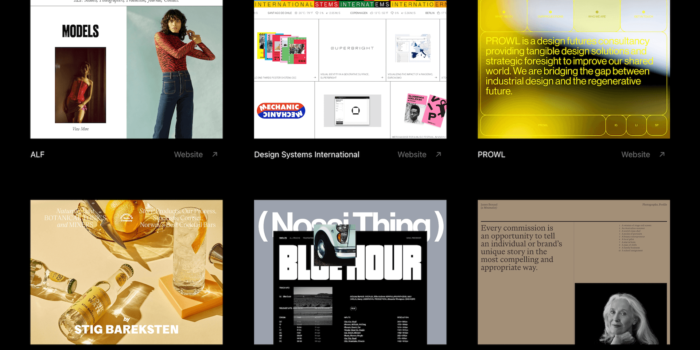
Inspiring Web Design And UX Showcases — TechRuum
Design inspiration! Where do you find interesting websites? Here’s a list of showcases that we frequently visit for inspiration.
No matter if you’re looking for effective, unpretentious designs, websites that have that extra bit of fun built-in, examples of good e-commerce UX, interaction scenarios, or if you want to leave your own comfort zone and dive deeper into designs that go beyond the Latin writing system, you’ll surely find something in this post to tickle your ideas. Happy browsing!
Table Of Contents
You can jump directly to the topic you’re interested in to find relevant showcases or browse the complete list. Enjoy!
Japanese Design
The web spans the entire globe, however, when we talk about web design, the examples usually revolve around the 26 characters of the Latin alphabet. Other writing systems are often not part of the discussion — with the effect that a lot of brilliant websites stay unnoticed for a lot of us. Time to change that. If you’re up for a journey through Japanese web design, Responsive Web Design JP is for you. The examples in the collection shine with a unique lightness and concentration on the essential, and, even if you don’t master Japanese, you can browse the showcase by technique.

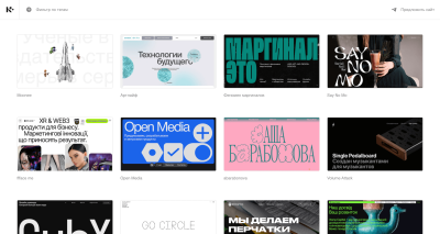
Cyrillic Design
Another site that grants us a look at web design beyond the Latin writing system is Cyrillic Design, dedicated to sites that use Cyrillic typefaces. Lots of beautiful designs can be discovered in there and it’s particularly interesting to see how type is used to make bold statements. A great reminder to look for inspiration outside our own comfort zones.
Design Made In Germany
Design Made In Germany compiles the best design work from German agencies and designers. Apart from covering website design, there are also collections featuring stellar pieces of brand design, print design, packaging, logos, posters, movies, typefaces, and illustrations.

Dark Mode Design
Dark Mode Design showcases beautifully designed websites that are either exclusively in dark mode or have the ability to switch. Wonderful examples that dark mode is not an add-on to a “regular” light design but a style with lots of creative possibilities.

Minimal Design
Dominic Whittle and Tom Fitzgerald, curators of Httpster, love good typography and effective, unpretentious design. More than ten years ago, they started emailing links of nice sites to each other but quickly realized that they needed a better system for sharing and tagging the things they get inspired by. That’s when Httpster was born.

Low-Carbon Websites
With big JavaScript libraries, large unoptimized images, and auto-playing videos, many incredible websites are heavier than they could be, creating a large, hidden carbon footprint. And then there are websites that prove that good design can also be achieved while keeping the carbon impact on the planet low. Lowwwcarbon features examples of sustainably built, low-impact websites. And if that’s not enough inspiration yet, Lowww is also dedicated to sustainable web design.

One Page Love
One Page Love showcases websites that get by with just one single page. The beauty of “one-pagers” lies in promoting one thing, straight to the point, without any clutter. Rob Hope founded One Page Love back in 2008 and continues to add one-page websites and resources daily. If you need some landing page inspiration or are looking for templates, this place has got you covered.

Fine Web And Interaction Design
Almost 8,000 sites that run the spectrum from fun and novel to clean and simple are waiting to be discovered on Siteinspire. Curated by Howells—Studio, you can browse them by style, type, or subject, or just see the very best.

Alternative Design
If you’re looking for extraordinary designs that experiment with interactivity and content in new and interesting ways, Hoverstat.es never ceases to inspire. The site describes itself as “the home of alternative design, code and content on the world wide web” and features everything from a portfolio with layered 3D preview to delightful little details like a slick looping scroller or menus that think outside the box.

Whimsical Design
“The web needs to take itself less seriously” is the message of The Whimsical Web. The site showcases websites that have that extra bit of fun that we often miss on the web these days. So if you’re up for some little surprises and weird details, Whimsical Design will leave you with a smile on your face and some new ideas.

Personal Sites
Your personal site needs an update? Personalsit.es has some new ideas in store for you. Built to share and revel in each others’ personal sites, the collection is jam-packed with inspiration — from simple and minimalistic to bold.

Site Of The Day
Every day, Awwwards awards the title “Site of the Day” to an outstanding website, rating its design, usability, creativity, and content and highlighting some of the details that make it outstanding, among them typography and color palette.

Website Roundups
In her Inspirational Website Roundups, Manoela Ilic presents websites with exceptional designs and interactions. Each edition is a surprise bag of the most beautifully designed and thoughtfully crafted websites.

UX In The Wild
Waveguide documents UX examples on different platforms and in different contexts, shining a light on remarkable interaction scenarios. From load-more pagination to QR code login, JJ. Ramirez, curator of Waveguide, explores every example in detail.

UI Patterns
From launch screens to error messages, from settings to radio buttons — no matter what kind of UI pattern you’re looking for, UI Garage features more than 6,700 patterns for web, mobile, and tablet, categorized and handpicked. Another great stop for some UI inspiration is Design Vault. The ever-growing collection features designs and patterns from products like Netflix, Pinterest, Medium, GitHub, and many more.

E-Commerce UX
The Baymard Institute maintains a database of 12,000+ full-page design examples, documenting e-commerce designs from 2012 to today. The examples are organized across 57 page types ranging from homepage and category to accounts and self-service and include desktop, mobile web, and mobile apps. Each example highlights what the page design does well from a UX perspective and what could be improved.

E-Commerce Inspiration
Ecomm.design unites design and tech inspiration in one place. The site showcases more than 3,800 e-commerce websites, along with their tech stack. You can browse the examples by e-commerce platform, category, technologies, and traffic.

Landing Pages
Landbook showcases different types of websites, browsable by color, typography, style, and industry. Among the examples are landing pages, portfolios, blogs, product pages, and more. For more landing page inspiration, also be sure to browse by Landings. The site collects hundreds of landing pages created by leading companies. You can browse them by color, light, and dark mode.

Mobile Inspiration
Mobbin is a library of more than 100,000 fully searchable mobile and web screenshots. The screenshots are organized by app categories, screen patterns, and user flows. Login is required; the free plan includes the latest app designs of the week.

Page Flows
Page Flows was created to help you design better user flows by learning from proven products. The library features more than 3,300 recordings and emails of tried and tested products to give you inspiration for anything from onboarding to upgrading and inviting friends. A membership is required to access all user flows.

User Journeys
UI Sources has got your back when it comes to designing common flows. The site features recordings of end-to-end user journeys to help you gain insights and identify trends. A subscription is required to access some of the features.

SaaS Interfaces
Do you need some inspiration for SaaS interfaces? SaaS App Design Inspiration collects UI and UX design examples from some of the best SaaS products. A subscription is required to access the complete gallery. Lookin’ for more? Saas Landing Page Examples features UI examples created by SaaS companies. Plenty of inspiration for anything from landing pages and pricing to “About Us” pages, features, testimonials, and more.

Weekly Showcase
Do you want to get design inspiration delivered directly to your inbox? The UIJar newsletter brings you design updates, articles, and design resources every week. The accompanying online showcase features handpicked websites, branding, and curated collections, among them brutalist websites, websites with big typography, or websites with lots of whitespace.

Fonts In Use
There are so many fantastic typefaces out there that decisions can be hard. Fonts In Use is here to help. The independent archive indexes typography by typeface, format, industry, and period. Perfect for discovering new fonts and font pairings.

Wrapping Up
Do you have a favorite showcase that you keep visiting for web design inspiration? Or maybe you’ve been curating one yourself? Let us know in the comments below! We’d love to help spread the word.
.nl-boxform .nl-boxform–button,.nl-boxform .nl-boxform–email{flex-grow:1;flex-shrink:0;box-sizing:border-box;width:auto;margin:0;padding:.75em 1em;border:0;border-radius:11px;background:#fff;font-size:1em}
input.nl-boxform–email:active,input.nl-boxform–email:focus,.nl-boxform–button:active,.nl-boxform–button:focus{box-shadow:0 1px 1px rgba(0,0,0,.3)}
.nl-boxform–button:-ms-input-placeholder,.nl-boxform–email:-ms-input-placeholder{color:#777;font-style:italic}
.nl-boxform–email::placeholder,.nl-boxform–button::placeholder{color:#777;font-style:italic}
.nl-boxform .nl-boxform–button{transition:all .2s ease-in-out;color:#fff;background-color:#0168b8;font-family:Mija,-apple-system,Arial,BlinkMacSystemFont,“roboto Slab”, “droid Serif”, “segoe UI”, Ubuntu, Cantarell, Georgia, serif;font-weight:700;box-shadow:0 1px 1px rgba(0,0,0,.3);width:100%;border:0;border-left:1px solid #ddd;flex:2;border-top-left-radius:0;border-bottom-left-radius:0}
.nl-boxform .nl-boxform–email{border-top-right-radius:0;border-bottom-right-radius:0;width:100%;flex:4}
.nl-box__img{height:auto;width:100%}
@media all and (max-width: 650px){.nl-boxform .nl-boxgroup { flex-wrap: wrap; box-shadow: none; } .nl-boxform .nl-boxform–email, .nl-boxform .nl-boxform–button { border-radius: 11px; border-left: none; }
.cardsgrid { grid-template-columns: repeat(auto-fit, minmax(220px, 1fr)); } .nl-boxform .nl-boxform–email { box-shadow: 0 13px 27px -5px rgba(50, 50, 93, 0.25), 0 8px 16px -8px rgba(0, 0, 0, 0.3), 0 -6px 16px -6px rgba(0, 0, 0, 0.025); min-width: 100%; } .nl-boxform .nl-box__form–button { margin-top: 1em; box-shadow: 0 1px 1px rgba(0, 0, 0, 0.5); }}
.nl-boxform .nl-boxform–button:active,.nl-boxform .nl-boxform–button:focus,.nl-boxform .nl-boxform–button:hover{cursor:pointer;color:#fff;background-color:#0168b8;border-color:#dadada;box-shadow:0 1px 1px rgba(0,0,0,.3)}
.nl-boxform .nl-boxform–button:focus,.nl-boxform .nl-boxform–button:active{outline:none!important;text-shadow:1px 1px 1px rgba(0,0,0,.3);box-shadow:inset 0 3px 3px rgba(0,0,0,.3)}
.nl-box__group{display:flex;box-shadow:0 13px 27px -5px rgba(50,50,93,.25),0 8px 16px -8px rgba(0,0,0,.3),0 -6px 16px -6px rgba(0,0,0,.025);border-radius:11px}
.nl-box__wrapper{display:flex;flex-direction:column;justify-content:center}
.nl-box__form form{width:100%}
.nl-boxform .nl-boxgroup{margin:0}
.nl-box__caption{font-size:.9em;line-height:1.5em;color:#fff;border-radius:11px;padding:.5em 1em;display:inline-block;background-color:#0067b859;text-shadow:1px 1px 1px rgba(0,0,0,.3)}
.nl-box{margin:1.5em 0;padding:1em 0;box-shadow:none;max-width:750px;justify-self:center}
.nl-box__blue{background-color:#1b71bb;background-image:linear-gradient(#1b71bb 60%,#01a6c1 100%)}
.nl-box__desc{padding:.5rem 2rem 1rem}
.nl-box__image{width:100%;height:auto}
@media screen and (min-width: 48em){.nl-box__desc { padding: 0.5rem calc(2rem + 0.5vw) 1rem calc(2rem + 0.5vw); }}
.nl-box__desc–heading-link{color:#fff;text-shadow:1px 1px 1px rgba(0,0,0,.9)}
.nl-box__summary{border-bottom:0;color:#fff;font-style:normal;text-shadow:1px 1px 1px rgba(0,0,0,.4)}
.promo-box–blue{–promo-background:#e7f8ff;–promo-text:#000;–promo-highlight-text:#e7f8ff;–promo-highlight:#006fc6;–promo-highlight–hover:#006fc6}
.promo-box{background:var(–promo-background);color:var(–promo-text);position:relative;padding:125px 1.5em 2em;margin-top:125px;text-align:center;display:flex;flex-direction:column;align-items:center;justify-content:center;border-radius:11px;width:100%}
.promo-box__image-link{position:absolute;display:block;top:0;padding:0;left:50%;transform:translate(-50%,-50%);width:250px;height:250px;text-decoration:none;background:0 0}
.promo-box__image{width:100%;height:100%}
.promo-box__cta{background:#fff;color:#d33a2c;text-decoration:none;padding:.5em .8em;border-radius:11px;box-shadow:0 0 1px 1px rgba(0,0,0,.15);background-image:none;font-weight:700;font-size:1.2em;margin:0;position:relative;box-shadow:0 2px 6px rgba(0,0,0,.12);transition:background .4s ease-in-out,color .4s ease-in-out}
.promo-boxcta:active,.promo-boxcta:focus{outline:0!important;background:#fff;text-shadow:none;box-shadow:inset 0 3px 3px rgba(0,0,0,.3)}
.promo-box__heading{line-height:1.2;font-size:1.5em;font-weight:700;margin:1.25em 0 0}
.promo-box__button{background:var(–promo-highlight);border-radius:11px;padding:.8em 1em;font-size:1.15em;text-shadow:1px 1px 1px rgba(0,0,0,.3);text-decoration:none;color:#fff;font-weight:700;display:flex;width:100%;justify-content:center;transition:all .2s ease-in-out}
.promo-boxbutton:active,.promo-boxbutton:focus,.promo-box__button:hover{border-bottom:none;cursor:pointer;border-color:#dadada}
.promo-boxbutton:active,.promo-boxbutton:focus{outline:0!important;box-shadow:inset 0 3px 3px rgba(0,0,0,.3)}
#Inspiring #Web #Design #Showcases #Smashing #Magazine
