The goal of content design is to reduce confusion and improve clarity. Yet often it’s…
Designing A Better Design Handoff File In Figma — TechRuum
Creating an effective handoff process from design to development is a critical step in any product development cycle. However, as any designer knows, it can be a nerve-wracking experience to send your carefully crafted design off to the dev team. It’s like waiting for a cake to bake — you can’t help but wonder how it will evolve in the oven and how it will taste when you take it out of the oven.
The relationship between designers and developers has always been a little rocky. Despite tools like Figma’s Inspect feature (which allows developers to inspect designs and potentially convert them to code in a more streamlined way), there are still many barriers between the two roles. Often, design details are hidden within even more detailed parts, making it difficult for developers to accurately interpret the designer’s intentions.
For instance, when designing an image, a designer might import an image, adjust its style, and call it done. More sophisticated designers might also wrap the image in a frame or auto layout so it better matches how developers will later convert it to code. But even then, many details could still be missing. The main problem here is that designers typically create their designs within a finite workspace (a frame with a specific width). In reality, however, the design elements will need to adapt to a variety of different environments, such as varying device sizes, window widths, screen resolutions, and other factors that can influence how the design is displayed. Therefore, developers will always come back with the following questions:
- What should be the minimum/maximum width/height of the image?
- What is its content style?
- What effects need to be added?
As in reality, these are the details needed to be addressed.
Designers, let’s face the truth: there’s no perfect handoff.
In this article, we will explore how to create a design handoff document that attempts to strike the right balance between providing developers with the information they need while still allowing them the flexibility to bring the design to life in their own way.
How Can The Handoff Files Be improved?
1. Talk To Developers More Often
Design is often marked as complete once the design handoff file is created and the developers start transforming it into code. However, in reality, the design is only complete when the user finds the experience pleasant.
Therefore, crafting the design handoff file and having the developer help bring your design to the user is essentially another case study on top of the one you have already worked on. To make it perfect, just as you would talk to users, you also need to communicate with engineers — to better understand their needs, how they read your file, and perhaps even teach them a few key things about using Figma (if Figma is your primary design tool).
Here are a few tips you can teach your developers to make their lives easier when working with Figma:
Show Developers The Superpower Of The Inspect Panel
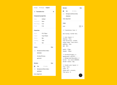
Figma’s Inspect feature allows developers to see the precise design style that you’ve used, which can greatly simplify the development process. Additionally, if you have a design library in place, Inspect will display the name of each component and style that you’ve used. This can be incredibly helpful for developers, especially if they’re working with a style guide, as they can use the component or style directly to match your design with ease.
In addition to encouraging developers to take advantage of the Inspect panel, it’s sometimes helpful to review your own design in a read-only view. This allows you to see precisely what the developers will see in the Inspect panel and ensures that components are named accurately, colors are properly linked to the design system, and other vital details are structured correctly.
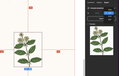
Share With Developers The Way To Export Images/Icons
Handling image assets, including icons, illustrations, and images, is also an essential part of the handoff process, as the wrong format might result in a poor presentation in the production environment.
Be sure to align with your developers on how they would like you to handle the icons and images. It could either be the case where they would prefer you to export all images and icons in a single ZIP file and share it with them or the case where they would prefer to export the images and icons on their own. If it’s the latter, it’s important to explain in detail the correct way to export the images and icons so that they can handle the export process on their own!
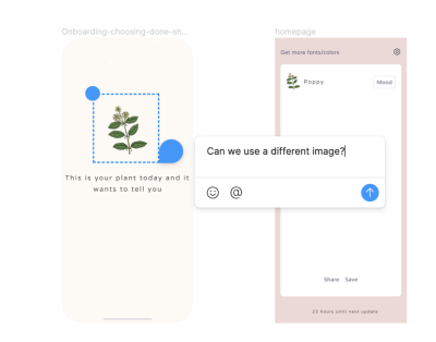
It’s common for developers to have questions about the design during the handoff process. To make it easier for everyone involved, consider teaching them to leave comments directly in Figma instead of sending you a message. This way, the comments are visible to everyone and provide context for the issue at hand. Additional features, such as comment reactions and the “mark as resolved” button, further enable better interaction between team members and help everyone keep track of whether an issue has been addressed or not.
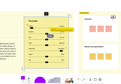
Leverage Cursor Chat
If you and the developers are both working within the same Figma file, you can also make use of the cursor chat feature to clarify any questions or issues that arise. This can be a fun and useful way to collaborate and ensure that everyone is on the same page.
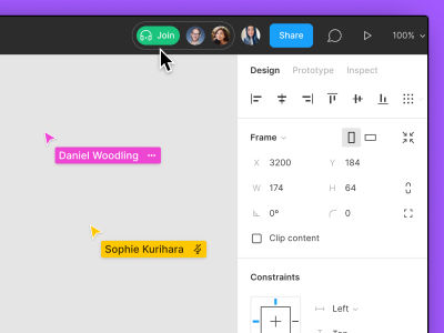
Use Figma Audio Chat
If you need to discuss a complex issue in more detail, consider using Figma’s audio chat feature. This can be a quick and efficient way to clarify any questions or concerns arising during the development process.
It’s important to keep in mind that effective collaboration relies on good communication. Therefore, it’s crucial to talk to your developers regularly and understand their approach to reading and interpreting your designs, especially when you first start working with them. This sets the foundation for a productive and successful partnership.
More after jump! Continue reading below ↓
2. Documenting Design Decisions For You And Developers
We have to be honest, the reason why building our design portfolios often takes a lot of time is the fact that we do not document every design decision along the way, and so we need to start building the case studies later by trying our best to fetch the design files and all the stuff we need.
I find it useful to document my decisions in Figma, not only just designs but, if appropriate, also competitor analysis, problem statements, and user journeys, and leave the links to these pages within the handoff file as well. The developer might not read it, but I often hear from the developers in my team that they like it as they can also dig into what the designers think while working on the design, and they can learn tips for building a product from us as well.

3. Don’t Just Leave The Design There. Add The Details
When it comes to design, details matter — just leaving the design “as is” won’t cut it. Adding details not only helps developers better understand the design, but it can also make their lives easier. Here are some tips for adding those crucial design details to your handoff.
Number The Frame/Flow If Possible
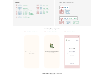
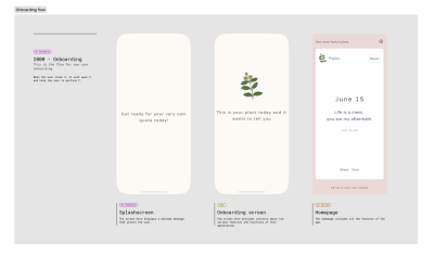
I really like the Figma handoff template that Luis Ouriach (Medium, Twitter) created. The numbering and title pattern makes it easy for developers to understand which screen belongs to which flow immediately. However, it can be complicated to update the design later as the numbering and title need to be manually updated.
Note: While there are plugins available (like, for example, Renamed), which can help with renaming multiple frames and layers all at once, this workflow can still be inconvenient when dealing with more complicated naming patterns. For instance, updating “1. Welcome → 2. Onboarding → 3. Homepage” into “1. Welcome → 2. Onboarding → 3. Sign up → 4. Homepage” can become quite a hassle. Therefore, one alternative approach is to break down the screens into different tickets or user journeys and assign a number that matches each ticket/user journey.
Name The Layers If Possible
We talked about numbering/naming the frames, but naming the layers is equally important! Imagine trying to navigate a Figma file cluttered with layers and labels like “Frame 3123,” “Rectangle 8,” and “Circle 35.” This can be confusing and time-consuming for both designers and developers, as they need to sift through numerous unnamed layers to identify the correct one.
Well-named layers facilitate better collaboration, as team members can quickly locate and comprehend the purpose of each element. This also helps ensure consistency and accuracy when translating designs into code.
If you search around in Figma, you will find a number of plugins that can help you with naming the layers in a more systematic way.
Add The Details For Interaction: Make Use Of Figma’s Section Feature
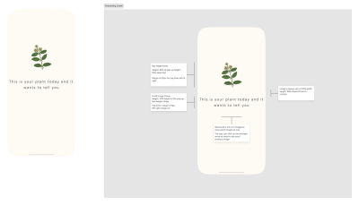
This might seem trivial, but I consider it important. Design details shouldn’t be something like “This design does X, and if you press that, it will do Y.” Instead, it’s crucial to include details like the hover state, initial state, max width/height, and the outcome of different use cases.
For this reason, I appreciate the new section feature that Figma has released. It allows me to have a big design at the top so that developers can see all of the design at once and then look at the section details for all the design and interaction details.
Make Use Of The Interactive Prototype And FigJam Features To Show The User Flow
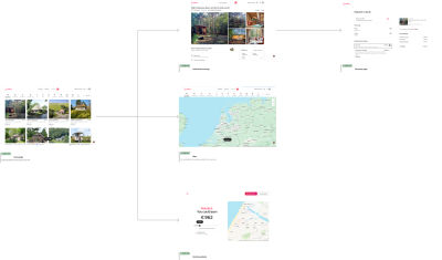
Additionally, try to share with the developers how the design screens connect to one another. You can use the interactive prototype feature within Figma to connect the screens and make them move so that developers can understand the logic. Alternatively, you can use FigJam to connect the screens, allowing developers to see how everything is connected at a glance.
4. The Secret Weapon Is Adding Loom Video
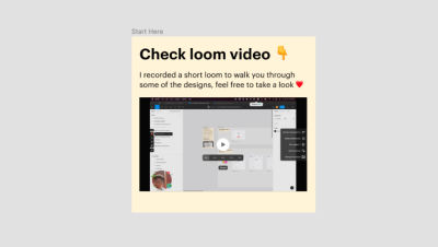
Loom video is a lifesaver for us. You only need to record it once, and then you can share it with anyone interested in the details of your design. Therefore, I highly recommend making use of Loom! For every design handoff file, I always record a video to walk through the design. For more complicated designs, I will record a separate video specifically describing the details so that I don’t need to waste other people’s time if they’re not interested.
To attach the Loom video, I use the Loom plugin and place it right beside the handoff file. Developers can play it as many times as needed without even disturbing you, asking you more questions, and so on.
→ Download the Loom Embed Figma plugin
5. The Biggest Fear: Version Control
In an ideal world, the design would be completely finalized before developers start coding. But in reality, design is always subject to adjustments, even after development has already begun. That’s why version control is such an important topic.
Although Figma has a branching feature for enterprise customers to create new designs in a separate branch, I find it helpful to keep a few extra things in your design file.
Have A Single Source Of Truth
Always ensure that the developer handoff file you share with your team is the single source of truth for the latest design. If you make any changes, update the file directly, and keep the original as a duplicate for reference. This will prevent confusion and avoid pointing developers to different pages in Figma.
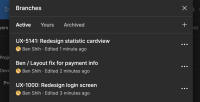
If you have access to the branching feature in Figma, it can be highly beneficial to utilize it to further streamline your workflow. When I need to update a handoff file that I have already shared with the developers, my typical process is to create a new branch in Figma first. Then I update the developer handoff file in that branch, send it to the relevant stakeholders for review, and finally merge it back into the original developer handoff file once everything is confirmed. This ensures that the link to the developer handoff file remains unchanged for the developers.
Changelogs/Future Plan
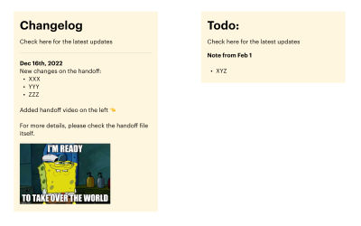
Include a changelog in the handoff file to help developers understand the latest changes made to the design.
Similarly to changelogs, if you already know of future plans to adjust the design, write them down somewhere in Figma so that the developers can understand what changes are to be expected.
6. Make Use Of Plugins
There are also a number of plugins to help you with creating your handoff:
- EightShapes Specs
EightShapes Specs creates specs for your design automatically with just one click.
→ Download the EightShapes Spec Figma plugin - Autoflow
Autoflow allows you to connect the screens visually without using FigJam.
→ Download the Autoflow Figma plugin - Style Organizer
Style Organizer allows you to make sure all of your styles are linked to your component/style so that developers won’t need to read hex code in any case.
→ Download the Style Organizer Figma plugin
7. The Ultimate Goal Is To Have A Design System
If you want to take things a step or two further, consider pushing your team to adopt a design system. This will enable the designs created in Figma to be more closely aligned with what developers expect in the code. You can match token names and name your layers/frames to align with how developers name their containers and match them in your design system.
Here are some of the benefits of using a design system:
- Consistency
A design system ensures a unified visual language across different platforms, resulting in a more consistent user experience. - Efficiency
With a design system in place, designers and developers can reuse components and patterns, reducing the time spent on creating and updating individual elements. - Collaboration
A design system facilitates better communication between designers and developers by establishing a shared language and understanding of components and their usage.
Note: If you would like to dig deeper into the topic of design systems, I recommend reading some of the TechRuum articles on this topic.
Conclusion: Keep Improving The Non-perfect
Ultimately, as I mentioned at the beginning, there’s no one-size-fits-all approach to developer handoff, as it depends on various factors such as product design and the engineers we work with. However, what we can do is work closely with our engineers, communicate with them regularly, and collaborate to find solutions that make everyone’s lives easier. Just like our designs, the key to successful developer handoff is prioritizing good communication and collaboration.
Further Reading
- “Design Handoffs,” Interactive Design Foundation
Design handoff is the process of handing over a finished design for implementation. It involves transferring a designer’s intent, knowledge, and specifications for a design and can include visual elements, user flows, interaction, animation, copy, responsive breakpoints, accessibility, and data validations. - “A Comprehensive Guide to Executing The Perfect Design-to-Development Handoff,” Phase Mag
- “Design Handoff 101: How to handoff designs to developers,” Zeplin Blog
Before we had tools like Figma, design handoff was a file-sharing nightmare for designers. When UI designs were ready for developers to start building, nothing could begin until designers manually added redlines to their latest local design file, saved it as a locked Sketch or Photoshop file or a PDF, and made sure developers were working on the correct file after every update. But those design tools completely changed the way teams collaborate around UI design — including the way design handoff happens. - “How to communicate design to developers (checklist),” Nick Babich
- “A Front-End Developer’s Ode To Specifications,” Dmitriy Fabrikant, TechRuum
In the physical world, no one builds anything without detailed blueprints because people’s lives are on the line. In the digital world, the stakes just aren’t as high. It’s called “software” for a reason: when it hits you in the face, it doesn’t hurt as much. But, while the users’ lives might not be on the line, design blueprints (also called design specifications or specs) could mean the difference between a correctly implemented design that improves the user experience and satisfies customers and a confusing and inconsistent design that corrupts the user experience and displeases customers. (Editor’s Note: Before tools like Figma were on the rise, it was even more difficult for designers and developers to communicate and so tools such as Specctr — which this article mentions — were much needed. As of today, this article from 2014 is a bit of a trip into history, but it will also give you a fairly good idea of what design blueprints are and why they are so important in the designer-developer handoff process.) - “Everything Developers Need To Know About Figma,” Jurn van Wissen, TechRuum
Unlike most design software, Figma is free and browser-based, so developers can easily access the full design files making the developer handoff process significantly smoother. This article teaches developers who have nothing but a basic understanding of design tools everything they need to know to work with Figma. - “Penpot, An Open-Source Design Platform Made For Designers And Developers Alike,” Mikołaj Dobrucki, TechRuum
In the ever-evolving design tools landscape, it can be difficult to keep up with the latest and greatest. In this article, we’ll take a closer look at Penpot, the first design and prototyping tool that’s fully open-source and based on open web standards, making it an ideal choice for both designers and developers. (Editor’s Note: Today, it’s not always “There’s only Figma.” There are alternatives, and this article takes a good look at one of them — Penpot.) - “The Best Handoff Is No Handoff,” Vitaly Friedman, TechRuum
Design handoffs are inefficient and painful. They cause frustration, friction, and a lot of back and forth. Can we avoid them altogether? Of course, we can! Let’s see how to do just that.
(mb, yk, il)
#Designing #Design #Handoff #File #Figma #Smashing #Magazine
