There’s a pattern that’s haunted web design for over a decade now—one so embedded in…

Are Simple Websites Better For Business?
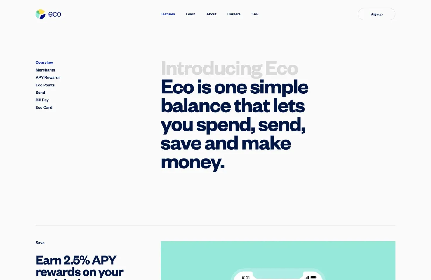
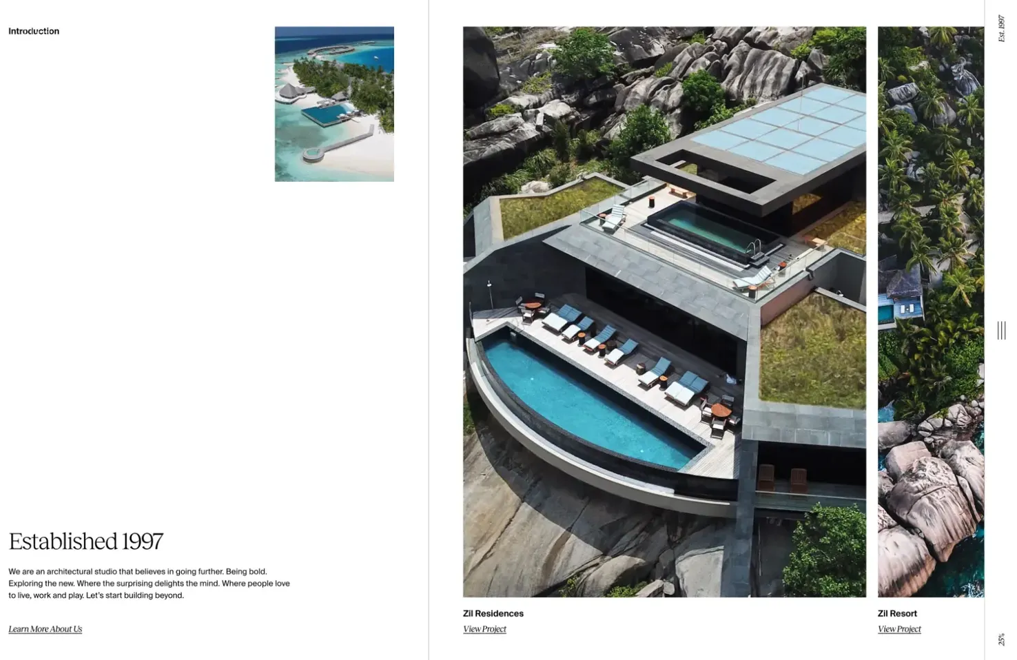
Minimalism — the clean, grey-on-white aesthetic popularised by (among others) Apple — has been the dominant trend for years. It creates a professional look and offers easy-to-understand navigation. On the other hand, Maximalism — a visual feast that attracts attention with complexity and uniqueness — has started to gain traction.
In this post, we’ll explore both sides of the argument and provide easy ways designers can simplify websites.
What is Simplicity in Web Design?
Minimalism is often characterized as simplicity. But that’s not always the case. Occasionally Minimalist navigation is so minimal that it is difficult to use. The flip side is that Maximalism, often characterized as complex, can use simple navigation.
Many Minimalist elements are more complex than a few Maximalist elements. The key is to reduce the number of elements, regardless of the chosen style.

Simplicity in web design is usually about how simple the user experience is, and that comes down to navigation. Often, designers make navigation unnecessarily complex by attempting to creatively invent the wheel. This forces users to experiment to learn how to use the design, increasing frustration and the perception of complexity.
Scrolling is not simple. A gesture applied to a mouse, a trackpad, or a screen (each gesture being different) that moves the position of content relative to the viewport is not simple. But it is second nature because we know how to do it. Scrolling is learned, and so it is simple. By restricting interaction to established design patterns, we can design websites that are simple to use.

In addition to building websites that are simple to use. We need to ensure that they appear to be simple to the user. The Aesthetic Usability Effect is a fascinating concept in UX design that says that how attractive something looks affects how easy to use it is perceived to be.
Regardless of your approach, beauty = simplicity.
Whether you opt for Minimalism, Maximalism, or some other ‑ism, simplicity in web design is a combination of familiarity and beauty.

The Pros of Simple Websites
There are numerous benefits to opting for a simple website:
- Improved UX — A simple website that is easier to navigate leads to a better experience for the user, which means more conversions.
- Improved brand perception — brands that are seen as producing more beautiful content tend to be perceived as having a higher quality, which means higher value.
- Fast load times — simple websites tend to have fewer elements that need to be loaded, and they use less custom JavaScript, making them faster to load than complex sites with multiple elements and interactive components.
- Increased SEO performance — simple sites lean into common design patterns utilizing simple source code that is easier for search engines to crawl and are more likely to be ranked highly.
- Easier development — with less work involved in building a simple website, it is often faster and cheaper to create and maintain.
The Cons of Simple Websites
It isn’t all upside; there are a few downsides to creating a simple website:
- Simple is hard — simplicity is one of the hardest things to design. It requires humility, experience, and the ability to reach the core of a problem.
- Lack of visual impact — simple websites with Minimalism as their chosen aesthetic can lack a “wow” factor and fail to stand out in a crowded market.
- Some things are just complex — complexity isn’t always a bad thing. Complexity introduces variety and flexibility. Simplicity can mean rigid repetition.
- Difficult to scale — simple websites include only what is necessary for their content, but content changes over time. Simple websites often lack the ability to grow and must be reassessed and redesigned as new features and content are introduced.
Easy Tactics For Simplifying Websites
There are a number of ways in which designers can easily simplify their website designs:
- Use established design patterns — using established design patterns, especially for navigation, simplifies a site because users know and understand how the site works. Familiarity simplifies anything.
- Reduce the number of links — navigation should be simple, with just enough links for users to find their way around without being overwhelmed by choice.
- Utilize negative space — negative space (also known as white space) helps delineate areas of a website allowing users to focus on one task at a time.
- Create modular designs — divide pages into smaller sections using clear headings and negative space. Modular designs allow quicker scanning of information while maintaining an aesthetic.
- Reduce clutter — eliminate any non-essential design elements that will detract from the core elements of the website.
- Streamline processes — make sure forms are easy to fill out and utilize shortcuts wherever possible to make navigating the website easier.
- Design a beautiful website — beauty is perceived as simple, so ensure that your design is beautiful, and it will also be perceived as simple.
Conclusion
Although there are some drawbacks to designing and building a simple website, the pros far outweigh the cons for businesses. A simple website creates a professional look, increases the perception of your products or services as high quality, and promotes engagement and conversions.
Designers aiming to create a simple website should start by focusing on navigating content in a predictable way using established design patterns. Choose any aesthetic you like, from Minimalism to Maximalism, but ensure that you use it well and that users will perceive the experience as simple.
Simon Sterne
Simon Sterne is a staff writer at WebdesignerDepot. He’s interested in technology, WordPress, and all things UX. In his spare time he enjoys photography.
#Simple #Websites #Business


