The goal of content design is to reduce confusion and improve clarity. Yet often it’s…

A Full-Width Slider Case Study — TechRuum
You know what’s perhaps the “cheapest” way to make a slider of images, right? You set up a container, drop a bunch of inline image elements in it, then set overflow-x: auto on it, allowing us to swipe through them. The same idea applies nicely to a group of cards, too.
See the Pen [Cheap Slider [forked]]( by Geoff Graham.
While that’s a quick and dirty way to get a slider up and running, there is more we can do to smooth it out a bit. That’s what we’re going to cover in this tutorial. Specifically, we’re improving our cheap slider with controlled scrolling, courtesy of CSS Scroll Snapping. The idea is that the slider naturally stops on an image during the scroll. Otherwise, we could blow through a bunch of images in a single swipe and lose our place.

But we’ll go deeper than scroll snapping. The thing with sliders is that it can be difficult to instruct them on where to “snap.” For example, what if we want to configure the slider in such a way that images always snap at the left (or inline-start) edge when swiping right to left?

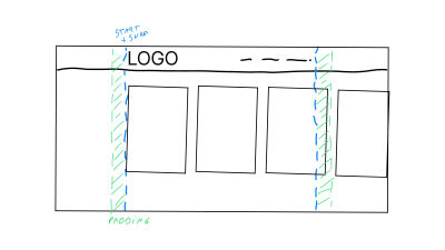
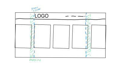
But that’s not even the “tricky” part we’re looking at. Say we are working within an existing page layout where the main container of the page has a set amount of padding applied to it. In this case, the slider should always begin at the inline starting edge of the inside of the container, and when scrolling, each image should snap to the edge rather than scroll past it.
Simply drop the slider in the layout container, right? It’s not as straightforward as you might think. If you notice in the illustrations, the slider is outside the page’s main container because we need it to go full-width. We do that in order to allow the images to scroll fully edge-to-edge and overflow the main body.
Our challenge is to make sure the slider snaps into place consistent with the page layout’s spacing, indicated by the dashed blue lines in the drawings. The green area represents the page container’s padding, and we want images to snap right at the blue line.
The Basic Layout
Let’s start with some baseline HTML that includes a header and footer, each with an inner .container element that’s used for the page’s layout. Our slider will sit in between the header and footer but lack the same inner .container that applies padding and width to it so that the images scroll the full width of the page.
<header>
  <div class="container">
    <!-- some contained header with some nav items -->
  </div>
</header>
<main>
  <section class="slider">
    <!-- our slider -->
  </section>
  <section class="body-text">
    <div class="container">
      <!-- some contained text -->
    </div>
  </section>
</main>
<footer>
  <div class="container">
    <!-- a contained footer -->
  </div>
</footer>
Creating The Container
In contrast to the emphasis I’ve put on scroll snapping for this demo, the real power in creating the slider does not actually start with scroll snapping. The trick to create something like this starts with the layout .container elements inside the header and footer. We’ll set up a few CSS variables and configure the .container’s properties, such as its width and padding.
The following bit of CSS defines a set of variables that are used to control the maximum width and padding of a container element. The @media rules are used to apply different values to these properties depending on the viewport’s width.
:root {
  --c-max-width: 100%;
  --c-padding: 10px;

  @media screen and (min-width: 768px) {
    --c-max-width: 800px;
    --c-padding: 12px;
  }
  @media screen and (min-width: 1000px) {
    --c-max-width: 940px;
    --c-padding: 24px;
  }
  @media screen and (min-width: 1200px) {
    --c-max-width: 1200px;
    --c-padding: 40px;
  }
}
The first couple of lines of the :root element’s ruleset define two CSS custom properties: --c-max-width and --c-padding. These properties are used to control the layout .container’s maximum width and padding.
Next up, we have our @media rules. These apply different values to the –-c-max-width and --c-padding properties depending on the screen size. For example, the first @media rule updates the value of --c-max-width from 100% to 800px, as well as the --c-padding from 10px to 12px when the screen width is at least 768px.
Those are the variables. We then set up the style rules for the container, which we’ve creatively named .container, and apply those variables to it. The .container’s maximum width and inline padding are assigned to the also creatively-named -c-max-width and --c-padding variables. This opens up our container’s variables at a root level so that they can easily be accessed by other elements when we need them.
I am using pixels in these examples because I want this tutorial to be about the actual technique instead of using different sizing units. Also, please note that I will be using CSS nesting for the demos, as it is supported in every major browser at the time I’m writing this.
Let’s work on the scroll-snapping part of this slider. The first thing we’re going to do is update the HTML with the images. Remember that this slider is outside of the .container (we’ll take care of that later).
<header>
  <!-- .container -->
</header

<section class="slider">
  <div>
    <img src=" alt="">
  </div>
  <div>
    <img src=" alt="">
  </div>
  <div>
    <img src=" alt="">
  </div>
  <!-- etc. -->
</section>

<footer>
  <!-- .container -->
</footer>
Now we have a a group of divs that are direct children of the .slider. And those, in turn, each contain one image element. With this intact, it’s time for us to style this as an actual slider. Flexbox is an efficient way to change the display behavior of the .slider’s divs so that they flow in the inline direction rather than stacking vertically as they naturally would as block-level elements. Using Flexbox also gives us access to the gap property to space things out a bit.
.slider {
  display: flex;
  gap: 24px;
}
Now we can let the images overflow the .slider in the horizontal, or inline, direction:
.slider {
  display: flex;
  gap: 24px;
  overflow-x: auto;
}
Before we apply scroll snapping, we ought to configure the divs so that the images are equally sized. A slider is so much better to use when the images are visually consistent rather than having a mix of portrait and landscape orientations, creating a jagged flow. We can use the flex property on the child divs, which is shorthand for the flex-shrink, flex-grow, and flex-basis properties:
.slider {
  display: flex;
  gap: 24px;
  overflow-x: auto;

  > * {
    flex: 0 0 300px;
  }
}
This way, the divs are only as big as the content they contain and will not exceed a width of 300px. But! In order to contain the images in the space, we will set them to take up the full 100% width of the divs, slap an aspect-ratio on them to maintain proportions, then use the object-fit property to to cover the div’s dimensions.
.slider {
  display: flex;
  gap: 24px;
  overflow-x: auto;

  > * {
    flex: 0 0 300px;
  }

  & img {
    aspect-ratio: 3 / 4;
    object-fit: cover;
    width: 100%;
  }
}
With this in place, we can now turn to scroll snapping:
.slider {
  display: flex;
  gap: 24px;
  overflow-x: auto;
  scroll-snap-type: x mandatory;

  > * {
    flex: 0 0 300px;
    scroll-snap-align: start;
  }

  /*
}
Here’s what’s up:
- We’re using the
scroll-snap-typeproperty on the.slidercontainer to initialize scroll snapping in the horizizontal (x) direction. Themandatorykeyword means we’re forcing the slider to snap on items in the container instead of allowing it to scroll at will and land wherever it wants. - We’re using the
scroll-snap-alignproperty on the divs to set the snapping on the item’sstart-ing edge (or “right” edge in a typical horizontal left-to-right writing mode).
Good so far? Here’s what we’ve made up to this point:
See the Pen [Cheap Slider, Scroll Snapped [forked]]( by Geoff Graham.
Calculating The Offset Size
Now that we have all of our pieces in place, it’s time to create the exact snapping layout we want. We already know what the maximum width of the page’s layout .container is because we set it up to change at different breakpoints with the variables we registered at the beginning. In other words, the .container’s width will never exceed the value of --c-max-width. We also know the container always has a padding equal to the value of --c-padding.
Again, our slider is outside of the .container, and yet, we want the scroll-snapped images to align with those values for a balanced page layout. Let’s create a new CSS variable, but this time scoped to the .slider and set it up to calculate the space between the viewport and the inside of the .container element.
.slider {
  --offset-width: calc(((100% - (min(var(--c-max-width), 100%) + (var(--c-padding) * 2))) / 2) + (var(--c-padding) * 2)
  );
}
That is a lot of math! First, we’re calculating the minimum value of either the .container element’s max-width or 100%, whichever is smaller, then increasing this minimum value with padding on the .slider. This result is then subtracted from 100%. From this, we get the total amount of space that is available to offset either side of the .slider to align with the layout .container.
We then divide this number by 2 to get the offset width for each specific side. And finally, we add the .container’s inline padding to the offset width so that the .slider is offset from the inside edges of the container rather than the outside edges. In the demo, I have used the universal selector (*) and its pseudos to measure the box-sizing of all elements by the border-box so that we are working inside the .slider’s borders rather than outside of it.
*, *::before, *::after {
  box-sizing: border-box;
}
Some Minor Cleanup
If you think that our code is becoming a bit too chaotic, we can certainly improve it a bit. When I run into these situations, I sometimes like to organize things into multiple custom properties just for easy reading. For example, we could combine the inline paddings that are scoped to the :root and update the slider’s --offset-width variable with a calc() function that’s a bit easier on the eyes.
:root {
  /* previous container custom properties */

   --c-padding-inline: calc(var(--c-padding) * 2);
}

.slider {
  --offset-width: calc(((100% - (min(var(--c-max-width), 100%) + var(--c-padding-inline))) / 2) + var(--c-padding-inline));

  /* etc. */
}
That’s a smidge better, right?
Aligning The Slider With The Page Layout
We have a fully-functioning scroll scroll-snapping container at this point! The last thing for us to do is apply padding to it that aligns with the layout .container. As a reminder, the challenge is for us to respect the page layout’s padding even though the .slider is a full-width element outside of that container.
This means we need to apply our newly-created --offset-width variable to the .slider. We’ve already scoped the variable to the .slider, so all we really need is to apply it to the right properties. Here’s what that looks like:
.slider {
  --offset-width: calc(
    ((100% - (min(var(--c-max-width), 100%) + (var(--c-padding) * 2))) / 2) + (var(--c-padding) * 2)
  );

  padding-inline: var(--offset-width);
  scroll-padding-inline-start: var(--offset-width);

  /* etc. */
  }
The padding-inline and scroll-padding-inline-start properties are used to offset the slider from the left and right sides of its container and to ensure that the slider is always fully visible when the user scrolls.
padding-inline
This sets spacing inside the.slider’s inline edges. A nice thing about using this logical property instead of a physical property is that we can apply the padding in both directions in one fell swoop, as there is no physical property shorthand that combinespadding-leftandpadding-right. This way, the.slider’s internal inline spacing matches that of the.containerin a single declaration.scroll-padding-inline-start
This sets the scroll padding at the start of the slider’s inline dimension. This scroll padding is equal to the amount of space that is added to the left (i.e., inline start) side of the.slider’s content during the scroll.
Now that the padding-inline and scroll-padding-inline-start properties are both set to the value of the --offset-width variable, we can ensure that the slider is perfectly aligned with the start of our container and snaps with the start of that container when the user scrolls.
We could take all of this a step further by setting the gap of our slider items to be the same as our padding gap. We’re really creating a flexible system here:
.slider {
  --gap: var(--c-padding);
  gap: var(--gap);
}
Personally, I would scope this into a new custom property of the slider itself, but it’s more of a personal preference. The full demo can be found on CodePen. I added a toggle in the demo so you can easily track the maximum width and paddings while resizing.
See the Pen [Full width scroll snap that snaps to the container [forked]]( by utilitybend.
But we don’t have to stop here! We can do all sorts of calculations with our custom properties. Maybe instead of adding a fixed width to the .slider’s flex children, we want to always display three images at a time inside of the container:
.slider {
  --gap: var(--c-padding);
  --flex-width: calc((100% - var(--gap) * 2) / 3);

  /* Previous scroll snap code */

  > * {
    flex: 0 0 var(--flex-width);
    scroll-snap-align: start;
  }
}
That --flex-width custom property takes 100% of the container the slider is in and subtracts it by two times the --gap. And, because we want three items in view at a time, we divide that result by 3.
See the Pen [Updated scroll container with 3 items fitted in container [forked]]( by utilitybend.
Why Techniques Like This Are Important
The best thing about using custom properties to handle calculations is that they are lighter and more performant than attempting to handle them in JavaScript. It takes some getting used to, but I believe that we should use these kinds of calculations a lot more often. Performance is such an important feature. Even seemingly minor optimizations like this can add up and really make a difference to the overall end-user experience.
And, as we’ve seen, we can plug in variables from other elements into the equation and use them to conform an element to the properties of another element. That’s exactly what we did to conform the .slider’s inner padding to the padding of a .container that is completely independent of the slider. That’s the power of CSS variables — reusability and modularity that can improve how elements interact within and outside other elements.
(gg, yk)
#FullWidth #Slider #Case #Study #Smashing #Magazine


