The goal of content design is to reduce confusion and improve clarity. Yet often it’s…

The Complex But Awesome CSS border-image Property — TechRuum
border-image property is one of those properties you undoubtedly know exists but may not have ever reached for. Or maybe you have reached for it but found all of its slicing logic difficult and cumbersome. That’s because it is! But the property is also capable of some really interesting things if we take the time to understand its syntax. In this article, Temani Afif demonstrates different approaches for using border-image to create clever decorative accents and shapes.The border-image property is nothing new. Even deprecated Internet Explorer supports it, so you know we’re treading well-charted territory. At the same time, it’s not exactly one of those properties you likely keep close at hand, and its confusing concepts of “slicing” and “outsets” don’t make it the easiest property to use.
I’m here to tell you that border-image is not only capable of producing some incredibly eye-catching UI designs but is also able to accomplish some other common patterns we often turn to other properties and approaches for.
In this article, my plan is to dispel the confusing aspects of border-image without getting into a bunch of theoretical explanations and technical jargon. Instead, we’re going to have fun with the property, using it to create shapes and put a different spin on things like range sliders, tooltips, and title decorations.
By the end of this, I hope that border-image becomes your new favorite property just as it has become mine!
The Concept of Image Borders
There are a few specific aspects of border-image that I think are crucial for understanding how it works.
It’s Easy To Accidentally Override A Border Image
The CSS Backgrounds and Border Module Level 3 specification says border-image should replace any regular border you define, but it’s not always the case. Try the code below, and all you will see is a red border.
/* All I see is a red border */
.element {
  border-image: linear-gradient(blue, red) 1;
  border: 5px solid red;
}
That’s because we’re technically declaring border after border-image. Order really does matter when working with border-image!
/* 👍 */
.element {
  border: 5px solid red;
  border-image: linear-gradient(blue, red) 1;
}
You can already see how this could be confusing for anyone jumping into border-image, especially for the first time. You will also notice that our gradient border has a thickness equal to 5px, which is the border-width we defined.
I make it a personal habit not to use border and border-image together because it helps me avoid overriding the border image I’m trying to create and be able to control the border decoration using only one property (even if both can be used together). So, if you get a strange result, don’t forget to check if you have a border declared somewhere.
It Is Painted Over Backgrounds And Box Shadows
The second tip I want to offer is that border-image is painted above the element’s background and box-shadow but below the element’s content. This detail is important for some of the tricks we will use in later examples. The following Pen demonstrates how a border image is applied in that order:
See the Pen [Showing border-image above background and shadow!]( by Temani Afif.
It Has A Complex Syntax
I want to underscore this because I think it’s the reason for the vast majority of confusion. This is the property’s syntax:
border-image: <source> <slice>/<width>/<outset> <repeat>
In this article, the<source> will consist of gradients, although it supports image sources as well. And we are not going to use <repeat> a lot. Let’s re-write the syntax removing the <repeat> and setting a placeholder, *-gradient(), as the source for the time being:
border-image: *-gradient() <slice>/<width>/<outset>
We’ve abstracted a couple of the parameters so that all we’re left with is <slice>, <width>, and <outset>.
The <width> and <outset> work the same as setting border-width, padding, and margin. They each take between one and four values depending on whether you want specific <outset> and <width> values set individually on the element’s edges. Sometimes, I only need to specify the outset, making the width unnecessary. So, you may find me writing something like this:
border-image: *-gradient() <slice>//<outset>
It’s probably the only property where we can have a double slash!
The <slice> also takes between one and four values (either unitless or percentage) as well as an optional fill keyword. This is what makes border-image difficult to understand because it’s not easy to visualize the concept of slices.
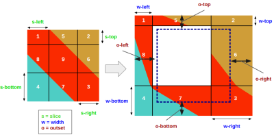
<slice>, <width>, and <outset> values of the border-image property. (Large preview)If we were to translate the figure above into code using the provided variables as values, it would look like this:
border-image:
  linear-gradient(...)
  s-top s-right s-bottom s-left /
  w-top w-right w-bottom w-left /
  o-top o-right o-bottom o-left;
By default, border-image considers the boundaries of the element (illustrated with the blue dotted border in Figure 1) as its area to paint the gradient, but we can change this using the <outset> to increase that area and create an overflow. This is super useful to have “outside” decorations.
Then, the <width> is used to split the area into nine regions, and the <slice> is used to split the source (i.e., the gradient) into nine slices as well. From there, we assign each slice to its corresponding region. Each slice is stretched to fill its assigned region, and if they don’t share equal dimensions, the result is typically a distorted image slice. Later on, we will learn how to control that and prevent distortion.
The middle region is kept empty by default. That said, it is totally possible to use the fill keyword to do what it says and fill the middle region with slice nine (which is always the center slice).
border-image: linear-gradient(...) fill
  s-top s-right s-bottom s-left /
  w-top w-right w-bottom w-left /
  o-top o-right o-bottom o-left;
I know this was a pretty fast primer on border-image, but I think it’s all we need to do some pretty awesome stuff. Let’s jump into the fun and start experimenting with effects.
Gradient Overlay
Our first experiment is to add a gradient overlay above an existing background. This is a fairly common pattern to improve the legibility of text by increasing the contrast between the text color and the background color.
There are several well-known approaches to setting an overlay between text and content. Here’s one from Chris Coyier back in 2013. And that isn’t even the most widely-used approach, which is likely using pseudo-elements.
But border-image gives us a one-line way to pull it off:
.overlay {
  border-image: fill 0 linear-gradient(#0003,#000);
}
That’s all! No extra element, no pseudo-element, and no need to modify the background property.
See the Pen [Gradient Overlay with border-image]( by Temani Afif.
If we dissect the property, we have the <source> (i.e., the gradient) and the <slice> (i.e., fill 0). We didn’t define either the <width> or the <outset>, so they default to 0.
Let’s take that same idea and apply it to the figure we presented earlier when demonstrating the concept of slicing. We’ll replace the variables we used as placeholders with the values from the last example we just looked at.
We have a slice that is equal to 0, so the slices — 1 through 8 — will be empty while the middle slice is filled with the whole gradient. It’s like we have only one slice. The <width> is equal to 0, so regions 1 to 8 are sized to 0, leaving the middle region to what’s left (the whole border-image’s area). And since we did not specify an <outset>, the border-image’s area is equal to the element’s area.
In the end, we have one slice placed in the middle region and eight others we do not see at all. That’s how we end up having our gradient above the element’s background and behind the text.
Let’s try a different syntax but that produces the same output as what we just did.
.overlay {
  border-image: linear-gradient(#0003, #000) 50%/50%;
}
This time, we are defining a <slice> that is equal to 50%, a <width> that is also equal to 50%, and no <outset>. Slices 1 to 4 each take up one-quarter of the gradient. Slices 5 to 9, meanwhile, are empty. Using the same logic for the regions, we have four regions — 1 to 4 — that each takes up a quarter of the element’s area while the rest of the regions are equal to 0.
In the first approach, we placed one slice in the middle of the element. In this approach, we have four slices, where each is placed in a corner of the element and allowed to fill the entire element.
It’s the same output but a different approach using the same property.
If the slicing concept is tripping you up, we still have plenty of other examples we are going to look at to help you understand it. The trick is to first understand how the gradient is divided into different slices, then how those slices are placed into different regions, which are sized by the <width> and the <outset>. It may take time to grasp the mechanism, but it’s a lot of fun once you do! So, let’s continue to the next example.
Full-Width Backgrounds
Our next example is a common design pattern where we want the background of an element to extend to the screen’s full width. We often refer to this as a “break-out” background because the element typically needs to break outside the constrained width of its parent container in order to stretch across the full screen.
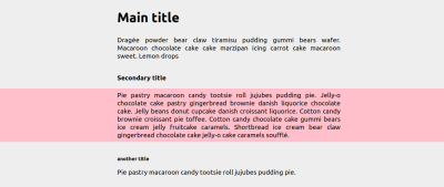
Well, guess what? The border-image property can pull it off with one line of code:
.full-background {
  border-image: conic-gradient(pink 0 0) fill 0//0 100vw;
}
See the Pen [Full screen background color]( by Temani Afif.
You are probably wondering what’s going on with that conic-gradient(), right? I want a solid color, but unlike the background and background-color properties, border-image does not support color values, so I use a gradient that produces a solid color. For this, I define one color with two color stops inside the gradient.
The type of gradient or what color stops are applied to it doesn’t matter. I prefer conic-gradient() and two zeros because it simply offers the smallest syntax to get a solid color as a result.
Now, let’s dissect that line of code. We have a <slice> that is equal to 0, no <width> (it is implicitly equal to 0), and this time the <outset> is equal to 0 100vw which increases the border-image’s area from the left and right side by 100% of the viewport’s width (100vw).
We could technically use a value smaller than 100vw since the space we need to cover will most likely be smaller, but using a larger value is always good to make sure we consider all the possibilities. And border-image doesn’t trigger scrolling, so don’t worry about using big values!

If you compare what we just did with the gradient overlay example, the <outset> is the only difference between the implementations. Other than that, we have a single slice placed in the middle region that covers the entire area we extended to the edge of the screen.
We are not limited to a solid color, of course, since we are working with gradients.
See the Pen [Full screen background coloration]( by Temani Afif.
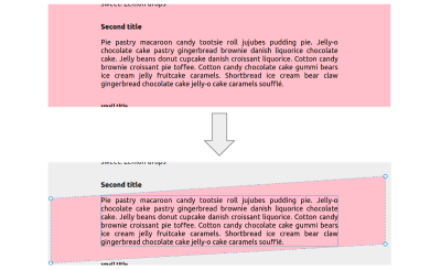
We can even get a little fancy by slanting the backgrounds to produce an interesting page design.
See the Pen [CSS-only full screen slanted background]( by Temani Afif.
The “tricky” part is that I have combined border-image with clip-path:
.slant {
  --a: 3deg; /* control the angle (it should be small) */

  border-image: conic-gradient(pink 0 0) fill 0//9999px;
  clip-path:
    polygon(
      -9999px calc(tan(var(--a)) * 9999px),
      9999px calc(tan(var(--a)) * -9999px),
      calc(100% + 9999px) calc(100% - tan(var(--a)) * 9999px),
      calc(100% - 9999px) calc(100% + tan(var(--a)) * 9999px)
    );
}
This time, we have a rather large <outset> extending in all directions. This forces the color to overflow the element’s boundaries, which allows us to reach for the CSS clip-path property to cut out the shape.
Fancy Headings
Another thing we can use border-image for is decorating headings with fancy borders. Let’s start with the exact same implementation we used for the full-width backgrounds. Only this time, we’re replacing the conic-gradient() with a linear-gradient():
.full-background {
  border-image: linear-gradient(0deg, #1095c1 5px, lightblue 0) fill 0//0 100vw;
}
Now we apply this to an <h1> element:
See the Pen [Full screen gradient coloration on title]( by Temani Afif.
Nothing surprising here. We’re basically establishing a gradient with a sharp color stop that creates a border-like appearance along the bottom edge of the heading, extending the full width of the screen. But what if we make one of the colors transparent and define a big <outset> in only one direction? This produces a bottom border that extends to the edge of the screen in a single direction rather than both directions.
See the Pen [CSS only extended underline]( by Temani Afif.
That’s a simple pattern, but it could be a nice design accent. Still using one line of code:
.full-line {
  border-image: linear-gradient(0deg, #1095c1 5px, #0000 0) fill 0//0 100vw 0 0;
}
We can actually accomplish this another way:
.full-line {
  border-image: conic-gradient(#1095c1 0 0) fill 0/calc(100% - 8px) 0 0 0/0 100vw 0 0;
}
This defines the size of the top regions to be equal to 100% - 8px while the rest of the regions are equal to 0. If you refer back to the first figure, it means we are making the height of region five equal to 100% - 8px, so the middle region will have only 8px of height, and since the slice is still 0, we only have the middle slice placed inside that 8px of space.
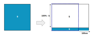
So, that’s two different ways to get the same effect using the same border-image syntax. We can actually get this a third way as well:
.full-line {
  border-image: conic-gradient(#1095c1 0 0) 0 0 1 0/0 0 8px 0/0 100vw 0 0;
}
This time, I have defined a bottom slice equal to 1 (unitless values are computed as pixels), which produces two slices, the seventh (bottom center) and the ninth (center). From there, I have set the seventh region to a height of 8px. Note that I am not using the fill keyword this time, so the middle region is not filled like it was last time. Instead, we only fill the seventh region that takes up 100% of the boder-image’s area and 8px of its height.
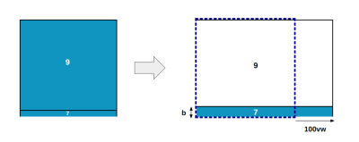
You’re wondering why I am defining a slice equal to 1, right? The goal is to have only two slices: the seventh (bottom center) and the ninth (middle), and since we are applying a solid color, the size doesn’t matter. That’s why I used 1; a small positive value. Any value will work (e.g., 0.5, 2, 100, 50%, 76%, and so on); it’s just that 1 is shorter to type. Remember that the slice will get stretched within its region, so 1px is enough to fill the whole region.
Here’s the deal: The slice value doesn’t really matter when working with a solid coloration. In most cases, the value winds up being 0 (empty) or 1 (filled). You can think of it as binary logic.
We could do this a fourth way!
.full-line {
  border-image: conic-gradient(#1095c1 0 0) 0 1 0 0/calc(100% - 8px) 100% 0 0/0 100vw 0 0;
}
I’ll let you do the work to figure out how the above CSS works. It’s a good opportunity to get a feel for slicing elements. Take a pen and paper and try to identify which slices we are using and which regions will be filled.
One thing that makes border-image a complex property is all the different ways to achieve the same result. You can wind up with a lot of different combinations, and when all of them produce the same result, it’s tough to form a mental model for understanding how all of the values work together.
Even though there is no single “right” way to do these heading borders, I prefer the second syntax because it allows me to simply change one color value to establish a “real” gradient instead of a solid color.
.full-line {
  border-image: repeating-linear-gradient(...) fill 0 /
    calc(100% - var(--b)) 0 0/0 100vw 0 0 repeat;
}
See the Pen [CSS only extended underline with gradient]( by Temani Afif.
Notice the repeat keyword in that last example. I talked earlier about how a slice can be set to a size that is different than its corresponding region, and that could lead to a distorted border image. This isn’t an issue when dealing with a solid color. Using a real gradient, however, is where distortion might occur. Fortunately, the fix in most cases is to set repeat at the end of the border-image declaration (stretch is the default value).
If repeat doesn’t seem to work, then it’s possible there is an issue somewhere else in the code… or perhaps you have reached the limit of what border-image can do. It’s a powerful property, but like any other, it has its limitations.
Heading Dividers
Since we were just making bottom borders for headings in the last example, I figure we can do a variant of that by drawing the border through the heading.
See the Pen [Horizontal lines around your title]( by Temani Afif.
This can be a nice way to emphasize a heading, especially those in an article body. Here is the pertinent code:
h2 {
  --s: 3px;   /* the thickness */
  --c: red;   /* the color */
  --w: 100px; /* the width */
  --g: 10px;  /* the gap */

  border-image:
    linear-gradient(
      #0000      calc(50% - var(--s)/2),
      var(--c) 0 calc(50% + var(--s)/2),
      #0000 0)
    0 1 / 0 var(--w) / 0 calc(var(--w) + var(--g));
}
This example is putting CSS variables to use so we have some flexibility to re-configure the border image and create variations of the pattern. But before reading the explanation of how this works, please take a moment to visualize the result using what you have learned so far. Try to identify the slices, the regions, and their dimensions.
Ready? Here’s how it works.
We have a slice equal to 0 1 — 1px each from the left and right. This establishes slices eight (center-right) and six(center-left) with a width of 1px while the remaining space is reserved for the ninth (center) slice. We are not using fill, so we don’t really care about the ninth slice since it won’t get painted.
The width (--w) is used to set the size of regions six and eight. We need the same amount inside the <outset> to make sure those two regions are outside of the element’s boundaries. Another variable, --g, is added to the outset formula to control the gap between the text and the decoration.
The gradient is similar to the one we used for the bottom heading borders in the last section. Only this time, the color is in the center instead of the bottom, and its size is controlled using the --s variable.
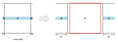
Let’s try another syntax for the same effect:
h2 {
  --s: 3px;   /* the thickness */
  --w: 100px; /* the width */
  --g: 10px;  /* the gap */
  border-image:
     conic-gradient(red 0 0)
     0 50%/calc(50% - var(--s)/2) var(--w)/0 calc(var(--w) + var(--g));
}
The top and bottom values of the <slice> are equal to 0, and the left and right ones are equal to 50%. This means that slices six and eight share the gradient. All the other slices — including the center — are empty.
As far as the regions go, the top and bottom regions (consisting of regions 1, 5, and 2 at the top and regions 4, 7, and 3 at the bottom) have a height equal to 50% - var(--s)/2 leaving the --s variable as a height for the remaining regions (6, 8, and 9). The right and the left regions have a width equal to the --w variable. Since slices 6 and 8 are the only ones that are filled, the only regions we need to care about are 6 and 8. Both have a height equal to the border’s thickness, --s, and a width equal to --w.
I think you know how the rest of the story goes.
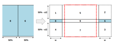
Notice I am using 50% as a slice. It demonstrated how any value does the job, as we discussed in the last section when I explained why I chose to use a value of 1 but also to prepare for the next effect where I will be using a real gradient:
See the Pen [Horizontal lines around your title with gradient coloration]( by Temani Afif.
When it comes to real gradients, the value of the slice is important, and sometimes you need very precise values. To be honest, this can be very tricky, and I even get lost trying to figure out the right value.
Let’s end this section with more examples of title decorations. When combined with other properties, border-image can make really nice effects.
See the Pen [Fancy title divider with one element]( by Temani Afif.
See the Pen [Fancy title divider with one element]( by Temani Afif.
More Examples
Now that we’ve seen several detailed examples of how border-image, I’m going to drop in several other examples. Rather than explaining them in great detail, try to explain them in your own words by inspecting the CSS, and use these as inspiration for your own work.
Infinite Image Decorations
When it comes to images, border-image can be a lifesaver since we don’t have access to pseudo-elements. Here are some cool infinite decorations where we can have a touch of 3D effect.
See the Pen [Infinite image shadow]( by Temani Afif.
See the Pen [Infinite image shadow II]( by Temani Afif.
See the Pen [Infinite image stripes shadow]( by Temani Afif.
See the Pen [3D trailing shadow for images]( by Temani Afif.
If you check the code in these examples, you will find they share nearly the same structure. If you have trouble recognizing the pattern, please don’t hesitate to leave a comment at the end of this article, and I would be happy to point it out.
Custom Range Slider
I wrote a detailed article on how to create the following example, and you can refer to it for range slider variations using the same technique.
See the Pen [CSS only custom range sliders]( by Temani Afif.
I used border-image and styled only the “thumb” element. Range inputs are known to have different implementation cross-browser, but the “thumb” is common between all of them.
Ribbon Shapes
In case you missed it, I have created a collection of more than 100 single-element ribbon shapes, and some of them rely on border-image. I call them the “infinite ribbons.”
See the Pen [Full screen Ribbon title]( by Temani Afif.
See the Pen [Infinite Ribbon Shapes]( by Temani Afif.
Heart Shapes
I have written about CSS heart shapes using different approaches, and one of them uses a border-image technique.
.heart {
  width: 200px;
  aspect-ratio: 1;
  border-image: radial-gradient(red 69%,#0000 70%) 84.5%/50%;
  clip-path: polygon(-42% 0,50% 91%, 142% 0);
}
See the Pen [Heart shape using border-image]( by Temani Afif.
The interesting part here is the slice that is equal to 84.5%. That is a bigger value than 50%, so it may seem incorrect since the total exceeds 100%. But it’s perfectly fine because slices are able to overlap one another!
When using values bigger than 50%, the corner slices (1, 2, 3, and 4) will share common parts, but the other slices are considered empty. Logically, when using a slice equal to 100%, we will end with four slices containing the full source.
Here is an example to illustrate the trick:
See the Pen [Overview of the slice effect]( by Temani Afif.
The slider will update the slice from 0% to 100%. On the left, you can see how the corner slices (1-4) grow. Between 0% and 50%, the result is logical and intuitive. Bigger than 50%, you start having the overlap. When reaching 100%, you can see the full circle repeated four times because each slice contains the full gradient, thanks to the overlap.
It can be confusing and not easy to visualize, but overlaps can be really useful to create custom shapes and fancy decorations.
What about a simple tooltip shape with only two properties? Yes, it’s possible!
See the Pen [A simple Tooltip using 2 CSS properties]( by Temani Afif.
.tooltip {
  /* triangle dimension */
  --b: 2em; /* base */
  --h: 1em; /* height*/

  border-image: conic-gradient(#CC333F 0 0) fill 0//var(--h);
  clip-path:
    polygon(0 100%,0 0,100% 0,100% 100%,
      calc(50% + var(--b)/2) 100%,
      50% calc(100% + var(--h)),
      calc(50% - var(--b)/2) 100%);
}
Filling Border Radius
Unlike most decorative border properties (e.g., box-shadow, outline, border, and so on), border-image doesn’t respect border-radius. The element is still a box, even if we’ve rounded off the corners. Other properties will recognize the visual boundary established by border-radius, but border-image bleeds right through it.
That could be a drawback in some instances, I suppose, but it’s also one of the quirky things about CSS that can be leveraged for other uses like creating images with inner radius:
See the Pen [Inner radius to image element]( by Temani Afif.
Cool, right? Only one line of code makes it happen:
img {
  --c: #A7DBD8;
  --s: 10px; /* the border thickness*/

  border-image: conic-gradient(var(--c) 0 0) fill 0 // var(--s);
}
We can even leave the center empty to get a variation that simply borders the entire element:
See the Pen [Rounded images inside squares]( by Temani Afif.
Conclusion
Did you know border-image property was such a powerful — and flexible — CSS property? Despite the challenge it takes to understand the syntax, there are ways to keep the code clean and simple. Plus, there is often more than one “right” way to get the same result. It’s a complicated and robust CSS feature.
If the concepts of slicing and defining regions with border-image are still giving you problems, don’t worry. That’s super common. It took me a lot of time to fully understand how border-image works and how to use it with different approaches to the syntax. Give yourself plenty of time, too. It helps to re-read things like this article more than once to let the concepts sink in.
Complexities aside, I hope that you will add border-image to your toolbox and create a lot of magic with it. We can do even more with border-image than what was demonstrated here. I actually experiment with this sort of stuff frequently and share my work over at my CSS Tip website. Consider subscribing (RSS) to keep up with the fun and weird things I try.
Special thanks to @SelenIT2, who pushed me to explore this property and wrote an excellent article on it.
(gg, yk)
#Complex #Awesome #CSSborderimage #Property #Smashing #Magazine
