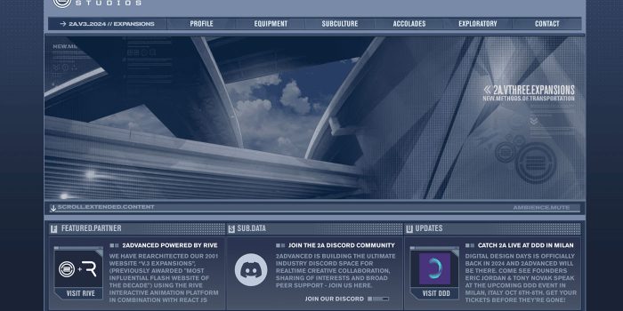
In the early 2000s, the internet was undergoing a massive transformation. Websites were no longer…
3 Essential Design Trends, September 2024

4 days ago
September’s web design trends have a fun, fall feeling … and we love it. See what’s trending in website design this month.

Excuse the pun, but let’s fall into some new design trends this month.
There are so many good things happening with website design right now. From simplification of style and brand to creating warmth with color to finding ways to incorporate motion throughout a design without feeling obtrusive, we love the concepts that designers are playing with.
Here’s what’s trending in design this month:
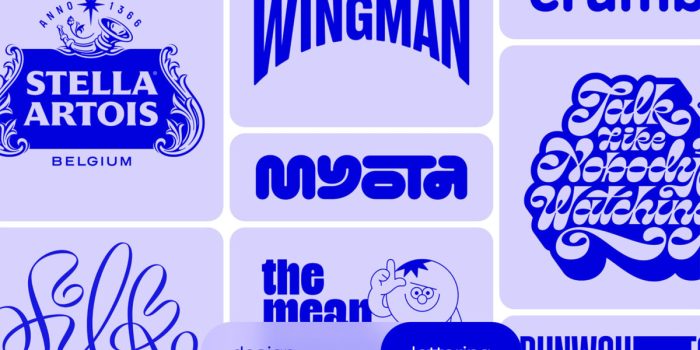
1. Super Simple Brand Marks
Simple is in when it comes to branding. Clean lines, geometric shapes, and easy-to-understand icons are trending in a major way for all types of website designs.
There are a few reasons for that:
- Simple brand marks are easy to understand; there’s nothing overly complex or visually challenging
- It’s easy to modify, animate, or play with a simple brand mark in your website projects
- This style works well with busy or more intricate overall web designs as well as simple aesthetics, making it a versatile choice
- It’s trendy, therefore luring in more designers to try this style and experiment with website projects
The great thing about this trend is that it is versatile. Designers can add an alternate, simple brand style to freshen up an existing brand or project without a full-on rebranding, and new brands can start with a simple mark.
Each of the three examples here uses different styles and effects with a simple brand mark base, showing how many options you have with this design trend.
Ross has a brand with four simple letters in a sans serif typeface. The fun factor comes in with the stretch and animation of the R on the homepage. This helps create visual interest for the brand and name when there might not be otherwise.

Trewithen Dairy
takes a different approach with a combination of typography and an icon that’s simple and beautiful at the same time. The icon is a great visual cue as to what Trewithen is if you don’t know. Add in the great splash animation for the dot on the “i” and this simple brand is superb.

Sound Ethics
combines the S and E for a great little brand mark that feels special and is interesting with the bright color choice of the website design. As with the previous examples, this simple brand mark also lends itself to work exceptionally well with a simple animated effect that feels almost like a waving flag thanks to the shape and motion of the characters.

2. Warm Color Schemes
When the temperatures drop, you want to feel warm (color)!
These color schemes are just the right match for cooler, shorter days, with hues that make you feel all kinds of comfy. While there are a variety of ways to implement this trend, many website designs seem to be using red, pink, and fuchsia hues with a semi-monotone palette. There are few other colors here besides an accent.
What’s great about this website design trend is that it can be visually stunning and disruptive. With so many stark color palettes in fashion, the full saturation of warm color will surely stop you in your tracks.
This style can work for almost any website and has complementary effects, making it an easy choice for a quick revamp.
Here’s how a few different brands are doing it:
Serious Business
uses bright pink with a fairly stark background—combining trends a bit here—with an oversized header that draws you in. The fun hover effect on the smiley face is also worth your time.

Dezea 50 Years of Waterloo uses a bright, monotone palette with all the happy vibes. While purples often feel quite cool, there’s a focus on warmth toward the center of the screen with the bright hues and a bright yellow accent. The guitar in the center also seems to sparkle, another association with warm emotions.

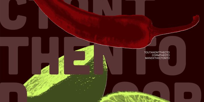
Cantina del Sol
is visually hot with a pepper and lime front and center. But the color choices also emit some warmth. This is a good example of how the overall content can make you feel something. You associate the heat and feeling of a pepper or more spicy food in your mouth with the visual elements here, creating a warm sensation all around.

3. Motion on the Scroll (And More)
Finally, designers are really thinking about engagement with motion as a scroll effect. As part of the scroll, it can help keep users interacting with a website design longer.
Many of these designs also use hints of animation in other places as well. This creates a transition between moving and still elements, making the design feel complete, interactive, and consistent.
Each of these examples uses this concept exceptionally well (make sure to click through each one):
The Software House
has a few simple moving elements on the home screen, but the real motion happens on scroll as elements seem to come to life just as you begin to look at them. This includes some images that move in from the left or right and type that slowly “typewriters” across the screen. The best little animation might be the eye-blink of the person on the homepage.

Three Sphere reserves all of its motion for below the scroll. Each new “screen” seems to have some simple motion that helps add visual interest to otherwise bland content. This can be a good technique when you don’t have much in the way of visuals.

Mia Kai leads with a home page video and follows up with more motion on the scroll with images that drop in and rotate on almost every screen. The pacing is slow and easy, and you can almost feel the slower-paced vacation lifestyle the company is promoting through the website.

Conclusion
Which of these trends can you see yourself or your company using in the near future? Personally, I’m loving the concept of warm color schemes heading into the cooler seasons. The colors are fun and lively without being too much. It’s a nice change from many of the starker styles that have been popular recently.
Happy fall, and have fun with these trends!
Carrie Cousins
Carrie Cousins is a freelance writer with more than 10 years of experience in the communications industry, including writing for print and online publications, and design and editing. You can connect with Carrie on Twitter @carriecousins.
#Essential #Design #Trends #September
Related Posts