There’s a pattern that’s haunted web design for over a decade now—one so embedded in…
3 Essential Design Trends, February 2024

Yesterday
From atypical typefaces to neutral colors to unusual user patterns, there are plenty of new website design trends to try this month.

Spring into a new website design aesthetic with some of the hottest trends of the season. Some of the things we are seeing right now are unexpected twists and takes combined with classic design styles that result in interesting and unique site designs.
Here’s what’s trending in design this month:
1. Atypical Typefaces
Forget all the same old sans serifs! Designers are making bold choices with atypical typefaces that you don’t often see in website projects. What’s lovely about this trend is that it pays a sort of homage to print design, where interesting type styles are more of the norm.
There’s no set rule for choosing a different typeface, it’s just ensuring that it works with the rest of your design and is readable on screens of all sizes.
In this design trend, we are seeing all kinds of variations from handwriting styles to simple flair with what might otherwise be a standard sans serif. In order to make it work well, these typefaces are used for display purposes and almost always paired with a simple font for the main body copy. This helps ensure readability and comprehension for users.
Parga uses a Greek-inspired typeface for its restaurant website design. The display is bold and interesting and helps support images that lack a ton of depth.

Ochuko goes big and bold with a name and title in an interesting typeface. This is especially nice because of the simplicity of the design with the high visual interest of the typeface.

Lucke has a handwriting style that feels inviting and encouraging to the user. All of the supporting typography is simple and easy to read, creating an easy and readable user experience.

2. Neutral Color Palettes
While big color has been trending for a while, there’s a shift to more neutral palettes on the horizon. Almost counter-intuitively, they are a bit disruptive because there aren’t that many of them out there.
Neutral color palettes instill a sense of visual harmony and calmness that can work great for almost any project. These colors – including beiges, browns, greens, and grays – can work nicely with almost any type of imagery, type style, or content.
The examples here show the wide range of potential uses for a neutral color concept.
IntraPan uses a brighter version of neutrals with a warm overall feel. The overall palette and background for the website design are in the same shade as the product it produces, with additional pops of color from examples of packaging. A slight animation keeps the otherwise monotone display interesting.

Ara Kara is a super stark neutral design with a beige background and black text. With a brutalist feel, this design is made specifically for reading. On the scroll, there’s some color variation but it sticks to a neutral palette with black text as well.

Code opts for the most neutral of overall displays with beiges, browns, and greys for everything including the photos. Look closely, and even the text in the top navigation bar is a shade of brown that matches the background image. A fun typography treatment is what really helps this neutral design shine with an element of flair.

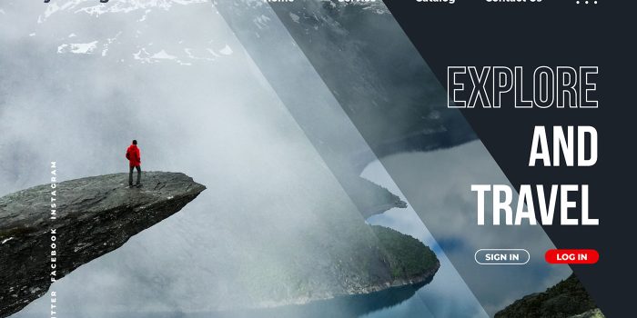
3. Unusual User Patterns
Our final trend this month is one you’ll have to click through each example to get the full experience for – unusual user patterns. Each of these designs does something a little different with the aesthetics, interactions, and even loading states.
What’s nice about an unusual user pattern is there’s something fun about the unexpected when you land on a website and it works well. (There’s also the risk that it could be misunderstood.)
The trick – and middle ground – is creating something different, but with enough common elements and cues that users are not confused about what to do, where to go, or how to engage with the design. Most commonly, you’ll see a trend like this on portfolio sites before it gets more mainstream usage because designers are testing these concepts in a lower-risk environment before deploying to client sites.
Playfora is actually a coming soon landing page for a new shopping app. The scroll action is what’s unusual here. The page just kind of moves in place rather than scrolls in a traditional manner. (Each of the interactions moves in a different way or direction.) There’s also a navigation bar that sticks to the top of the screen in front of the motion behind it. The one thing that’s a little confusing is the homepage QR code. You can’t scan that from a website unless you are using multiple devices.

Arabica Orient also uses scrolling to create unusual animation patterns. The screen seems to zoom out, then takes on a more typical scroll for the parts of the site you need to read. There are also some color changes that help signify the changes to animation types across the homepage. The good thing is the user controls the speed and stops for animation so that you can see everything you want without the motion feeling overwhelming.

Sebastian Martinez combines multiple unusual design patterns for his portfolio site. First, there’s a text-heavy loading animation that ends in what you see here. This visual configuration in itself is a bit unusual for website design with a corner image and almost wrapping text – there’s a bit of a print throwback feel to it. There are mixed oversized and undersized typefaces and then the scroll animation is something you have to experience to get the full feel for the unusual nature of how it works.

Conclusion
One of the best ways to freshen up a stale website design is with a simple tweak to a style, color, font, or image. Use these trends as inspiration to bring new life to an older project this month.
Carrie Cousins
Carrie Cousins is a freelance writer with more than 10 years of experience in the communications industry, including writing for print and online publications, and design and editing. You can connect with Carrie on Twitter @carriecousins.
#Essential #Design #Trends #February
Related Posts