If you often just obsessively nudge pixels until your sanity starts to fray... This painfully…
16 Standout Social Media Logos
Social media logos must be robust because they have to be reproduced and recognizable across multiple contexts, from giant billboards all the way down to website footers. When it comes to designing a logo for social media, simplicity wins out thanks to the versatility it offers.
Unfortunately for social media logo designers, it’s impossible to control how a logo will be used — no matter how comprehensive a brand guideline document you produce. As a result, social media icons tend to use flat colors, in addition to their simple shapes, so that they maintain brand recognition no matter how badly the design is abused.
When it comes to social media logos, there are three main approaches: some sites, like LinkedIn or Facebook, create monogram logos that rely on portions of the site’s name; some platforms opt for a friendly mascot, such as Snapchat’s ghost, or Mastodon’s woolly mammoth; other platforms lean into their core functionality, like Instagram’s camera icon or YouTube’s play button.
No matter the approach, one thing is consistent: all successful social media platforms opt for simplicity.
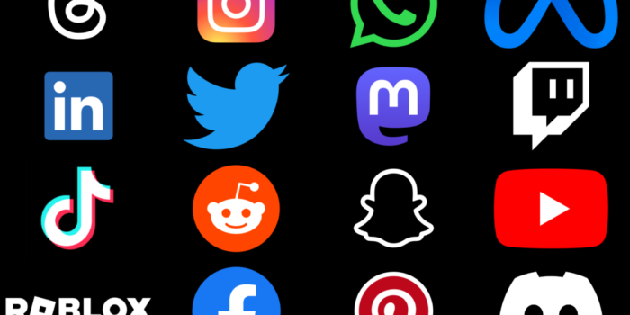
TikTok Logo
TikTok’s logo has swiftly emerged as one of the more recognizable social media logos, helping drive adoption of the short-form video app. It combines a lowercase’ t’ with a musical note framed by vibrant shades of cyan and magenta to create a sense of movement and dynamism.
YouTube Logo
Google’s popular video-sharing platform YouTube has undergone several logo changes, and it’s currently a large red ‘play’ button. The simple design tells you everything you need to know about the platform, signifying watching video content on a computer or TV. The rounded square delivers excellent contrast, helping it stand out online.
Mastodon Logo
Mastodon’s distinctive logo combines a stylized woolly mammoth and a speech bubble. The design is strong, reliable, and trustworthy, embodying the qualities the decentralized social network prides itself on. The simplicity of the brand approach is synonymous with the easy-to-use, ad-free, independent platform.
Roblox Logo
Roblox is an online gaming and social platform with a distinctive minimal logo. It features a bold, square-shaped ‘O’ which is a reference to the platform’s virtual building blocks. It’s a fun, dynamic logo that uses a simple alignment trick to create a sense of motion. Its 150 million active users easily recognize it.
Instagram Logo
Instagram’s logo started life as a skeuomorphic camera image and has gradually been transformed into a flat design. Unlike most other social media icons, it eschews the two color approach, instead embracing a multicolored gradient that emphasizes the visually-oriented nature of the content.
Threads Logo
Threads is a new text-based social app from Instagram that loops a ‘thread’ into the form of an @ symbol. In contrast to Instagram’s famous gradient, the Threads logo uses a simple black and white palette to emphasize the streamlined, functional platform.
LinkedIn Logo
The LinkedIn logo is distinctly different from the other logos in this list because it is aimed exclusively at professionals. As such, the LinkedIn logo is more reserved and less playful than other social media networks. However, it still employs simplicity to create a powerful message of inclusion and maintain its flexibility.
Meta Logo
Meta is relatively new to the social media landscape, being the newly branded parent company of Facebook and Instagram. It uses an infinite loop symbol, distorted to look like an ‘m.’ The infinite loop represents the company’s ambitions to move beyond the current internet and into the metaverse of VR and AR.
Facebook Logo
Facebook’s logo is one of the most recognized brand assets on the web, largely thanks to the 2.9 billion monthly users it pulls in. Facebook’s logo features a lowercase’ f’ that has been refined over the years to reproduce perfectly at various sizes. What it lacks in creativity, the Facebook logo makes up in consistency.
Snapchat Logo
One of Snapchat’s defining features is the transient nature of its content — messages vanish after a set period of time, making it a favorite of politicians everywhere. The feature inspired the friendly little ghost icon nicknamed ‘Ghostface Chillah’ that adorns the logo. It’s a unique and whimsical logo that’s easily recognized.
WhatsApp Logo
The WhatsApp logo is one of the most literal icons on this list and has remained relatively consistent over the years. It features an old-fashioned telephone handset inside a speech bubble. This simple design communicates the company’s core feature of a reliable and straightforward way to communicate with people.
Reddit Logo
Reddit is the place to discover what’s going on and to comment on it. Its logo features its alien mascot, affectionately known as ‘Snoo.’ Despite being an illustration, Snoo’s simple outline is readily identified online. The friendly face is a great way of welcoming new users onto the platform, helping it grow.
Pinterest Logo
Pinterest uses a simple, stylized pin icon to represent the act of pinning content to a board inside a circle, representing all-encompassing inspiration. Because Pinterest allows users to superimpose the icon on content, it has had to guard the asset carefully, maintaining brand recognition with few design revisions.
Discord Logo
Discord is another platform that uses a mascot as a logo; in this instance, the character is known as ‘Clyde.’ Suitably for a site principally concerned with gaming, Clyde also bears an unmistakable likeness to a gaming console controller. The sleek modern design scales well and is instantly recognizable even at small sizes.
Twitch Logo
The Twitch logo uses a speech bubble with eyes, known as ‘Glitch,’ combined with the word ‘twitch.’ The shape is extruded, creating a dynamic energy as if the icon were zooming into the foreground. The simplicity of the form makes it a cinch to reproduce in outlines, so it’s easy to scale in any medium.
Twitter Logo
Alas, poor Larry the bird. Twitter’s bird logo was one of the most widely recognized brand assets in social media until it was killed off by a large X as part of the controversial rebranding of Twitter into X. Only time will tell if the unprecedented rebrand will help recoup the $44 billion paid for the platform in 2022.
Conclusion
In conclusion, the world of social media is a vibrant, ever-evolving landscape painted with a myriad of logos, each striving to encapsulate its platform’s unique essence. From the playful simplicity of YouTube’s ‘play’ button to the functional minimalism of Threads’ @ symbol, these logos serve as the visual ambassadors of their respective brands. They’re not just symbols; they tell stories, evoke emotions, and foster community and loyalty among their users.
Simon Sterne
Simon Sterne is a staff writer at WebdesignerDepot. He’s interested in technology, WordPress, and all things UX. In his spare time he enjoys photography.
#Standout #Social #Media #Logos
Related Posts