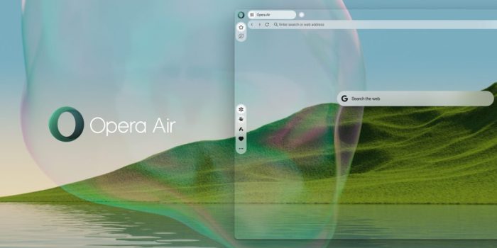
In an age where digital distractions seem to multiply by the minute, Opera has launched…

Weekly Design News #2 | WDD

Today
Every Sunday, we round up the best stories from webdesignernews.com. This issue features UX principles to improve your sites and apps, typography trends, a social rebrand, the best logos from the 1960s, and AI news. Plus, tons more! Let’s dive in!


This article discusses the most important visual hierarchy design principles that new designers need to follow if they want their app interfaces or website designs to succeed.

Whether you’re a design pro or just getting started, these principles will help you make websites and apps that people love to use.

When I showed up, I realized our local watering hole had recently optimized its experience. These changes brought some good UX tips to my attention, and I bet you can apply them to your work as well.

In 2023, the web typography world has enjoyed an explosion of creativity. Richer typefaces, 3D styles, bold fonts, and various other interesting typography trends have taken over the world of web design.

Last year, Getty rejected AI generated content and announced that it would not accept any submissions created with AI models. The company is reiterating that in an email sent to creators.

Today, the company announced DALL-E 3, its latest text-to-image generator and showed off some of its new impressive features, including the ability to generate readable text baked directly into images themselves.

As rebrands rip through the tech world, Facebook takes stock, altering its logo, wordmark, reactions and colour palette – but keeping the blue.

The goal of this guide is to give you an actionable plan of how to set up weekly user testing in an efficient way that while challenging, can be accomplished by a single designer.

Well, in this article, we’re unpacking the magic of React from a designer’s perspective, emphasizing its impact on user interface design, user experience (UX), and team collaboration.

Swirling psychedelic symbols, playful motifs and abstract icons – these are the best logos of the 1960s, as picked by designers and industry experts.

In 2019, TechRuum adopted a static site architecture, resulting in a 6× improvement in page speed but sacrificing some writing and editing bells and whistles that come with a bona fide content management system.

New technologies have long promised to make human software engineers redundant. But developers have only gotten more important over time.

Current and best practices for job seekers and hiring managers.

Who will design the next generation of readable, writerly web layouts? Who will design them? Layouts for sites that are mostly writing. Designed by people who love writing.

Substack’s app feels pretty familiar, but maybe that’s a good thing.
Louise North
Louise is a staff writer for WebdesignerDepot. She lives in Colorado, is a mom to two dogs, and when she’s not writing she likes hiking and volunteering.
#Weekly #Design #News #WDD


