4 days ago Welcome to our roundup of the best new fonts we’ve found online…

The 29 Best Free & Premium Retro Fonts (2024)
Retro fonts are typefaces that imitate and revive the styles of the past.
They’re perfect for any design project in which you’re trying to recreate the look of a specific time period, or just conjure up a sense of nostalgia.
In this post, we’ll be sharing what we think are the very best retro fonts available this year. We’ve included a bunch of free retro fonts as well as premium options from some of the world’s best typeface designers.
Ready? Let’s dive into the list.
 1")
Here’s a wonderful retro font pack inspired by Citypop—a form of Japanese pop music that was popular from the late 70s to the early 90s. It’s super cool and very on-trend right now.
Why it’s our top pick
The main reason I like this one so much is because of how versatile it is. The font pack includes 5 different styles: Citypop Main, Citypop Neon, Citypop Screen, Citypop Digital, and Citypop Automotive. Each of them is wildly different from the next with a completely different aesthetic, so there’s something for every project.
 2")
Vantage is a funky retro font that’s free for personal use. The designer took inspiration from the psychedelic, counter-culture movement that typified the 1960s, so it’s perfect for any project in which you’re trying to emulate the style of that period.
 3")
Retro Vibes is a retro font that looks super groovy, with its rounded edges and bodacious letterforms. It’s layered, which basically means it comes in two versions—Regular and Shadow—and the idea is to ‘layer’ those versions on top of each other to create eye-catching 3D-style typography designs that jump off the page.
 4")
Rambors is one of the most popular retro fonts on Envato Elements, and I can see why. I like the multiline style, and there’s something about it that captures the spirit of the 70s. It’s both nostalgic and modern at the same time with a retro-futuristic design. Keep in mind that it’s an all-caps font so you don’t get lowercase letters but you do get alternates that you can mix in to add some variety to your designs.
 5")
Klassic Style is a bold script font inspired by old-school retro posters. True to its name, it has that classic vintage look that works well on all sorts of designs, particularly fashion prints.
It comes with all the glyphs you need including uppercase and lowercase, numerals, and punctuation, as well as a bunch of stylish alternates and ligatures. It’s free for personal use only so you’ll need to purchase a license for commercial use.
 6")
Superior Aurora is an interesting retro font with a unique style. The wavy, distorted letterforms look super stylish and elegant. It’d work well in larger displays. You can download the free version of Superior Aurora directly through Behance under a Personal License, but you’ll need to purchase it if you want to use it in commercial projects.
 7")
Black Roasters Monoline Typeface is the perfect option if you want to combine that old-timey feeling with a touch of elegance. It’s a charming typeface with graceful letterforms, and it’s free for personal use. The pack comes with all the usual letters and numbers, plus a bonus package that consists of 12 coffee-inspired retro illustrations that you can use to spice up your designs.
 8")
Technically speaking, ‘retro’ refers to styles from recent history (i.e. the last 10-20 years or so)—that’s what distinguishes them from vintage fonts. So for a font to be truly ‘retro’, it should capture the essence of the early noughties. And no font does that as well as Epoxy.
This brilliant Y2K typeface from DHRMSTUDIO embodies the spirit of the millennium with its playful, cartoonish letterforms. It comes in 6 styles: Regular, Italic, Outline, Outline Italic, Extrude, and Extrude Italic.
 9")
Retrowave is a retrofuturistic font that blends elements of the past and the future. It’s inspired by the electronic music genre ‘synthwave’ that was iconic in the 1980s and mimics the kind of font you might see on SciFi posters during the era. It includes all the usual letters and numbers and comes in OTF format.
 10")
DigiBop is another Y2K retro font designed to capture the atmosphere of the ’00s digital era. Its quirky letterforms have that ‘digital’ look that calls to mind Game Boys and early computer games. It’d work well in lots of designs including posters, magazines, headlines, game UI text, and more.
 11")
Chido is a retro sans serif font that I’m a big fan of. The designer constructed it entirely of modular elements and took inspiration from the eroded edges of buildings. It’s a blocky font with thick strokes and simple yet quirky letterforms that give it a unique look. It’s also one of the few retro fonts that’s free for both personal and commercial use, which is awesome.
 12")
Retro Pixel is a retro font that was inspired by the golden era of gaming. It combines the kind of bad, pixelated graphics you might see in early computer and arcade games with a modern touch, and the result is a super unique and nostalgic font that gamers will appreciate. It comes in three formats: OTF, TTF, and WOFF.
 13")
Rousseau Deco is an excellent example of retro fonts that are inspired by the Art Deco era. It calls to mind the atmosphere of the 30s with some subtle touches and elegant curves and looks like something you might see on a Great Gatsby poster. The pack includes multi-lingual characters numbers and, of course, punctuation marks. It’s available for free under an open font license.
 14")
Serenity, by FapType, is one of the most unique retro fonts on this list. It’s highly decorative and detailed, with blocky letterforms that have a distinctive ‘squared’ appearance. The font pack includes all the glyphs you need including uppercase letters, numbers, punctuation, multilingual characters, and 45 stylish alternates.
It also includes three versions: regular, rounded, and extruded. You can ‘layer up’ the regular version with the extruded version to create a 3D effect that’s sure to make your type pop. I’d recommend using Serenity in large displays as it might not be very legible in small sizes.
 15")
Paintruck is a retro bold font by the talented designer ikiiko. It’s a very energetic font with a timeless charm and would work well in a wide variety of projects. The pack includes uppercase and lowercase letters, numbers, punctuation, and more.
 16")
Space Armada is another layered font inspired by the SciFi movies and games of the 1980s. It has a distinctive retrofuturistic look that calls to mind iconic 80s classics like Space Invaders and Back To The Future.
The designer has included nine unique versions of the font including the base font, three Outline fonts, a Wireframe font to add texture, and three Fill fonts in one pack. You can combine them in different ways for limitless creativity.
 17")
Kansei is another Y2K font inspired by the noughties, but this one has a distinctive Japanese twist. It uses the standard Latin (English) alphabet, but the letterforms are subtly designed to look like those used in Japanese scripts (Kanji, Hiragana, and Katakana). It’s a good choice for use in Japanese-inspired retro design projects.
 18")
Slow Moon is a weird and wonderful retro typeface inspired by the 80s. It’s more than just a font—it’s a complete design toolkit that comes with over 900 unique glyphs and a huge array of alternatives and ligatures that you can use to add your own personal flair and create stunning compositions.
 19")
Crafted by the gifted Bayu Suwirya, Round Light has a subtle sense of Art Deco style, even though it was inspired by the neon lights and street signs of the 90s. It has beautiful round letterforms and fine details, resulting in a pretty lavish appearance. It comes not only with an alphabet and all standard glyphs but also with a matching pattern to complete the design. It’s free for personal use.
 20")
Determination is a free retro font that calls to mind those classic, old-school video games of the late 80s or early 90s. The designer created it to mimic the font used in the cult classic Undertale. Its 8-bit pixelized letter forms make it great for projects in which you’re aiming for that ‘digital’ look.
 21")
Retro Zombies is exactly what the name says—a retro-style font that incorporates zombies (and other ghoulish characters) into its glyphs. It’s a good choice for retro Halloween projects; for example, Halloween disco invitations and posters.
 22")
KRICO is a retro bubble font. It has those curvaceous, rounded letterforms that you get with all bubble typefaces, but with an old-school twist. It’s charming, whimsical, and playful, so it’d look great in all sorts of fun design projects.
The pack includes six versions of the font—Slop, Regular, Outline, Oblique, Slop Oblique, and Outline Oblique—and you can mix and match them to add variety to your designs, or layer them up to create unique effects.
 23")
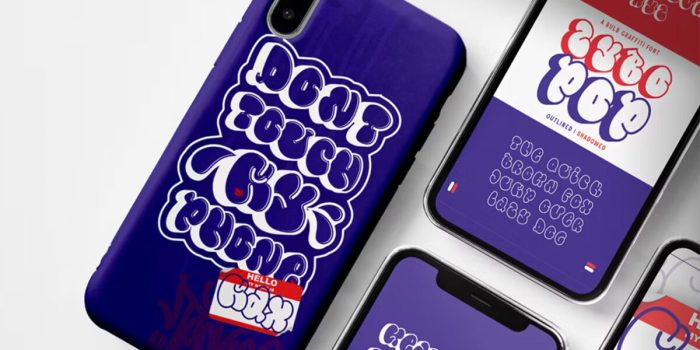
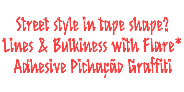
Neon Free Font by Lil Bro isn’t traditionally ‘retro’ as it features a luminescent look that wouldn’t look out of place in modern designs. Nonetheless, the typeface has a subtle retro feel as it is widely associated with the urban street American style of the 60s, 70s, and even 80s. It includes the basic Latin alphabet letters, numbers, and other glyphs. Both free and premium versions are available.
 24")
Derphace is one of the more tasteful retro fonts on this list. It was inspired by old labels and would work well in ‘sophisticated’ designs in which you’re going for that timeless aesthetic.
I like the script version of Derphace the most, but there’s also a serif version in the collection, and both come in four styles: regular, rounded, rough, and stamp. You also get access to 26 hand-drawn, retro-style nautical/pirate illustrations as dingbats to use in your designs.
 25")
Areion is another retrofuturistic Y2K font. The designer has clearly taken inspiration from the cartoons, music, and pop culture of that era. Personally, it reminds me of the font used in the ‘PowerPuff Girls’ cartoon, which was super popular in the early ’00s. It comes with all the essential glyphs and is available in TTF and OTF formats.
 26")
Obituary is more of a ‘vintage’ font than a ‘retro’ font, but as some people use the two terms interchangeably, I had to include it in this list. It’s a highly decorative blackletter font inspired by the Gothic style that was present in the mid-12th to 16th century. It’s free for personal use.
 27")
Flashy is a fun retro font that comes in two styles: Clean and Rough. I love the Rough version as it has a super unique texture that’s reminiscent of old-school comics. The designer seems to have deliberately used exaggerated ‘Ben Day dots’ to mimic the printing techniques used long ago.
 28")
Pukor is another Y2K display typeface with a retrofuturistic aesthetic. It calls to mind old computer displays, neon signs, and cartoon titles and is super nostalgic. The font includes both uppercase and lowercase letters and comes in TTF and OTF formats.
 29")
Hand Retro is a funky retro font that seems to be inspired by the 60s. It’s super groovy, with wavy letterforms and a unique hand-drawn look that’d work well in all design projects with retro themes.
Tips for Choosing a Retro Font
Can’t decide which retro font to use? Here are some tips to help you weigh up your options.
Start with the time period
We’ve included retro fonts inspired by all sorts of time periods in this post. Start by thinking about which specific period you want to evoke in your design project—whether that’s the noughties, 90s, 80s, 70s, 60s, or any other decade—and go from there.
Pick a style
Retro fonts come in all sorts of styles. There are retrofuturistic fonts, layered retro fonts, handwritten retro fonts, bubble retro fonts… I could go on. It’s important to make sure to choose a font that matches the kind of look you’re going for in your project, and that might take some trial and error.
Pair fonts appropriately
If you’re using more than one font in your design, make sure you follow best practices when it comes to font pairing.
We don’t have time to get into that in too much detail in this post, but generally, if you’re using two fonts, it’s a good idea to mix categories (for example, combine a serif or script font with a sans-serif font).
Fonts with the same proportions and x-height will often pair well together too, but try not to go for anything too similar—it’s important to have some contrast.
Oh, and you probably don’t want to pair retro fonts from different decades in the same project. For example, if your title is a 90s font, you don’t want to use a 70s font in the body content—that’s just going to confuse your audience.
Don’t forget to consider the license
In this post, we’ve included a lot of free retro fonts. However, it’s important to read the small print on the download page carefully as some of these fonts will only be free for personal use and may require you to purchase a license if you’re going to use them in commercial projects.
Check what glyphs are included
Before you get your heart set on a particular font, make sure it has all the glyphs you plan on using in your project. Some fonts might only include uppercase letters A-Z, whereas others will also include lowercase letters, numbers, punctuation marks, ligatures and alternates, multi-lingual letters, etc.
Final Thoughts
There you have it—25 of the best premium and free retro fonts to add some old-school chic to your designs.
If you still haven’t found the perfect font you were looking for in this list, check out the posts below to explore more of your options:
Good luck!
#Free #Premium #Retro #Fonts
Related Posts