October 07, 2024 Welcome to our roundup of top new tools for October. We’ve got…
20 Best New Websites, October 2024

October 14, 2024
Welcome to October’s collection of sites we like – we hope you’ll like them too.

Something we’re seeing more and more of is the ‘customizable’ site. Most often, this means a button to swap between dark and light themes, but the options are starting to get increasingly sophisticated.
In this set, we have dark and light options, images and text-only options, color changes, whole theme change options, a custom text option, and even image editing options. This type of interaction differs from event-triggered animations and transitions. For the best effect, simplicity in layout is usually best, as is the case with these examples. Enjoy!
Luxury chocolate brand Montezuma’s has updated its website to improve the user experience. The color scheme and casual typeface match the product packaging, which in turn reflects the company’s ethical brand identity.

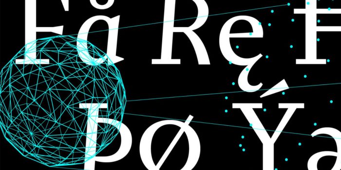
The type choices add crispness and modernity to this predominantly black and white design for Sake High. The contrast adds extra depth to the occasional color photos.

This is a fun little site with the serious intention of reducing stress. It has been established that micro-interactions and feedback make users feel good, and that is what Confetti Therapy is all about: click a button and pop some confetti from the direction of your choice.

The animation on this architectural firm’s site, particularly the transitions, makes for a really pleasing user experience. The fresh yellow accent color adds zest to the clean layout.

High quality photographs are cleverly combined with mockups to allow the user to visualize the product as it could be. Information is available but broken into small chunks to let the images take the lead.

Following Wildfire is a now sadly all too rare example of social media, technology, and good design combining to make something that is genuinely useful. Publicly available photos are scanned for signs of potential wildfire and added to the interactive map.

Sound Ethics advocates for artists’ rights and new standards for ethical AI. Their aim is not to exclude AI but to make it work for musicians and artists instead of against them. The site makes a statement with dark background images contrasted with neon yellow-green.

The pixelated images resolving to 3D models of products are an appealing feature here. On scroll animation helps to keep the user feeling engaged.

The architecture for this restaurant chain website does a good job of centralizing content that applies to all its branches – for example, menus – while at the same time allowing each branch its own identity.

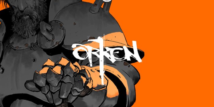
Orken is a new fantasy portrayed across different media and is due to launch soon on Kickstarter. This teaser site provides sample illustrations and video clips and offers just enough information to intrigue the user.

Cotton candy pink and smiley faces might not seem the obvious choice for an agency with the word ‘serious’ in its name, but actually, the contradiction works really well here.

This teaser page for The Cure’s new album harks back to a time when it was deemed acceptable to let users play about and discover things for themselves. It’s simple but fun and more intriguing than the usual ‘big red button’ CTAs.

This is a resource hub for Stripe developers, with videos, articles, and community links. It’s also a lot of fun. The default styling is basic black and white with highlighter highlights, but there is a console that allows you to mess about with everything that isn’t actual practical content. And play snake.

Branding agency Treize Grammes re-designed their site to meet changes they had experienced in their business. The result is well structured and indicates a high level of competence. The choice of colors and the sliding switch motif add personality and approachableness.

The Netlify platform is celebrating reaching 5 million developers with this interactive game. Each waypoint in the game reveals a piece of Netifly’s story so far.

This site for market research agency Sonder combines bright colors with crisp type and a clean layout to create a look that is confident and positive in tone.

Brutalist lives on in this visually basic but also pleasing site for design and technology studio Printer Scanner. Clicking on the logotype swaps the overall theme randomly between two dark versions and two light versions.

This is a well-structured portfolio site with a clean layout and intuitive flow. As an extra demonstration of the subject’s frontend development skills, there are options to switch between dark or light mode, images or text only mode, and color or grayscale.

Unsurprisingly perhaps, photographs are the dominant element in this site for surfer and snowboarder Mathieu Crepel. Photographs are even used for the menu instead of the usual text or icons. It’s unusual, but it works here.

The concept behind PackBags is customized bags put together from a set of components (body, strap, carabiner) chosen by the customer. The site is clear and easy to follow, and the configurator is very user-friendly.

#Websites #October
Related Posts