As regular readers will know, each month we roundup the best new designs of the…

3 Essential Design Trends, November 2023

Yesterday
In the season of giving thanks, we often think of comfort and tradition. These are common themes with each of our three featured website design trends this month.

We start with type elements that combine with motion, modern serifs that have both a funky and classic feel, and wrap up with designs featuring beautiful food. (You might even notice where some of these design trends overlap.)
Here’s what’s trending in design this month:
1. Text and Motion
Two elements that are on most websites – text and motion – can be combined to create an even more stellar interaction. While you may be thinking that moving text isn’t for you, that’s not the only option here. There are numerous ways to pull these two elements together.
Each of these examples highlights a different opportunity for using amazing typography with motion.
Alfred does what you might expect when you think “text and motion.” The hero header includes a bold layer of text that scrolls from right to left. What’s nice about this text element is that the font is highly readable, and because there aren’t a lot of words, reading in motion is a reasonable request of users.
Additionally, the moving text layer is on top of an animated video roll. While this could get overwhelming, the speed and content of each of the moving layers work together to create a nice overall package.

Skye High
uses oversized typography and lets all of the motion happen in a background layer. The design elements come together with the flying pages from the background animation coming through the letters.
This example shows that you don’t have to overdo it with motion to create a highly engaging visual.

In our final example of this trend, Solomun takes yet another approach to mixing text and motion. This design has a lot of flashing lights and fast action in a constantly moving background video. The text overlay uses a handwriting style typeface and something borrowed from print design – an overprint technique.
If you watch the video and text together, the letters allow some of the background elements to come through. While there’s no motion with the text per se, this effect, plus the background animation, creates a lot of movement and a highly engaging art element.

2. Modern Serifs
A modern serif, also known as a Didone or neoclassical serif, is a category of typefaces that emerged in the late 18th century and reached its peak of popularity during the 19th century. The key identifier of this style is the presence of both a serif and alternating thin and thick strokes for each character.
Commonly, vertical lines are thicker than horizontal lines, creating a sharp contrast that gives the typeface an elegant and refined appearance. This style is beginning to pop up everywhere with website design projects and exudes that same traditional elegance the type category is known for.
Why Collect Seashells uses a highly distinctive modern serif for “seashells” in the primary headline, as well as secondary headers throughout the design. What’s so nice about this typography option here is that it brings attention to the keyword in the headline to help you understand what the website is about.
The typeface also sets a certain tone for the design – importance, elegance, and significance. The design also uses alternate characters with the modern serif as well (note the small “L”). These features flow nicely into the images.

Manhattan Brussels
goes big with a modern serif headline that leads into an interactive timeline. This design pulls off a nice design technique that can be somewhat tricky with a modern serif due to thin lines in some of the letterforms: The text overlay is on a background video.

The design and typography for Six Eastern seems to say “go big or go home.” The brand name is in a large oversized modern serif font with an anchor placement at the bottom of the homepage screen.
A secondary text element – also featuring a lighter version of the same modern serif – is at the top center. The blue text on a stark background emphasizes the importance of the works here as well.

3. Beautiful Food
Maybe this is more of a photography trend than a website design trend, but either way, we love it. Websites for both restaurants and consumer products feature some absolutely beautiful food.
While this sounds like a no-brainer, food imagery is really difficult to do well. Even when you have great images, the rest of the design around them can wash out food photos or detract from the product itself.
None of that here. Each of these examples features beautiful food images inside an overall design aesthetic that looks like it was made for the images. Everything here looks so great you might feel the urge to prepare a snack.
Doe Donuts uses images of donuts so fluffy you can almost imagine the texture. Plus, each image layers on other textures for toppings.

Pantas Paladar
leads with the traditional white plate photo for a food item. Supporting images feature bright red and green vegetables to round out and balance the design.

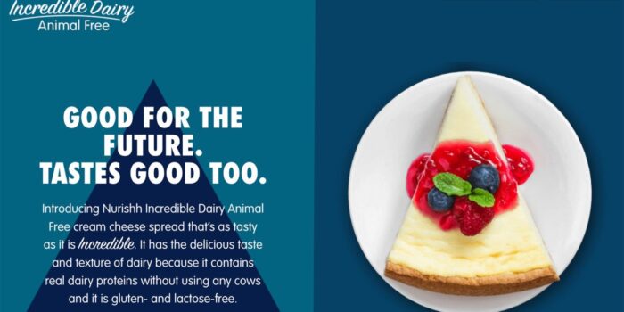
Finally, Nurishh
pairs a monotone palette to match the food container with something you might make with the product. The result is mouth-watering.
While this design makes it look easy, this combination of studio product photos and food images is challenging to do well. As you can see, though, when you do it right, the result is quite stunning. Who would have thought a website for a non-dairy cream cheese product would provide such a great visual case study?

Conclusion
While these design trends might feel somewhat seasonal because of the theme, they are anything but. All of these concepts can be applied almost anywhere for projects. The only one that’s somewhat specific is food photography.
We hope you can take away some elements from these great website design projects and make them your own.
Carrie Cousins
Carrie Cousins is a freelance writer with more than 10 years of experience in the communications industry, including writing for print and online publications, and design and editing. You can connect with Carrie on Twitter @carriecousins.
#Essential #Design #Trends #November


