Shapes play a crucial role in web design as they help craft more engaging layouts…
3 Essential Design Trends, May 2023
Here’s what’s trending in design this month.
1. Handwritten Text Emphasis
Sometimes it’s the little things that help set a design apart. One of those little things is an element of personalization that looks like someone added something special to the design just for you to ensure that you know what it’s about.
Right now, that go-to element is something in a handwritten style – circled text or words, an underline, or a font with a handwriting style. The commonality is that the element is perfectly imperfect and looks like it was added at the last minute to help you understand the design or content.
Each of these examples does it somewhat differently but with equal impact.
Envisioning Justice uses a pen stroke around the brand’s name in the copy. This could have been done with a logo, but the double circle line feels more important with added impact. That line continues below the scroll as well with a drawn arrow to help you follow the copy. (It’s used a few times.)

Joris does something similar with a yellow circle around “brands” in the main display copy. There’s a nice touch of animation here where the hand-drawn yellow line extends with a mouseover. This little unicorn is highly engaging and grabs your attention.

Zoey uses a couple of hand elements to create a combined effect here. There’s the marker style for “empathy” in the headline with a yellow underline. The brand mark also uses a yellow drawn “o” and a bit of a rough descender on the “y.” All of it comes together with a nice overall effect that isn’t too much but has just enough to keep you looking at the design.

2. Stickers
You can thank social media for this one. Sticker-style icons almost randomly placed on the screen are popping up almost everywhere.
This is a carryover from both digital stickers that are popular on social media posts and stories and real-life stickers that are on everything from laptops to water bottles. This digital element has a tactile feel because you can imagine it in reality, kind of crossing the digital life-real life divide.
It’s also a light and fun way to play with color, typography, and text elements that might not go together otherwise.
Letter Set Lab uses a big sticker-style element for its branding and in the center of the screen to introduce the website.

Readymag uses sticker elements of well-known brands to draw you into their tool. This is a prime example of how stickers pull together a lot of things that could otherwise be a bit of a mess with so many colors and fonts.

Frank Reichard uses animated stickers for his portfolio to create visual interest. Each sticker bounces onto the screen and then finds a static landing spot. The only miss here is that each one isn’t interactive. (Wouldn’t you like to know more about that cute dog?)

3. AI Models
Much of the conversation about everything in the tech and marketing spaces centers around artificial intelligence. Are robots about to take our jobs?
These projects use AI-inspired models to highlight that they are forward-thinking. What’s interesting is that so many of these models look incredibly similar. There are other commonalities with this website design trend as well:
- Minimal aesthetics with plenty of open space
- Not much typography and with a futuristic flair
- Dark color for AI models so they aren’t fully identifiable
- Connection to brand or business with AI
- Used for smaller websites without a lot of pages
The challenge with this trend is that many of the AI models seem to look similar. (Why are so many female figures?) And what does AI look like? There’s an odd humanization happening in these designs to make the computer models into people, but not so much so that they are real. This may be a design element that we continue to struggle to figure out for some time in the future as these projects grow in popularity.
Here’s a look at the three examples.
AVA‑X uses the least human-looking model to highlight their business, which is AI-based. She spins and moves with scrolling like a mannequin.

Mugler has a more glass or liquid-like AI model for the company that does NFTs. Again the model is in the background and not super clear; she’s human but also very robotic.

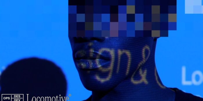
Locomotive uses actual people but with digitization that makes the video reel feel like a scene from a sci-fi movie. The mix of reality between AI and reality is interesting and feels like the right vibe for this company, what they do, and how they are trying to position themselves as forward-thinking.

Conclusion
How often do you look at website designs and think about what may have influenced them? Often website design trends are visual representations of the world around the designer at the time. Design and art as far back as you can go have these ties.
The beauty is that this connection is what makes something super trendy. The challenge is that it can also date the aesthetic if the element or idea fades quickly.
Carrie Cousins
Carrie Cousins is a freelance writer with more than 10 years of experience in the communications industry, including writing for print and online publications, and design and editing. You can connect with Carrie on Twitter @carriecousins.
#Essential #Design #Trends
Related Posts