As regular readers will know, each month we roundup the best new designs of the…

3 Essential Design Trends, July 2024

June 24, 2024
Add some summer sizzle to your design projects with trendy website elements. Learn what’s trending and how to use these styles.

The dog days of summer are here. While for some that means packing for vacations and spending time away, it can also be a great time to hunker down inside with cool air and work on projects. This month’s design inspiration should help you get in the mindset for the latter with some fun tricks and techniques to try.
Here’s what’s trending in design this month:
1. Interactive E-Commerce
Shopping and e-commerce sites don’t have to have the same old look and feel. You can mix it up with interactive elements and modern design touches to give users a full experience when looking at your product lineup.
There are many ways to sprinkle in interesting visual elements for an online store. The key factor is to remember that the conversion still needs to be easy. So, interactivity is good, but only as long as customers can still make a quick purchase.
Each of these designs takes a totally different approach to interactivity, and they are “ranked” from easiest to accomplish to most complex.
Shibumi Shade uses plenty of animation to grab your attention and show the product in a real environment. The wind-powered beach cover company uses video and an animated scroll to both show and tell about the product in a fast-paced way. Most users can see at a glance if this is the item they are looking for and click the shop button to make a purchase. This concept works best for an e-commerce site.

Enjoy uses full-screen, rolling, parallax animation to keep users scrolling through the design. Almost every element of the design includes some kind of motion – up and down, left and right, user experience elements popping into the viewing area. While it sounds like a lot, click through this one and see for yourself, it seems to work. Motion is timed to your scroll, giving users control over speed and function here. This design could work for almost any type of online store and then click you over to individual product pages.

Totem is the most immersive interactive experience in our trio of designs in this category, with full customization options. This works because of the high-end nature of the product—an automobile—and consumers’ expectation of customization. With a ton of available options, highly interested users will spend a lot of time with this site, working through their customization options.

2. Text Only Hero Headers
On the other side of the spectrum from the interactive website design above is a look at how to take a more minimal approach that still makes a strong impression. In this design trend, the hero header image is primarily text, but not just any text element; these are large, oversized text elements designed to be a focal point.
There are many different ways to do this, and different combinations of graphics, color, and animation can contribute to overall effectiveness.
Kolibri might be the biggest and boldest of these examples. Bold text paired with graphic shapes in a bright color demands immediate attention. You will definitely find yourself looking at this design. What’s very nice is the portfolio site uses the same clean typography with a hint of animation on the scroll to continue the theme until you begin to see some smaller images.

New Glyph uses an expected type-based approach for a typography house. What might be most interesting here is that the font and its options and styles are showcased in a rotating video. It’s visually interesting and makes you want to dive in even though the rest of the design is rather stark.

HJM Studio
almost seems to combine the effects and techniques of the two preceding examples. With oversized bold typography, the brand name is quite in your face. The stark black-and-white combo may also feel somewhat harsh at first, but it is softened by the circle animated element that moves across the screen with your cursor. The color change effect here is also quite nice.

3. Super Search
For large sites with plenty of content or options, “super” search features can be great for users and your website analytics. An oversized search bar or functionality can clue users into how to find what they are looking for quickly. It can also provide your marketing team or site administrators with plenty of information on what people are looking for to help shape decision-making.
These super search bars are often found on the homepage or in another prominent location that’s easy to find and use.
Search bars can be completely open-ended or include some options or prompts for users.
From a design perspective, search boxes are often on top of another visual element, such as a photo or video that shows users an idea of what they might be looking for. For that reason, search boxes often have a simple design that creates separation from the background. Most commonly, you may see these with a white or dark design, but that is not always the case, as you can see in the first example below.
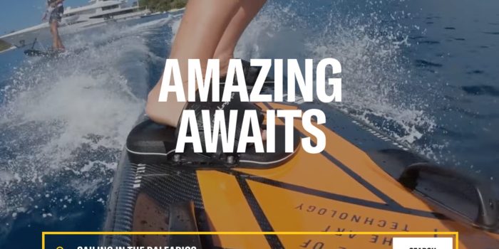
Y.CO emphasizes search with an interactive search box that shows potential search terms against a highly engaging video background. What’s interesting here is that the super search bar is in the style of a ghost button with a clear background. Thanks to strong color for the border and a thick typeface in the search bar, making the query easy to read.

Move Hotels uses a rather common option for the hospitality industry, with a large white search bar paired with additional preference boxes. Everything is clean and easy to read and understand on top of the background, which contains a mix of still and video imagery.

Roanoke Outside
uses the more traditional open-ended search option on top of an engaging adventure video. In terms of function, this search is “smart.” It shows results as the user types a query, making it highly usable.

Conclusion
One of the key themes across all website design trends we’ve explored this month is interactivity. Whether through video, text, or animated effects, users are coming to demand more interactive features that add value to their journey.
When creating these elements, make sure you design with users in mind to create the best user experiences possible.
Carrie Cousins
Carrie Cousins is a freelance writer with more than 10 years of experience in the communications industry, including writing for print and online publications, and design and editing. You can connect with Carrie on Twitter @carriecousins.
#Essential #Design #Trends #July


