What you can incorporate in a website design can have a definite impact on its…

20 Best New Websites, September 2023

3 days ago
Are you in need of design inspiration? Are you looking for the best websites designed in 2023 to pull ideas, techniques, and trends from? Do you just love web design and enjoy seeing what’s out there? Whatever your reason for being here, welcome!

Every month, we pull together this roundup of the very best in the field of web design. This month, there’s color everywhere, a new trend for low-fi graphics is emerging, and designers are borrowing heavily from fashion marketing.
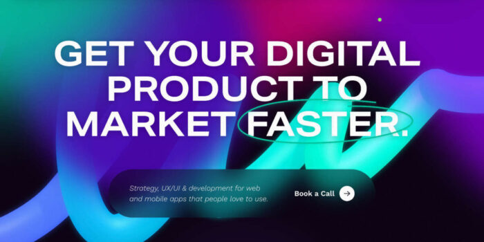
Few is a digital agency with an enviable client list. Its site features luminescent gradients and is focused on the experience of working with its flexible team structure. There’s nothing extraneous here, just a clear, appealing pitch.

Ever wanted to explore the hidden parts of the city without getting lost, burning through cash, or missing the best bits? Old Riga Kvest allows you to do just that in Riga Old Town with an innovative, gamified online tour of the Latvian capital.

Giopato & Coombes makes some of the most beautiful lighting products you’ve ever seen. Its site features clever, subtle effects, such as the filter applied to its logo, the subtle parallax effects that introduce its imagery, and the delightful text fades.

CoLabs builds and runs collaborative biology-orientated science labs, like co-working for laboratory science. It uses exceptional macroscopic video and vibrant natural colors to highlight its specialist field.

If you’re more of a maximalist than a minimalist, then check out this excellent site for Vicio. It uses the clichés of a fashion brand to promote a Spanish fast food brand.

Another creative company adopting the language usually reserved for fashion houses is Copenhagen’s Spring/Summer. It has an awesome collection of work on show, and we love the boldness of that vibrant red.

As soon as you set eyes on Nick Levecchia’s site, you know you’re looking at a professional photographer. There’s a wall of thumbnails that invite you to click through into individual stories. What more does a photographer need?

This fascinating site explores the history of ÖBB, Austria’s federal railways. It’s not a subject that sounds engaging, but taking a digital ticket for a different time period takes you on a journey that is unexpectedly engrossing.

Le Fruit is a French creative agency with a colorful and exciting showreel. Distinctly Parisian, its work is fun to browse and packed with amazing art direction. Click through the showreel to the main site and discover a modern take on Brutalism.

Huge is a creative agency that works with huge clients on huge campaigns. Its site employs Pantone’s color of 2023, which is hardly surprising as it helped launch it. It’s an enticing pitch if you have millions in your budget.

Non-Standard picks up on three popular design trends: glitchy motion design, dark mode, and a neo-brutalist approach that is very popular with design studios this month. It’s a confident, no-nonsense approach.

Tiles is a bio-builder that allows you to create a simple landing page for yourself with all of your links. Its site does a great job of previewing the variety that is achievable with such a simple concept.

Knith sells gorgeous handmade homeware, from blankets to spoons, from this playful ecommerce site. There’s a distinct sense of character, and the typeface employed throughout the site is a bold choice that really embodies the specialist approach.

The Mellon Foundation offers grants to organizations working in the arts and humanities. It uses rich pinks to highlight its non-profit status, avoiding the typical NGO style in favor of simple blog-style reporting of its success stories.

Tactic does something clever with AI and customer metrics, but what we’re interested in is the beautiful use of gradient on its homepage to create a sense of power and depth. Gradients work so much better when used as a metaphor.

The Multiverse Summit was a two-day conference experience focused on Web3 gaming. Its site features glitch-effect video, abstract animation, and some incredible UI details, not least the blur-in thumbnails.

More neo-brutalism, this time from design agency Artifact. We love the 90s-style pixel type and the decorative grid on display; it hints at the strategic decisions that take place unpinning the glossy design work.

The Workshop is described as an experimental space for building and scaling digital products. It’s a simple landing page with an awesome 3D logo that expands and then bursts into thousands of colored balls. It says very little but is incredibly memorable.

Deel is a global hiring, HR, and payroll app. Its site is designed to be fresh and multicultural whilst also appealing to modern corporations that expect reliability and transparency in addition to the energy and innovation of a startup.

Future London Academy’s free design leadership webinars adopts the popular pixel trend and packs it with color, making the site feel like a Mario game. If you’re interested in creative leadership, the videos are well worth your time.

#Websites #September


