Spring into action this season with new tools to boost your workflows, facilitate creative thinking,…
20 Best New Websites, October 2023

Today
Looking for inspiration? Well, look no further: here is our round up of what’s caught our eye for October.

The Bento trend is still going strong: In some cases, we see this extend to the layout, but many more are picking aspects of the Bento aesthetic and mixing them in with other layouts.
Rounded corners and colors ranging from pastels to stronger, candy brights are a popular combination. Often, color is kept contained within the rounded boxes as accents, or for emphasis, and the rest of the design is simple black and white.
The result is a modern, positive feeling look that also provides a calm, comfortable experience for the user, where everything feels well ordered without seeming too rigid. Smooth interactions and pleasing transitions add an extra layer of detail.
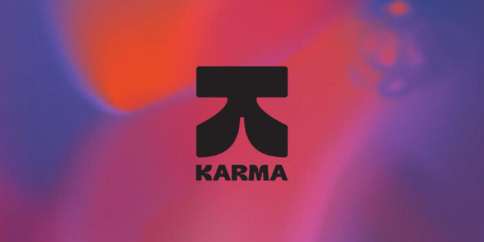
Tux Karma is a foundation set up by creative agency Tux, to support projects serving social and climate justice. The site is bold, with bright, liquid backgrounds, and multiple display typefaces. There are some nice animated interactions too.

Dark backgrounds, fine type, and muted color product shots all combine to evoke a sense of sophistication, while the black and white photography adds intimacy.

Outline’s portfolio site is beautifully simple and clean. A well spaced grid allows for easy navigation through featured work.

Basic black and white allows the product packaging colors to pop (pun definitely intended) here. A nice touch is the ‘screensaver’ that cycles through the can colors if you unfocus the browser window.

Nurishh is an animal free cream cheese, which is pretty amazing. The site for it exudes confidence with strong colors; it is fresh and modern and doesn’t feel niche.

Ascon System’s site uses coral as an accent color, in a predominantly black and white design. It’s a pleasing variation on the black and white with primary accent look, that results in a softer, more personable feel.

Bitesized have created this site for subscription based design services around a fast food theme. The concept is well executed, with bold colors and good display type.

Electra make car charging hubs and their website screams modern and clean, albeit in a quiet, understated manner. Rounded corners and smooth, animated interactions are the key elements here.

The use of geometric shapes forming and reforming different symbols is a nice detail that helps bring a largely corporate site to life.

This is a personal site by Tokyo based web designer, Prism. It is a rather pleasing experiment mixing sound with animated interactions. The aesthetics are very simple, keeping focus on the animations.

Design studio Method has filled its Bento box with sugared almonds. Pastels and curved corners create a modern and positive feel here.

The use of photography in this website is well executed to create an aspirational vibe. Tone-on-tone color on the individual product pages is refreshing and positive.

This site for creative studio Pinch exudes confidence with its bold use of bubblegum pink. The multicolored screen transitions are a nice touch too.

The Malin describes itself as a ‘work-focused members club’. Essentially, it’s co-working space but a pretty high class version. Great photography and clear presentation of information combine well to get the user interested.

This site for porcelain retailer — and institution of Manhattan’s Chinatown — Wing on Wo manages color really well. It is colorful without being overwhelming, and the colors used enhance rather than compete with the color of goods on sale.

Sometimes it’s nice to a showcase piece that feels like it has a purpose too. This one by Revelatio design studio, is well designed and the scroll animation and masked images are well executed.

The Journey is an immersive experience from luxury super-group company LVMH. It highlights the group’s embracing of technology for the future, and is all dreamscapes and neon.

Mirage is a massive sculpture/installation made from glass that has been produced using sand from deserts all over the world. There is clear, simple navigation and all text is kept well away from the beautiful, full-page images.

This single page site announcing early access for new app Noshly leans into the Bento trend with rounded boxes and candy color palette, but the eye-catcher here is the hero video with the logo type layered over it. It’s one of those actually quite simple techniques that looks really impressive.

You would hope a school of design and visual communication would have a good website. This site for Istituto Palladio in Verona certainly gives prospective students confidence that they know what they’re talking about.

#Websites #October
Related Posts