As regular readers will know, each month we roundup the best new designs of the…
20 Best New Websites, June 2024

June 10, 2024
Arranging content in an easily accessible way is the backbone of any user-friendly website. A good website will present that information well while conveying a coherent brand identity. A great site will go one step further to create an emotional response in the user.

In this collection we have some great examples of how different elements can be used to create such a response. Color is always effective in this respect when used well, but we can also see how important the choice of typeface can be in producing a particular effect on the user.
Strategy and creative agency Beech has recently repositioned to work exclusively with not-for-profit and for-purpose organizations. Its new site has a strong, modern feel that matches simplicity with bold color.

The 855-HOW-TO-QUIT helpline uses opioid imprint codes as phone extensions. The site is minimalist in style, with aspects that reflect the physical attributes of pills, such as the shape of menu buttons, and speckled backgrounds.

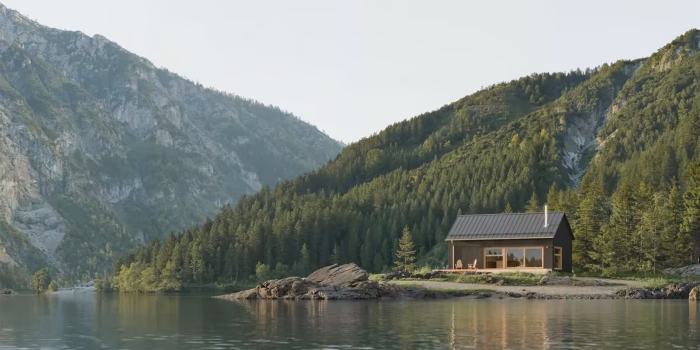
This site for a holiday rental home in rural Montana does a great job of creating a welcoming impression, while also conveying the beauty of the landscape.

Deeper Japan is a travel company that focuses on customized, authentic cultural experiences. The white and soft gold color scheme is muted, allowing the carefully curated images to stand out.

Pinks and purples might not seem the obvious choice for a quantum computer company, but here they add approachability to something most of us would find more than a little technical.

The striking color choices and hero image reveal on the home page set an appropriate tone for this site offering business leadership coaching.

Daylight Computer is a new tablet that claims to be healthier and kinder to use. Rounded corners, soft colors, and a pleasing display typeface with just a slight flare, work to emphasize this.

This simple, single page for Coding Bio makes great use of abstract illustrations to represent its work in the engineering of immunotherapies, without getting bogged down in technical detail.

Design Office is the newly launched design arm of creative agency Motion Sickness. There is a playful feel to this page, and the client/designer translator is particularly fun.

Q-Industrial makes paints and coatings for industrial use. Black backgrounds, a 3D animated logo, and clean navigation create a glossy feel to its site.

In order to demonstrate how its technology can help transform agriculture, CleverFarm has produced this interactive, virtual guide. The depth of information provided is good while still remaining clear and easy to navigate.

Creative studio Kuya makes a bold statement with its blue-on-white site. Primary color illustrations add even more punch, while work is given space to stand out.

This site for the Economic Development Partnership of North Carolina conveys both professionalism and approachability. The color scheme helps to achieve this, but the key element is the choice of display typeface.

Pilote Paris’ homepage uses infinite scrolling of layered images to create what could be described as a user-controlled showreel. In contrast, the rest of the site keeps things minimal.

This site for amaretti and mandorlotti producers Sapori e Natura di Calabria follows the current fashion for red as the dominant color, paired with a warm off-white for a modern feel.

The green and pinky-brown color scheme for Soller Tennis Club would be pleasing in itself anyway, but it is doubly so here because it alludes to the different tennis court surfaces.

This site for interior and furniture designer Patrick Bernatz is very simple, with some lovely detailing that sets it apart. In particular, the animated background suggesting tree branches in a breeze is very evocative.

There is no color scheme as such in evidence here, instead abstract blocks of multiple colors add interest without overwhelming.

Parisian coffee roasters White Coffee has gone for a sophisticated, pared-back look with dark grey rather than black, and neutral-toned backgrounds for product shots.

UKF’s site has a retro feel with its slightly blocky display type, alternating white on black with black on white, and abstract line illustrations.

#Websites #June
Related Posts