What you can incorporate in a website design can have a definite impact on its…

20 Best New Websites, July 2023
In the Summer months, it’s normal to see website trends diversify, with different sites moving in different directions. That holds true in this month’s collection, but for one growing trend: horizontal scrolling. Expect to see more of that in the coming months. Enjoy!
Diversify
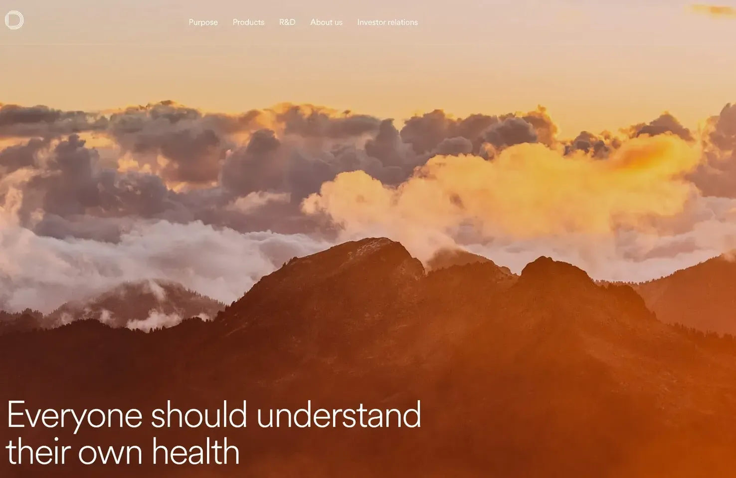
Diversify is a medical research company seeking to transform consumer health. Its website is slick, well designed, and clearly introduces a highly complex subject, lending credibility to the organization.
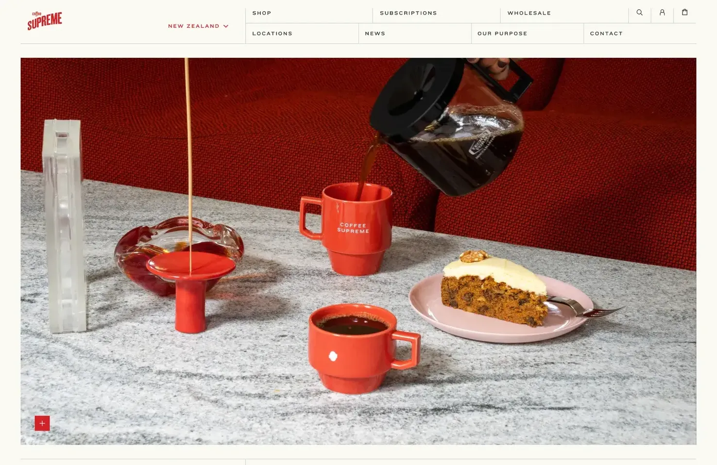
Coffee Supreme
We don’t spend enough time designing original sites; everything is too regimented. Coffee Supreme bucks that trend with a site that manages to feel both retro and contemporary.
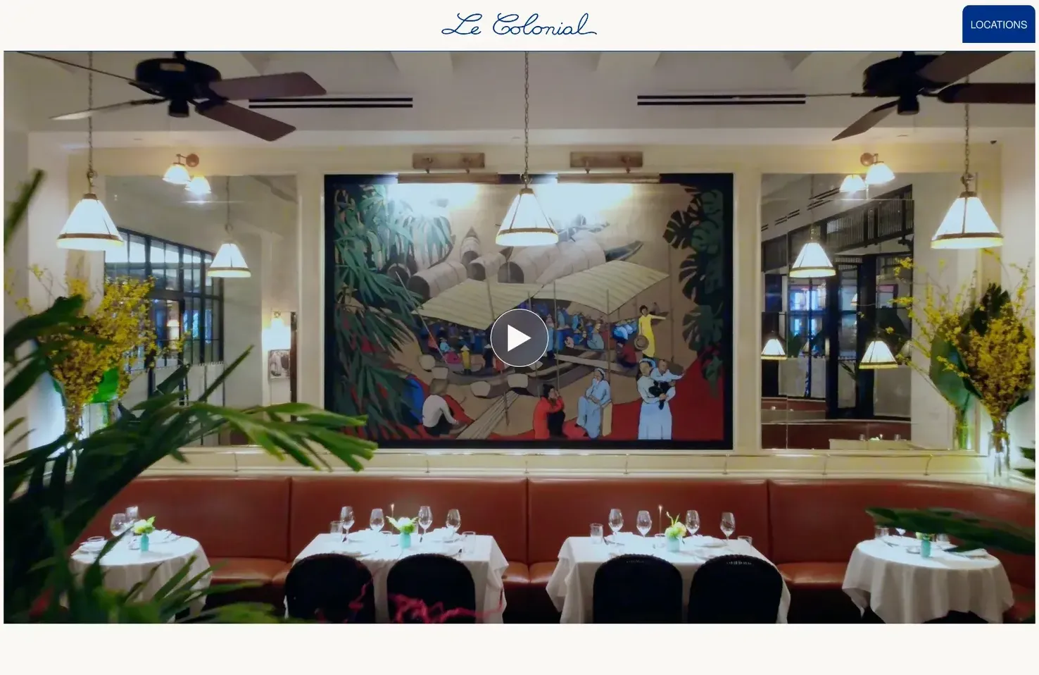
Le Colonial
Le Colonial uses different shapes as masks to break up the grid-like layout of its site. Different interior styles are combined with a carefully considered color scheme and refined typography.
Props
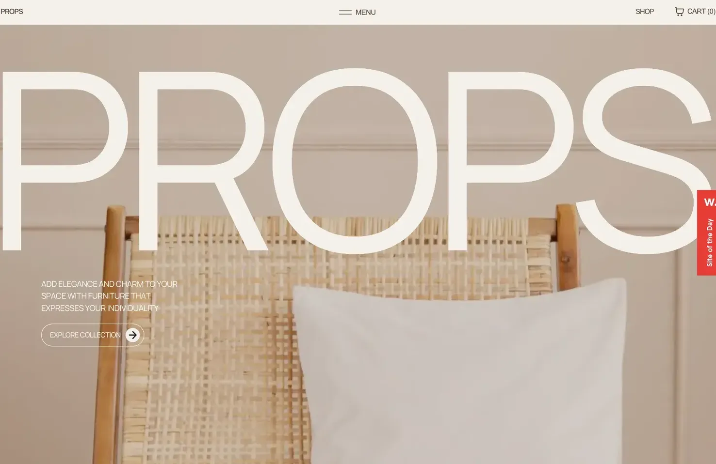
Props is an excellent furniture store offering modern designs. Its site is suitably sophisticated, with incredible product shots and horizontal scrolling, making browsing the range an enjoyable experience.
Saint Urbain
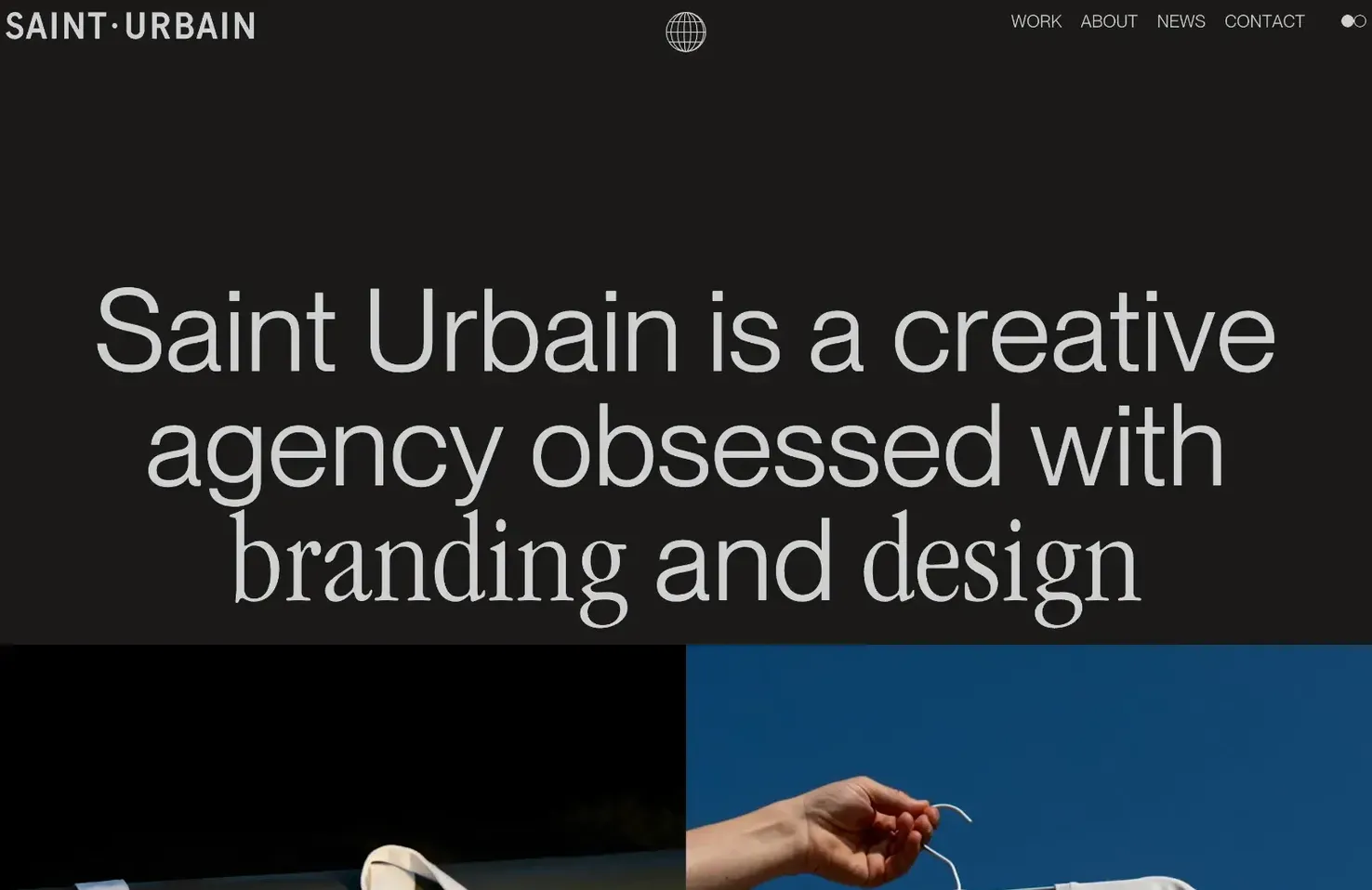
Saint Urbain is an international branding agency based in LA, NY, Montréal, and Mexico City. Its site showcases its best work, with thoughtfully placed text to guide you through the experience.
Manuel Moreale
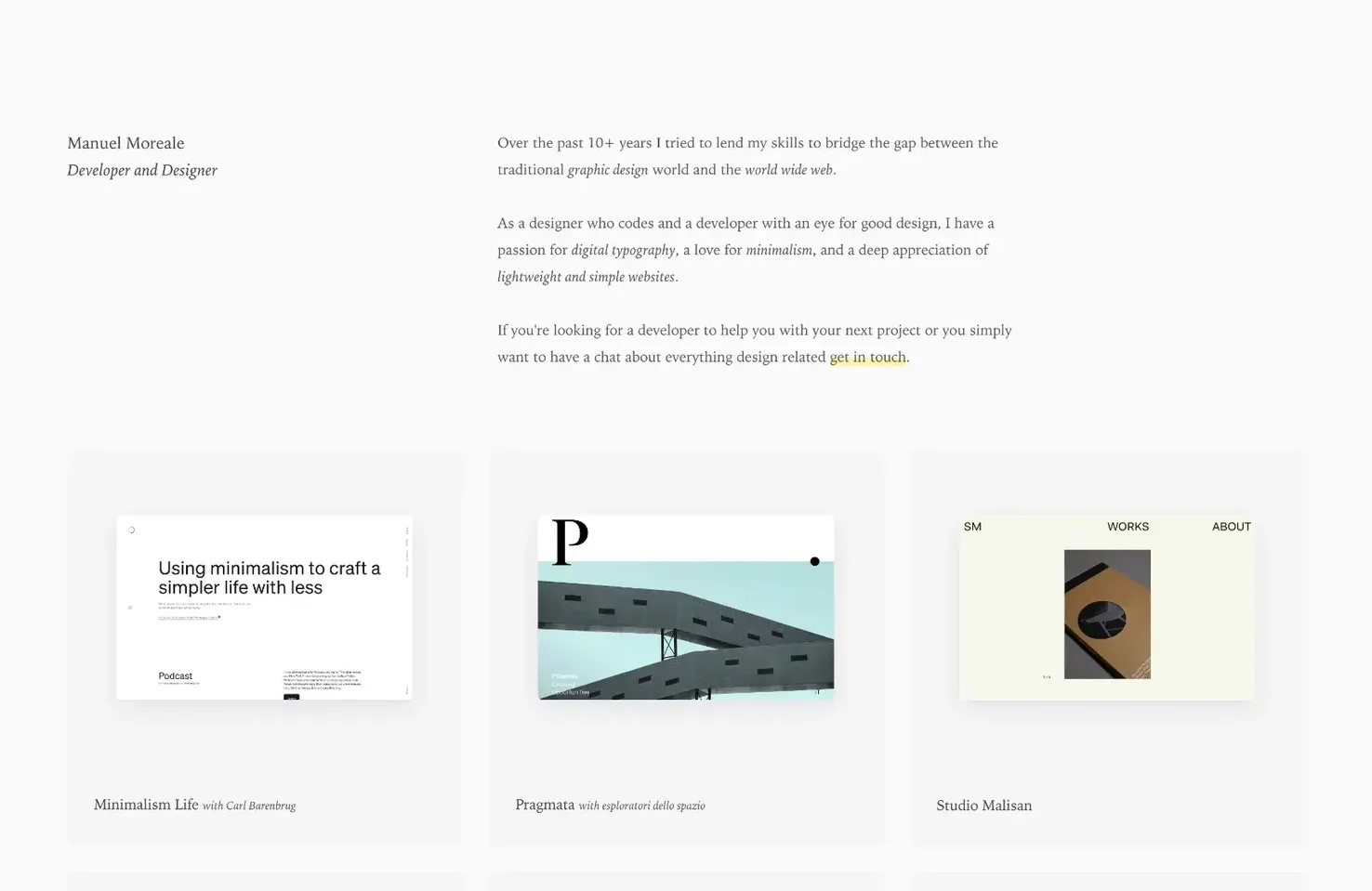
The portfolio of Manuel Moreale is a minimalist delight, using subtle grey cards, and highly-detailed typography, to create a sophisticated look that entices a great range of clients.
Garonzi
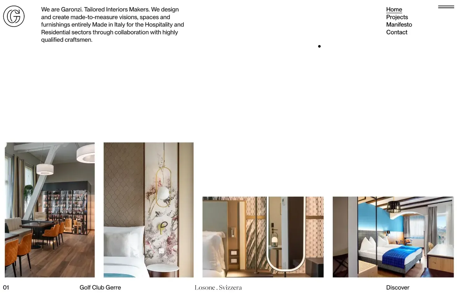
Garonzi’s excellent site uses a horizontal scroll with a sheer effect to enliven a case study slideshow. Tapping through into one of the case studies is immersive and thoroughly engaging.
Beam
Beam uses a monotone color palette and strong graphics to create a sense of strength, simplicity, and architectural interest. It’s a bold statement for a financial investment company.

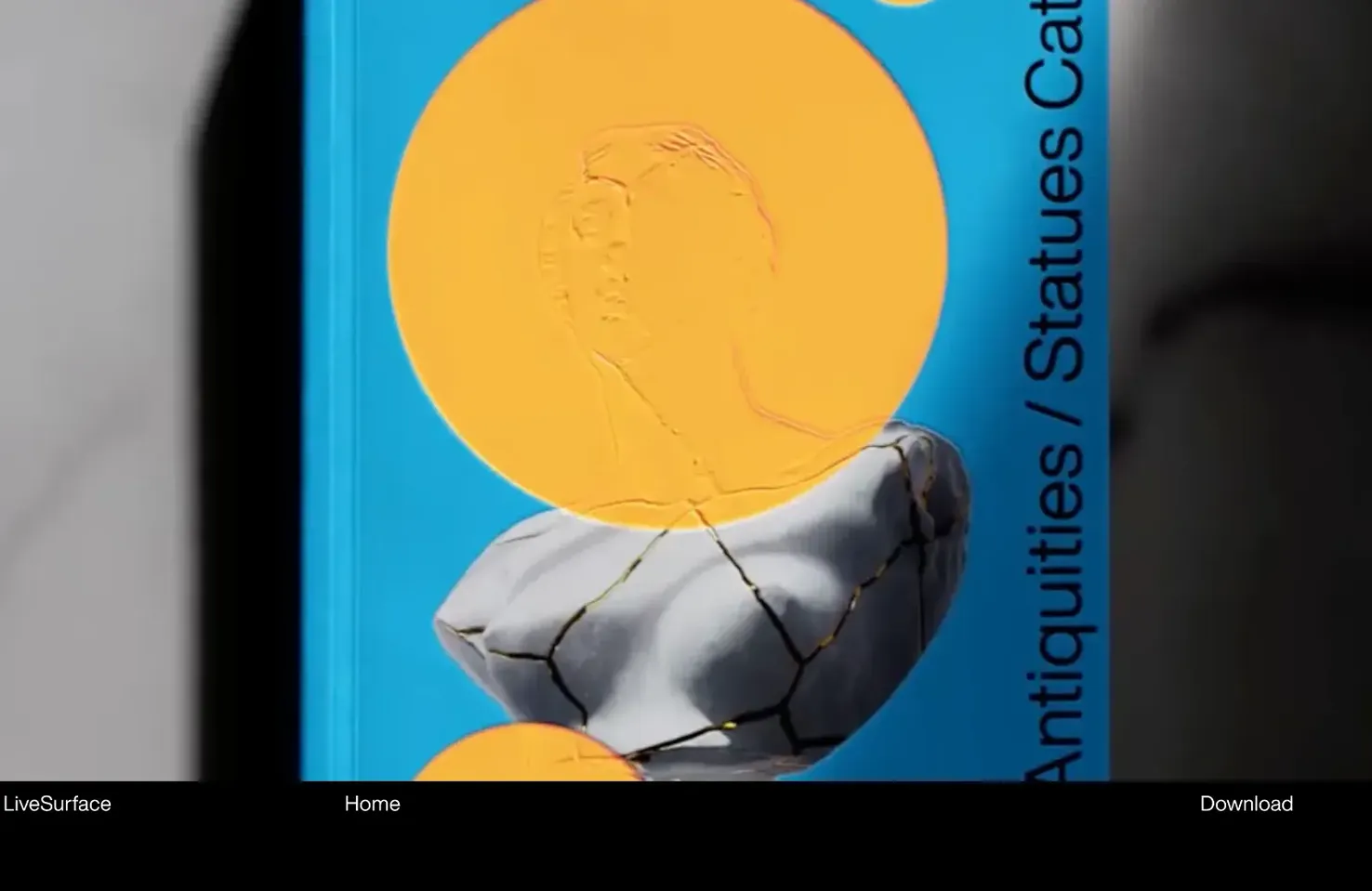
LiveSurface
LiveSurface is an awesome app that lets designers preview their print designs in realistic mockups. Its site shows off the software’s full capabilities with huge full-screen videos that demand attention.
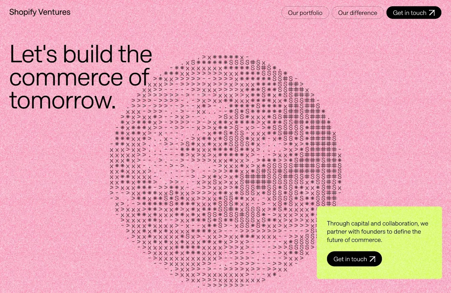
Shopify Ventures
The Brutalism trend just won’t die. This new site for Shopify Ventures is dedicated to Shopify’s plan to invest in companies that are defining digital commerce. It’s brave to embrace a trend like this.
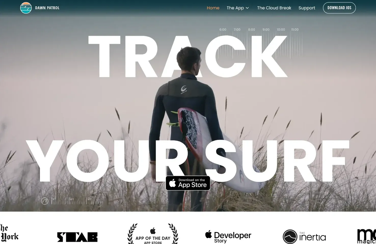
Dawn Patrol
Dawn Patrol is an app for surfers that transforms your Apple Watch into a surf-tracking device with wave counting and distance. Its site does a great job of explaining it all to a non-surfer.
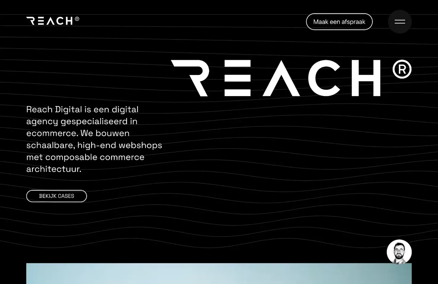
Reach Digital
Reach Digital is a design agency from the Netherlands specializing in high-end eCommerce and boasting an awe-inspiring client list. There’s a horizontal slideshow of case studies that’s worth checking out.
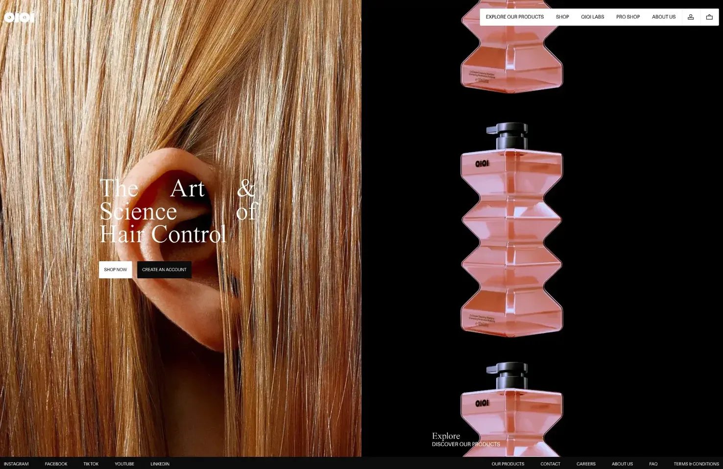
QIQI
QIQI uses an infinite horizontal scroll with fantastic photography and animated product shots to sell its hair control products. The style continues throughout the site and not just on the landing page.
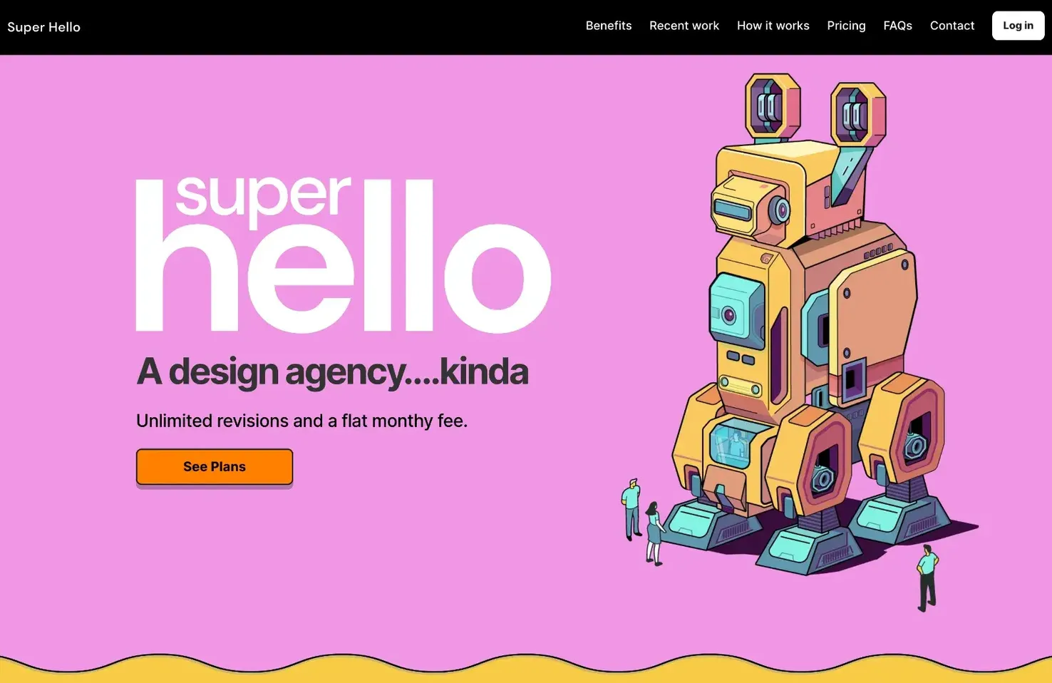
Super Hello
Super Hello is a design agency selling design services for a flat monthly fee. Instead of showcasing work, its colorful site is focused on explaining its pricing and business models.
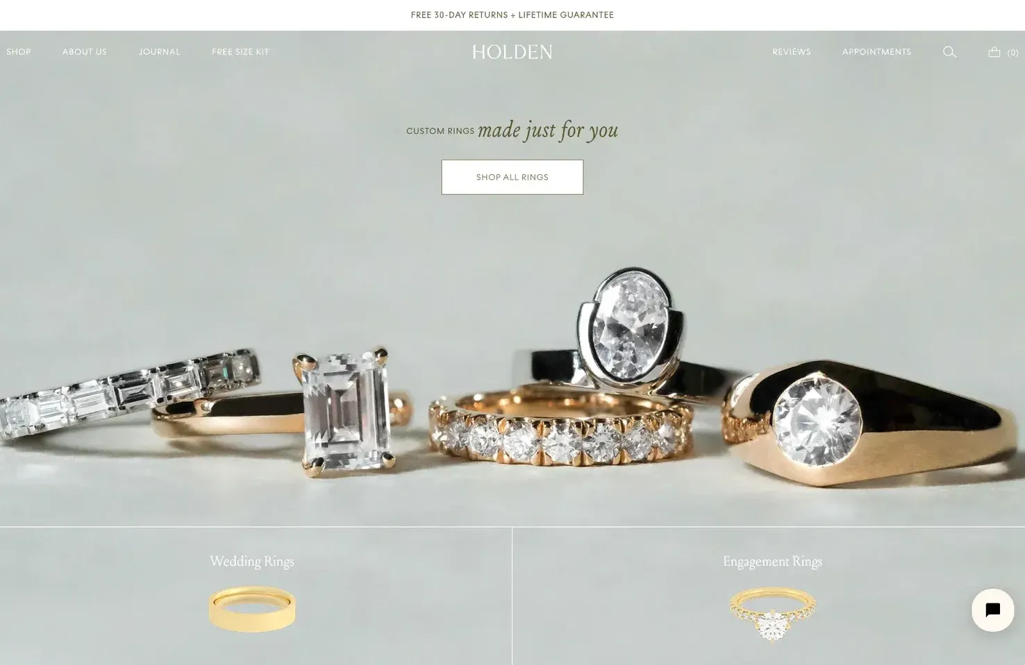
Holden
It isn’t easy to make a website for jewelry that is practical and appealing, but this site for Holden manages it. The ethical jewelry is climate neutral, gender-neutral, and the website reflects those values perfectly.
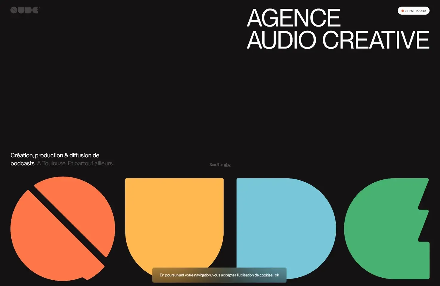
Qude
Qude is a creative audio agency specializing in the creation of podcasts. Its excellent minimal branding is central to its site, and there’s far more text than a creative agency typically uses, all thanks to the nature of its work.
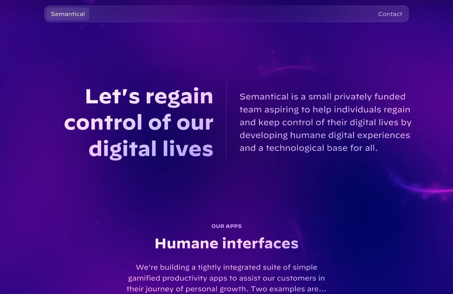
Semantical
Semantical’s site uses a 3D effect combined with a gradient to enliven a tombstone layout. The transparent layers add to the modern app feel, and there’s a control to reduce the resolution of the 3D effect, should you need it.
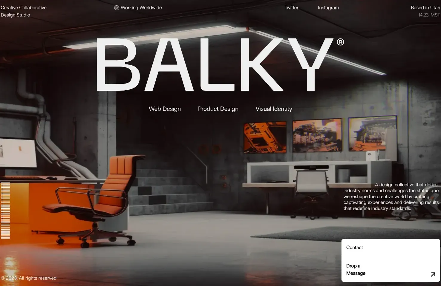
Balky Studio
Balky Studio is a design agency that — if its site is to be believed — works out of a nuclear bomb-proof bunker. The austere industrial chic is an excellent basis for the fun distortion effect that’s triggered by your mouse.
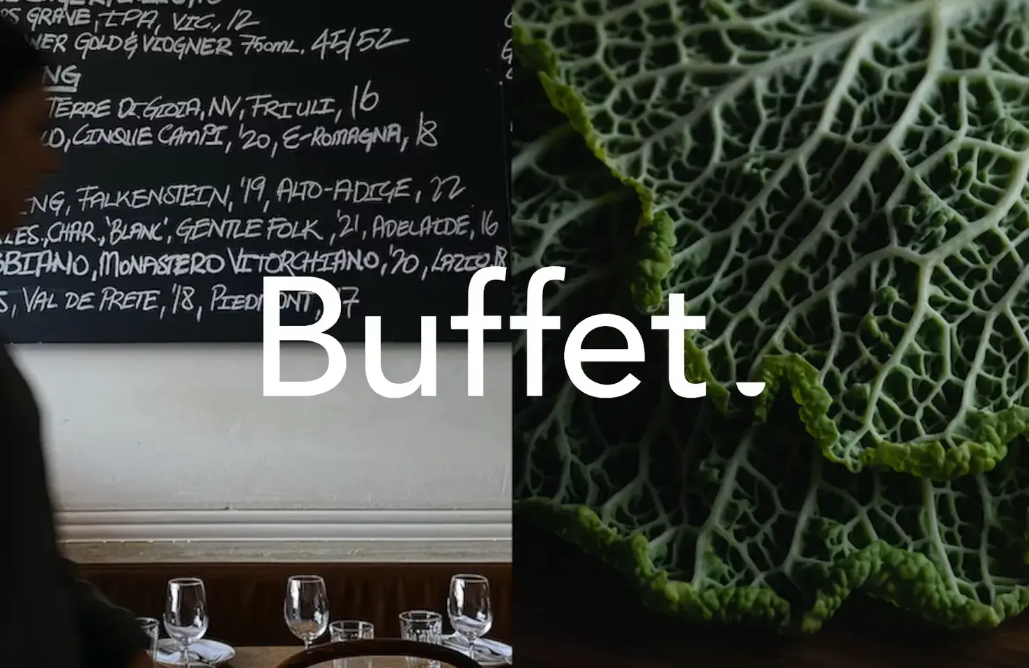
Buffet
Buffet is an Australian digital design agency. Its portfolio site presents a selection of case studies, and rolling over their titles with the out-sized mouse cursor presents each one visually. The typography is bold and refreshing.
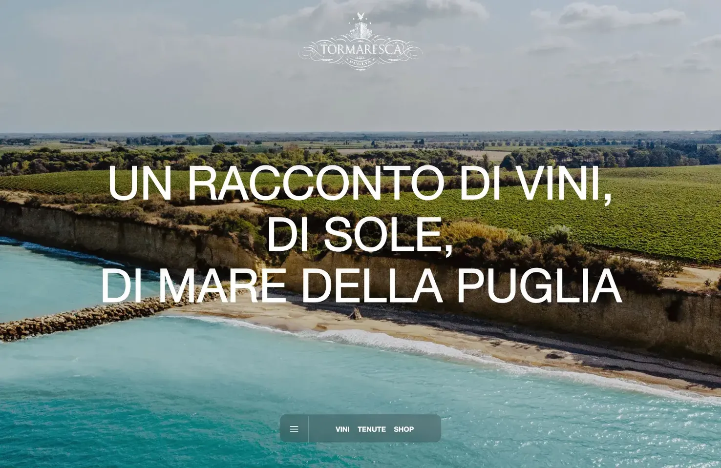
Tomaresca
Tomaresca is a simple site for an Italian wine brand. It’s designed to work best at mobile viewports, perfect for when you’re checking out the brand in front of a bottle in the store.
#Websites #July
