Spring into action this season with new tools to boost your workflows, facilitate creative thinking,…
20 Best New Websites, January 2024

4 days ago
Welcome to the first best sites collection of 2024. We’d like to offer you some inspiration to lift your spirits this Blue Monday, so this month’s collection is all about positivity and optimism.

It is noticeable that sustainability and environmental concerns have become increasingly important for both consumers and businesses. This has impacted marketing strategies, which in turn affects design choices.
As environmentalism has moved towards the mainstream, design strategies have expanded to include a variety of approaches. We’ve included in this collection several pro-environmental organizations — among them an ocean carbon survey, a green finance research group, and a nature restoration company — to show how different designers have approached the same theme. Enjoy.
Orange/red text has become pretty popular recently. Here, it is coupled with clean but friendly type, and some great micro-interactions.

This is a bold, fun take on plumbing and heating supplies. The rotating bathroom fittings images add personality, and the use of blue forms a strong subconscious link to water.

This site for new gin brand Sir Chill oozes class is very stylish, with speckled backgrounds, a carefully light sprinkling of illustration, and just a touch of quirkiness.

Anthropocene FII is a non-profit organization made up of financial market experts making the business case for environmentalism. A fresh, modern color scheme hits the sweet spot between green values and corporate finance.

There are some excellent animated elements here, 3d illustrations, and overall good styling, but what really stands out is the storytelling. There are statistics, numbers, and technical information that could be very dry, but the user is guided through a straightforward, easy-to-follow narrative.

Cocopalm makes and sells sustainable swimwear. Their site is easy to navigate and overall very pleasing to use. The illustrations add delight without being overly fussy.

Bureau for Visual Affairs has made case studies of its work the core of its site. A muted color palette and sectional scrolling contribute to the stylish presentation of the work.

Land Life is an expert in land and nature restoration. Instead of the more usual earthy colors and natural aesthetic, they have chosen to emphasize the scientific angle with a businesslike look.

Positivity is the dominant vibe in this graduate recruitment site, with its bright colors and gradients. Switching between the candidate and employer sections causes the background colors to invert, giving the user a clear indication of where they are.

Design agency Bonhomme celebrates its 10th anniversary with this fun site. It doubles up as a serious demonstration of interactive motion graphic skills.

This site is announcing a 5-year study into the role of oceans in carbon storage. It is a rather beautiful immersive experience that also presents information in easily digested, bite-sized chunks.

Perhaps not surprisingly, legendary Paris music venue Bataclan has a bold, vibrant online presence. The Polaroid-style’ Wall of Fame’ is a nice touch.

This is a companion site to a documentary series of the same name. The deep blue background and slightly rounded type create a glossy look. Language options for the site are English and Cree: it feels very positive to see a website in an Indigenous American language.

This is an introductory guide to sustainable web design: what it is and why it matters. The presentation is bright, with clean typography and a friendly tone to the text. The lime accent is a good choice with black and white.

The angle used on this site for an artisan vineyard is about combining history and the future. To emphasize this, the site has a modern feel with a monochrome color scheme and minimalist layout, but with occasional vintage flourishes.

This is for a cooking app, and the look of the site is very app-like. It shares some of the app’s functionality as a taster. As a sales pitch, it is an effective approach.

Oovra provides representation for artists, the name being a play on ‘oeuvre.’ Their site is a single page, but the alternating vertical and horizontal scrolling make it feel more substantial. The illustration work adds a sense of informality.

Paris Tile’s brand identity is about blending traditional craft with modern style, and the website does a great job of reflecting this. It uses photographs of tile makers in their workshop and combines that with modern type and an uncluttered layout.

Another site making great use of red text, in this case it’s oversized. The site is clean and to the point but with a friendly tone.

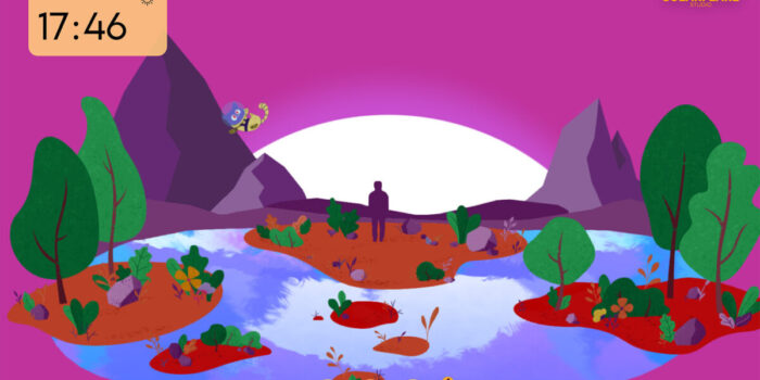
This lovely little showcase page changes depending on the time of day and weather conditions at your location, or you can customize it.

#Websites #January
Related Posts