Spring into action this season with new tools to boost your workflows, facilitate creative thinking,…
20 Best New Websites, February 2024

Today
It’s almost Valentine’s Day, so this latest collection is a billet-doux celebrating the best of the web this month.

Feel free to enjoy with champagne and chocolates!
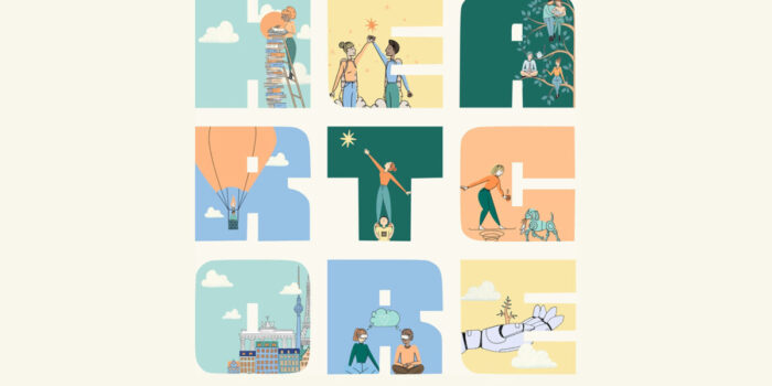
Heartcore is a European venture capital firm with a focus on investing in companies developing technology that will have a positive impact on people and the planet. To reflect this, the site uses a soft color palette, charming illustrations, and a display font that evokes nostalgia.

Right away it is clear this single page site is presenting an app. It is pleasant to use, easy to read, and clear to understand. There is a good balance between strongly colored and neutral backgrounds in the different sections. It may not be groundbreaking, but it gets the job done which is to make its subject appealing.

A palette of sky blues with dark and mid greens, along with some charming illustration, set the scene for this holiday villa on a forested hillside. The overall feel is appropriately fresh, calm, and relaxing.

The site for this business finance platform grabs the air travel metaphor with both hands and runs with it right down to details like the airplane window shaped team photos. The boarding card early access request form is particularly pleasing.

Kozowood specializes in timber construction, particularly in the luxury residential sector. The color palette has clearly been chosen to reflect both a sense of luxury and the warmth of wood. Old gold, chocolate, nougat, and taupe all feature heavily, with just the occasional splash of ivory.

Scalvini Marmi’s site exudes quality and luxury with its smooth interactions, multi-direction scrolling, transition, and gorgeous photography. Many sites now have a mobile-style menu slide in or expand on desktop: here the effect of the menu being behind the page is a nice twist.

The standout design element in Harmonic’s website is the color. Simple black and white in a clean layout is initially enhanced by bright green accents. As the user scrolls the volume and variety of tones of green increase, to finish with a 2-tone green footer.

This is essentially a house brochure. Although there is a menu, the site offers a linear walkthrough of the content, starting by clicking the illustration on the landing page, then following the next link at the bottom of each subsequent page. There is good use of multi-directional scrolling to keep everything feeling contained.

Prounis Jewelry blends the designer’s Greek heritage with a family legacy of creating treasured memories and objects. The brand identity was created to reflect both the colors and materials used to decorate her grandfather’s 1940s New York nightclub and her love of antiquities. The resulting website feels exclusive and yet intimate.

The website for this year’s HubSpot conference, Inbound 24, effectively maintains a consistent style with the main brand while also incorporating brighter colors and a more exciting tone. This helps to differentiate the online side of the business from the in-person gathering.

The copy for BCGBrighthouse’s website talks a lot about bringing light, and the use of yellow with black and white is used well to reflect this. The yellow disc motif, especially over a black background, is used to conjure the idea of the sun shining.

Photographer Anthony Blasko’s portfolio site is beautiful in its apparent simplicity. Visually, it is stripped back to the basics, but behind the scenes, there is a carefully thought out navigation structure. The thumbnail next image in the top right is a nice detail.

Overpass is a talent marketplace for remote sales and marketing. The vibe of the site is fresh and optimistic, with lots of bright color, simple icons, and geometric shapes. The overall feel is clean and professional but with a friendly side.

Mouthwash Studio has chosen to use grey as the accent color here, with black and white. It adds a level of sophistication to the site and creates warmth: particularly the dove grey background on the ‘Studio’ page.

GoodMoods is a style an interiors style magazine, with an online store. It is lifted above the level of a standard homewares store by the careful art direction, most noticeably the use of background colors to complement each image.

From its memorable headline quote to its neon cursor glow, Impolite’s website is all about impact. Mixing fonts and weights is risky, but when done well (as it is here) the result is very strong. Layered images and a good balance between static and motion create energy.

A first glance, this could be for an exclusive meditation retreat on a Greek island. However, it is actually for a font. Fonts can either be presented neutrally, or in a specific context that showcases the designer’s intention. This latter approach can limit how the font is viewed but as Solare has such a strong personality this latter approach works here.

Uponor’s virtual city provides a great framework for presenting case studies of the company’s products and services. The illustration style is pleasing and unfussy, and the navigation is clear. There is a lot of content here but it doesn’t feel overwhelming, and the language used is understandable to a non-expert.

Trunk is a set of dev tools to check, test, merge, and monitor code: something that always presents a challenge to promote without being very dry and technical. That’s why so many products like this have cute little mascots. Here, the animated illustration effectively adds personality and visual interest, while providing an engaging visual metaphor for the text.

This microsite from fashion platform SSense offers a small range of limited edition, exclusive items from brands featured on the parent site. It is very stripped down, with a channel view and a feed view. Rather than lots of product shots, each item has a short, promotional video linked to from a thumbnail.

#Websites #February
Related Posts