4 days ago Welcome to our roundup of the best new fonts we’ve found online…

15 Best New Fonts, October 2023

October 16, 2023
We’re entering the final quarter of 2023, and even in the pre-holiday lull, there are still plenty of fonts to get excited about. In this month’s edition of our roundup of the best new fonts for designers, there are lots of revivals, some excellent options for logo designers, and some creative twists on letterforms. Enjoy!

Geigy
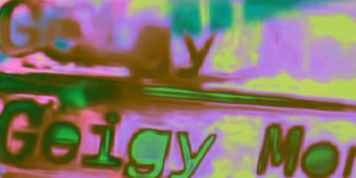
Geigy is inspired by Swiss typography from before Helvetica and the International Style. It’s playful and eccentric with extravagant curves and a relatively strong contrast for a sans-serif. The family includes four weights and italics, there’s a monospaced companion, and there’s a variable font available on request.

Obbligato
Obligato is based on Mortier, a typeface designed for New York City Opera that closed its doors in 2013. A decade later, Obligato is a revised design that’s bold and confident. It’s crying out to be used in a branding project. It’s currently available in a single weight.

Leopardo
Leopardo is a modern reworking of a 15th-century writing manual. The ribbon-like strokes are elegant and form highly legible word shapes, and there are some lovely swashes. The typeface is available in four italic styles that include alternatives, ligatures, swashes, and even ultraswashes(!)

Acting
Acting is a chunky slab serif packed with nostalgia thanks to the distinctive circular elements that, in some cases, form full letters (the s, for example) and, in others, simply adorn the shapes (as in the A). It comes with three different widths: Condensed, Normal, and Expanded.

Displayer
Displayer is a chunky sans-serif with a futuristic sensibility. The weighty letters are lightened with the strategic use of substantial ink traps that punctuate the shapes. As the name implies, it’s perfect for display text and would be an excellent option for a logo.

Orittish
Orittish is a modern, stylish lettering script. Its glyphs are deliberately separated to make it easy to use the font for logos, headlines, and any time the shapes of letters mean as much as their legibility. It’s great for anyone who needs lettering for a project and doesn’t have time to learn the techniques.

Correct
Correct is a contemporary sans-serif that draws inspiration from early grotesque condensed typefaces. Correct is available in five widths ranging from Condensed to XXXX Condensed, each with a matching italic. There is currently a single weight, but more are on the way.

Lardent
Lardent is a workhorse of a serif font with tons of built-in flexibility for anyone who has a demanding project. It is four families, each with a different serif style (Classic, Wedge, West, and Slab), all based on the same skeleton. Each family has three weights with italics.

Gasco
Gasco is a font family inspired by retro styles of the 1970s and 80s. There are ten different styles and accompanying italics. It’s a good choice for headings where the alternate characters can be used to lean into the old-school vibe.

Slabic
Slabic is a distinctly different slab serif with hammer-like serifs and exaggerated ink traps. It is compact and visually balanced, which makes it one of those rare slab serifs that can be used for body text on screens. It includes small caps, fractions, tabular, and old-style numbers.

Bronkoh
Bronkoh is a clear, simple sans-serif typeface. It features large, open counters and a generous x-height, making it ideal for running text, even at small sizes. There are eight weights, from Thin to Heavy, with accompanying italics.

Basilar
Basilar draws its inspiration from early 20th-century German type. It features slightly condensed letter shapes and a few modern slants. There is an accompanying monospaced font that takes the design to extremes.

Kaio
Kaio takes its name from Kayo, an Ultra Bold version of Gill Sans drawn in 1932. It’s available in six weights, from Light to Super Bold, and in the weightier end of the spectrum, it really shines. It’s a brilliant choice for a logo project, magazine header, or signage.

Amadi
Amadi follows the Art Nouveau trend that dominated the start of the year. Its elegant curves seem to ripple like water, creating a strong sense of nature and wellness. It’s available in a single weight with matching italics.

Mollusk
Mollusk is a charming sans-serif with a particularly appealing set of numerals. It features a distinctive k, which gives the design much of its character. There are five weights, from Light to Heavy.

Ben Moss
Ben Moss is Senior Editor at WebdesignerDepot. He’s designed and coded work for award-winning startups, and global names including IBM, UBS, and the FBI. One of these days he’ll run a sub-4hr marathon. Say hi on Twitter.
#Fonts #October


