4 days ago Welcome to our roundup of the best new fonts we’ve found online…

15 Best New Fonts, November 2023

3 days ago
2023 is almost over, and the new fonts are still coming thick and fast. This month, we’ve found some awesome variable fonts, some revivals, and one or two novelty fonts to get you through the holiday promotion work. Enjoy!

Dash
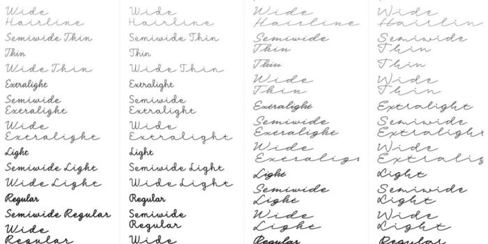
Dash is the result of detailed scientific study and a skilful hand. It’s one of the best handwriting fonts we’ve seen, with four different writing speeds: Casual, Slow, Fast, and Fastest. Each speed has a complete set of weights and widths. There are variable fonts available to give you flexibility.

Mergansers Variable
Mergansers Variable is a variable typeface intended for use at small sizes. It was inspired by the birding community but works well for any passages of body text and, as a variable font, is ideally suited to websites.

00 Wagram
00 Wagram is a collection of fonts that takes millennial office fonts as its starting point. From there, it evolves numerous variations. It uses variable font technology to allow control over weight, contrast, slant, and even character alternatives. As such, it’s an excellent workhorse for demanding projects.

Lambert
Lambert is a charming slab serif that draws inspiration from typewriter fonts — without embracing the monospaced approach. This makes it usable at a variety of different sizes. It includes a range of stylistic alternatives so you can lean into the 19th-century vibe.

Evans
Evans is a retro-feeling Old Style serif with calligraphic details. Softer and more fluid than many serifs, it has a relaxed, organic aesthetic that makes it great for editorial work and even for the right branding project.

DT Serifia Sans
DT Serifia Sans is a playful grotesque typeface with flared strokes that verge on serifs in the bolder weights. The heavier weights are cartoonish, making it an ideal choice for anyone looking for a left-field option for Christmas and New Year promotions.

Valpo
Valpo explores the differences between type and lettering, with letter shapes that feel like they’ve been hand-drawn with a brush or fat marker. It’s excellent for mimicking vintage signage and would be the perfect choice for a graphic novel. There are seven weights and a variable font available.

Fenul Standard
Fenul was inspired by human bones in an anatomy book; you can see the influence on the shapes that are thicker at the ends of the stroke. It’s an exceptional serif with plenty of character that looks amazing at large poster sizes. If you’re ever designing anything to do with orthopaedics, you know where to come.

Hello Radio
Hello Radio is a charming monoline script. The vintage feel makes it perfect for branding projects in the lifestyle sector. It works well combined with a solid geometric sans.

Adjunct
Adjunct is a simple sans-serif typeface with no spurs — meaning the vertical stroke on letters like the p and d doesn’t continue beyond the bowl. The result is a very confident graphic font that works well for logo design.

Rundo
Rundo is an all-caps decorative font family. It includes five complementary styles: Fill, Inline, Decline, Stencil, and Partenon. It’s bold, and architectural, and works best at large sizes.

Qommodore
Qommodore is an unusual serif font in that it’s monospaced. It has a high contrast like a didone, with a slight flex on its serifs that creates a less rigid feeling. Some unexpected details make it enjoyable to work with. It is available in six weights with accompanying italics.

Giliant
Giliant is a beautiful example of the Art Nouveau trend in display type. The standard characters are classic shapes, and there’s a range of alternate characters to provide flexibility and a creative option.

Recht
Recht is a clean geometric sans. It works best for short passages of text, and it is a great choice for a logo design that needs to be distinct but not too different.

Hemilk Soons
Hemilk Soons is a novelty display font intended to show text covered in milk. However, we think a little attention would make it look like holiday snow on winter rooftops.

Ben Moss
Ben Moss has designed and coded work for award-winning startups, and global names including IBM, UBS, and the FBI. When he’s not in front of a screen he’s probably out trail-running.
#Fonts #November


